Visualizing a bibliography: a cultural-intellectual history on the basis of printed epistolaries (1500-1800)
Exploring techniques for visualising multiple intersecting correspondences simultaneously.
Project Leader: Riccardo Bellingacci
Design Researchers: Carlo Alessandro De Gaetano, Glauco Mantegari
Scholars: Riccardo Bellingacci
About the project
“Reassembling the Republic of Letters” ultimately aims at providing free access to machine-readable texts of all learned letters printed and unprinted from the period 1500-1800. The database Letters of the Republic of Letters (EROL) holds the title details of 1874 printed epistolaries, and the full texts of 1666 of these. This Project was devoted to testing the possibilities and limits of this bibliography. Being a completely new bibliography, which started from scratch, it was important to try to visualize the main characteristics of these books, as for example, when and where they were published.
Aim of the project
Through a quick physical count the hypothesis rose that posthumous publications increased from the start of the 17th century onwards and became a major genre of publication through those years. We hoped that through the right type of visualization the answer of this question would appear in a concise and clear way. Furthermore there was an interest in finding out where and when these books were published in order to find possible unknown centers of publications.
Case study
The material we were using was a database in Zotero, containing around two thousand books, each containing letters. Normally, the dates of publication and the names of the authors are provided, as well as the language in which the books were published.
Technical issues with data
- No prior knowledge on visualization software and data manipulation
- Data available was very “dirty”, with much incongruence in language and place names.
- Missing of necessary data (e.g. Biographical data of authors, coordinates of locations, indication of post-mortem publications)
- Importation of wrong data through algorithm (names in VIAF, Coordinates in GeoNames)
Solution
- Communication and interchange of know-how with experienced developer and visual designers.
- Cleaning of Data through OpenRefine and Excel , plus a manual change of certain data.
- Use of VIAF to retrieve date of birth and death of authors plus a short bibliographical comment. Unfortunately usually not possible without a code which imports it. Fortunately one designer already had a working code. Similar proceeding with detailed geo-locations: First country Tags had to be manually imported into the database (Use of Openrefine to select locations of the same country); through a second code it was possible to import coordinates from GeoNames. The code gives a selection of possible places, hence afterwards there was the need of a manual selection of matching data.
- Unfortunately the code would take always the first selection of VIAF, which however was not always right (e.g Pietro Bembo became Giulio Cesare). There had to be a manual selection of right assigned names (however I am sure this could have been done faster). Same for coordinates (e.g. Instead of the famous location Cambridge, a little village near Bristol carrying the same name was considered.)
Design process
Two different programs where used for the two issues. Palladio was used for mapping the data on a geographical map of Europe, as well as for creating a timeline with the possibility of a slider. Raw.density was used for the visualization of postmortem publications.
Palladio is rather straightforward and once the data was clean it was mostly only a matter of cut and paste. The dashboard of the software is clear and simple and an easy to achieve .csv file is needed. “Size Nodes” should be used if one wants to have point in a location with more publications to be respectively bigger.
Raw offers a variety of possibilities of visualization. For our purposes of postmortem publications it was decided to use “Parallel Coordinates” where one has two vertical lines identifying different data (in our case date of death on the left and date of publications on the right) and edges, representing books in our case, going from their respective date of publication to the respective date of death of the author. Logically lines having a positive slope represent books published postmortem, while lines having a negative slope represent books published before the death of the author.
Issues involved with Raw
- The two lines were out of scale, meaning that the slope of the edges was not representative for anything.
- Same color for all edges, making a visual comparison impossible.
Solutions
- Creation of two Dummy variables, representing two books both published by a dummy author at the date of death. The values for the dates were taken according to the min/max that was available at the database. In our case one at 1200 and another one at 2000.
- Implementation in Excel of a new column containing the value “TRUE” if the book was published post mortem and “FALSE” if published before and “SAME” if published at the same year. This was done through a simple “IF-command” in Excel. Raw is then able to identify these three different criteria and color the edges accordingly.
Following are several screenshots of the two different visualizations.
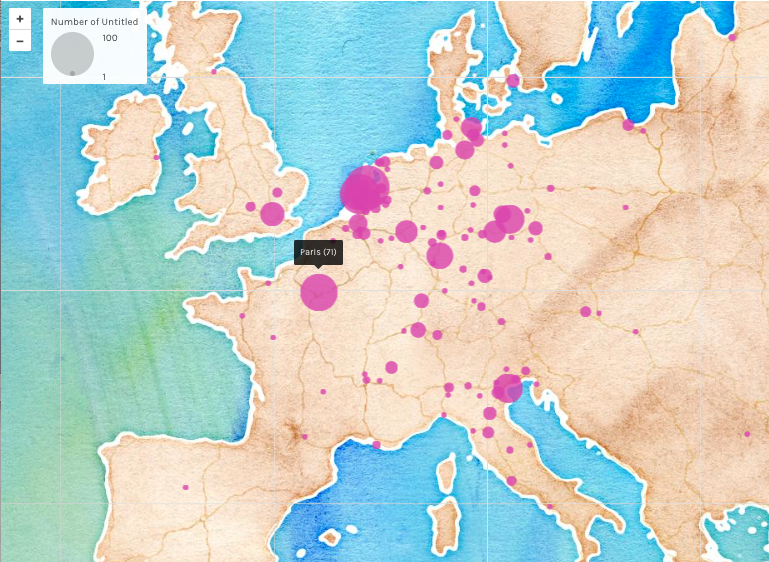
Figure 1.1 Location of the publications (based on books with one single author and one single publication place.
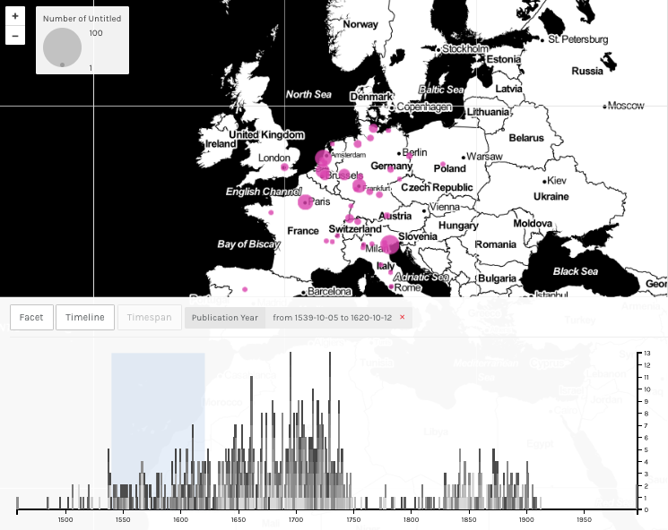
Figure 1.2. Time slider underneath gives the possibility of choosing one given period.
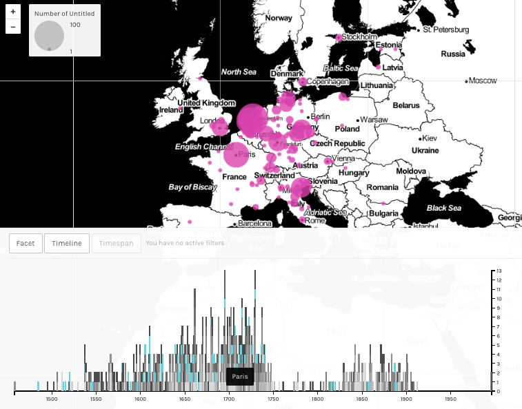
Figure 1.3. Timeline is divided by location; clicking on a line fragment shows when other books were published at the same location (e.g. Paris)
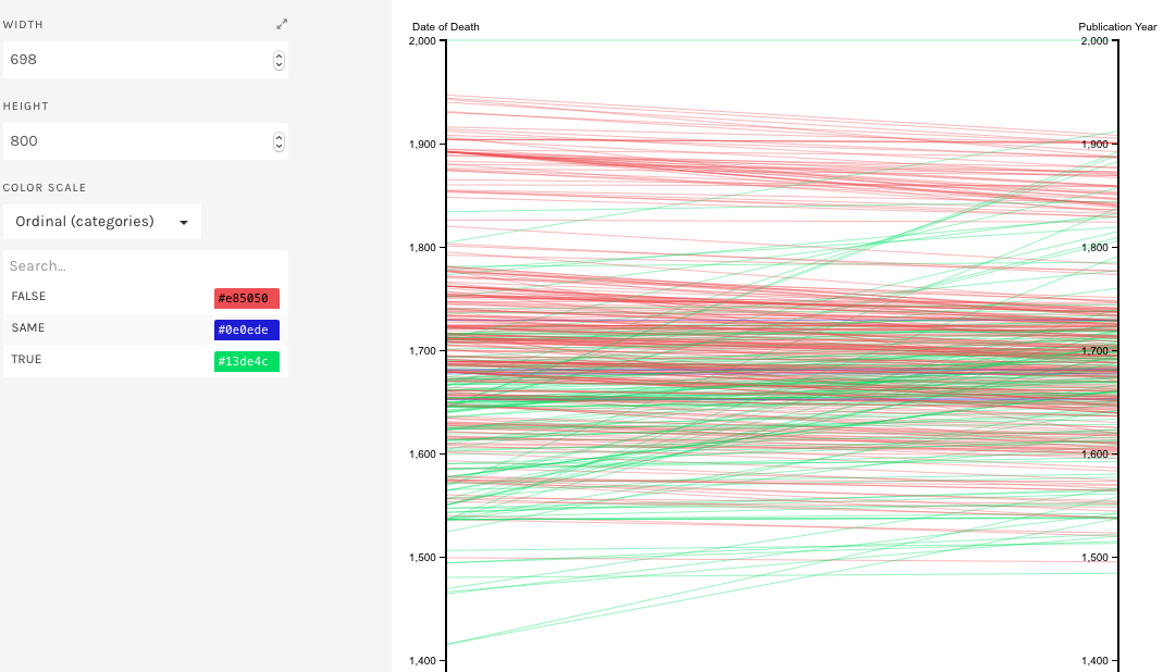
Figure 2.1. Use of “Parallel Coordinates” (RAW) to show relation between date of death of an author and the date of his publications (Highest segment is a dummy variable)
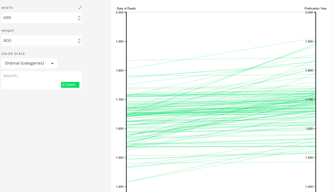
Figure 2.2. Only posthumous publications.
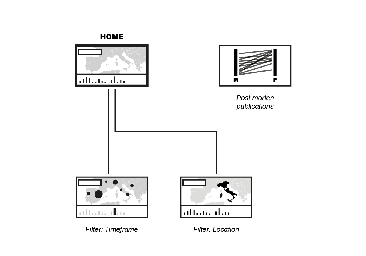
Project Diagram
Conclusions
We notice that the highest numbers of books were published in Amsterdam, Leiden, Paris and Venice, in decreasing order. This is not surprising as those where cultural centers at that time. The majority of the books we considered were published between mid 17th century and mid 18th century. This as well is not surprising, because the bibliographies we took into consideration when implementing our database were focused mostly on that time period.
More interesting was the analysis of the posthumous publications. Through a counting we had guessed that from the start of the 17th century onwards the quantity of posthumous publications increased. As you see in Figure 2.1, this appears not to be the case; publications dates have a tendency of being published shortly prior to the death of the author. This probably shows the will of the authors, conscious of their approaching end of life, to publish their letters and memories . Also remarkable is the increase in publications of books of authors deceased at least a century before. This trend starts from the 19th century onwards, however it has to be confirmed using a bigger amount of data.
Remarks
We learned that data is not just an amount of information to be blindly worked on, but that it is important to consider with care what this data means on a humanists point of view. When for example standardizing location names it is important to keep the original names in a column, as the way they have been written or the specific significance of the place written in that manner may be important for future, historical considerations. Unfortunately, especially with locations, it is impossible not to have certain approximations, it is therefore mandatory to annotate these if occurring (e.g. Some locations are nowadays all in one city, but this might not have been the case when the book was published. All this information would get lost without keeping the originals names somewhere memorized). Furthermore as specified before it is often necessary to use a subgroup of the data contained. This then may lead to conclusion for the whole data set, which may be erratic.
Biasness is important to consider as well and in fact some of our previous claimed results are partly due to our subjective choice of data: the Molhuysen bibliography contains books of letter written to and from Dutchman, hence the high amount of publications in Amsterdam and Leiden. Similar aspects have to be considered when analyzing the publications date of these letters. It appears now that most letters were send in the 17-18th century, but this, is also due to the choice of bibliographies.
Further Research
Visualizations techniques have proven to be very useful to visualize large amounts of data in a clear way. The geographical map-view, even if not so innovative on a visualization point of view, is valuable pedagogically, as it reconnects to a known view. Abstracter visualization, however, are capable of including more dimensions, and their interconnections, in one big picture. For our projects the geographical map was already able to give us much insight and helped to answer some of our research questions. This has however to be implemented on the whole of the data and not just on a subset. Furthermore we want to implement the database with other bibliographies from other countries in order to tackle some of the biasness issues mentioned before. There are also some future visualization plans regarding the posthumous publications, which we will try to incorporate.