Visualizing EMLO
Designing visual interfaces for browsing the EMLO repository.
Project leader: Howard Hotson
Scholars: Howard Hotson, Glauco Mantegari
Design researchers: Carlo De Gaetano, Azzurra Pini
About the project
EMLO, “created by the Cultures of Knowledge Project […] is a combined finding aid and editorial interface for basic descriptions of early modern correspondence”. During the latter part of the workshop, and building on the results obtained by the project so far, we aimed to design visual interfaces for browsing the repository. We have used data from Samuel Hartlib’s correspondence as a testbed for our experiment: 4833 letters (sent/received) that, for the most part, have a date associated with them, as well as the place from which the letter was sent and/or the place to which the letter was addressed. In addition other metadata (such as uncertain or inferred dates/places, geographical coordinates, and editorial notes) are available.
Aim of the project
The main research question we defined was: “How can we provide users of EMLO’s website with innovative ways of browsing the collection that support the discovery of relationships between multidimensional data involving people, space and time?“.
More specifically, we focused on Hartlib’s data to explore the characteristics of his network of correspondents and to deploy mockups illustrating possible solutions.
Case study
The main dimensions that characterize the data are:
Geography
The geographical dimension has a crucial role since it often consists of notations about both modern and historical places. For example “Heidelberg, Baden-Württemberg, (Electoral Rhenisch Imperial Circle) Germany, (Holy Roman Empire)” represents two different views of geography:
- Modern: e.g. Heidelberg > Baden-Württemberg > Germany
- Historical: e.g. Electoral Rhenisch Imperial Circle > Holy Roman Empire
Using mostly regular expressions, we split these notations into modern/historical classes, and we created hierarchies that could be leveraged during browsing.
Time
We also explored the temporal dimension in order to identify the fuzziness that usually characterizes historical chronologies, and the possibility of dealing with notations expressed using different calendars (e.g Julian and Gregorian).
People and Languages
We didn’t perform specific data analyses on people and languages for two main reasons:
- People, as identified by personal names and birth/death dates, represent a complex problem that needs specific work, e.g. through reconciliation with external sources (such as the Virtual International Authority File, VIAF) providing standard identifiers that allow connecting to library catalogues.
- Language data in Hartlib’s correspondence were simple and only limited to six instances
Design process
A few visual solutions were explored as a preliminary proof of concept aligning with the main dimensions emerging from the discussion.
Geography
The representation of the Geographical view has highlighted a number of criticalities related to the temporal and subjective variability of political borders. On the one hand the geolocation as reported in the dataset is often conflicting, registering the contemporary reference and the historical one at different levels of geographical granularity (i.e. nation, region, city). On the other hand both contemporary and historical reference are relevant for the exploration of correspondence. Moreover, even when the geographical unit in question remains unchanged (e.g. in reference to Poland, Hungary, or France), the boundaries shift over time in complex ways which have yet to be captured by any sophisticated and open-source digital system, making a precise representation of political boundaries at every stage of the past impossible at the present time. For this reason the approach that has been adopted for visualising the geographical level is a bubble chart cartogram, placed according to the approximate position of countries, where each geographical unit has been dimensioned with respect to the number of letters sent or received. This solution solves several problems simultaneously: (1) it obviates the need for precise political boundaries in any given period; (2) it avoids overlapping circles for densely populated areas; (3) it allows ready comparison when different data sets are visualized; (4) it allows geographical outliers (such as Turkey and Antigua in the example below) to be included without changing the scale of representation for the core data; (5) it allows regional categories (e.g. ‘central Europe’) to be visualized alongside national categories; and (6) it highlights anomalies in the data needing cleansing (e.g. Zeeland and Gelderland are separate from Netherlands, and Ireland from the Republic of Ireland).
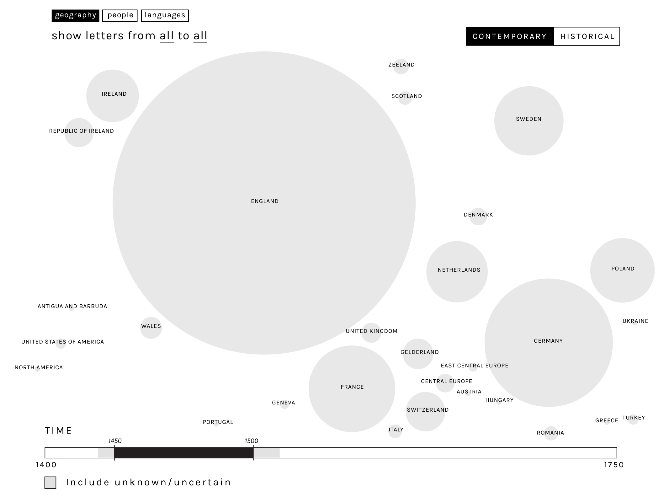
The visualisation of geography as also tackled from two points of view. Contemporary political entities can be used to provide a first overview of the amount of letters sent or addressed to a certain country. Alternatively, the user can switch an historical visualisation, which allows to explore the distribution of material from political entities which have vanished from the modern map (such as the Holy Roman Empire or Transylvania). The user also has the capacity to compare these two levels by keeping the one in the background (as a shadow) while viewing the other.
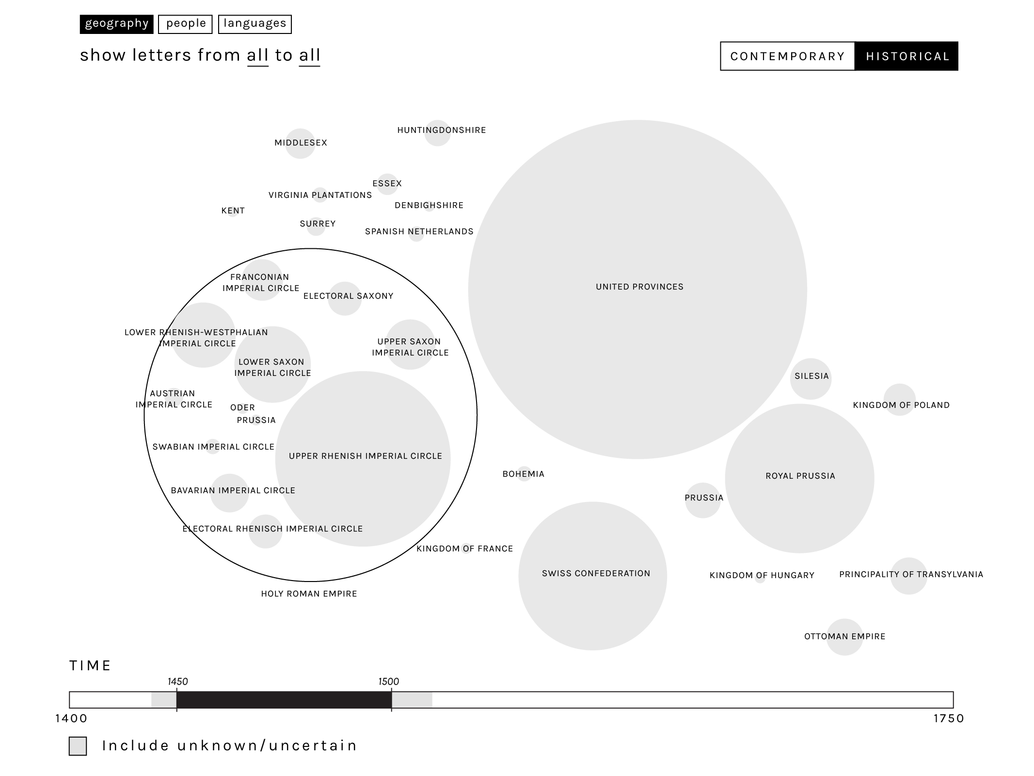
For both levels, it is also possible to visualize the constituent parts of larger geographical entities (such as the circles of the Holy Roman Empire, within the example above). Moreover, at both levels it is also possible to switch from a semi-cartographic representation to a network-like one, in order to represent the different levels of granularity at the geographical level (for example, highlighting the letters exchanged between a city and a country). The visualisation has been therefore approached by representing top level geographical units as metanodes, which can be expanded by the user to reveal the sub-nodes within them.
Time
The temporal dimension is also highly relevant for the exploration of correspondence archives. In this case, an additional level of uncertainty is added: not only as some dates missing or inferred, but this period witnessed the coexistence in Europe of three different calendars (Gregorian, Julian starting in January, and Julian starting in March). For this reason, in order to produce a better approximation in matching the exploration of the geographical and temporal dimension, we decided to represent the degree of fuzziness related to the selected timespan. This solution would also require a refinement of the database for the unknown records with the addition of inferrable date ranges together with their probability.

The representation of the temporal uncertainty can be also flagged in a more general overview, and different levels of likelihood can be included when drilling down to a more detailed view.
People
A more detailed view by people has also been designed in order to explore visually the correspondence of single authors.
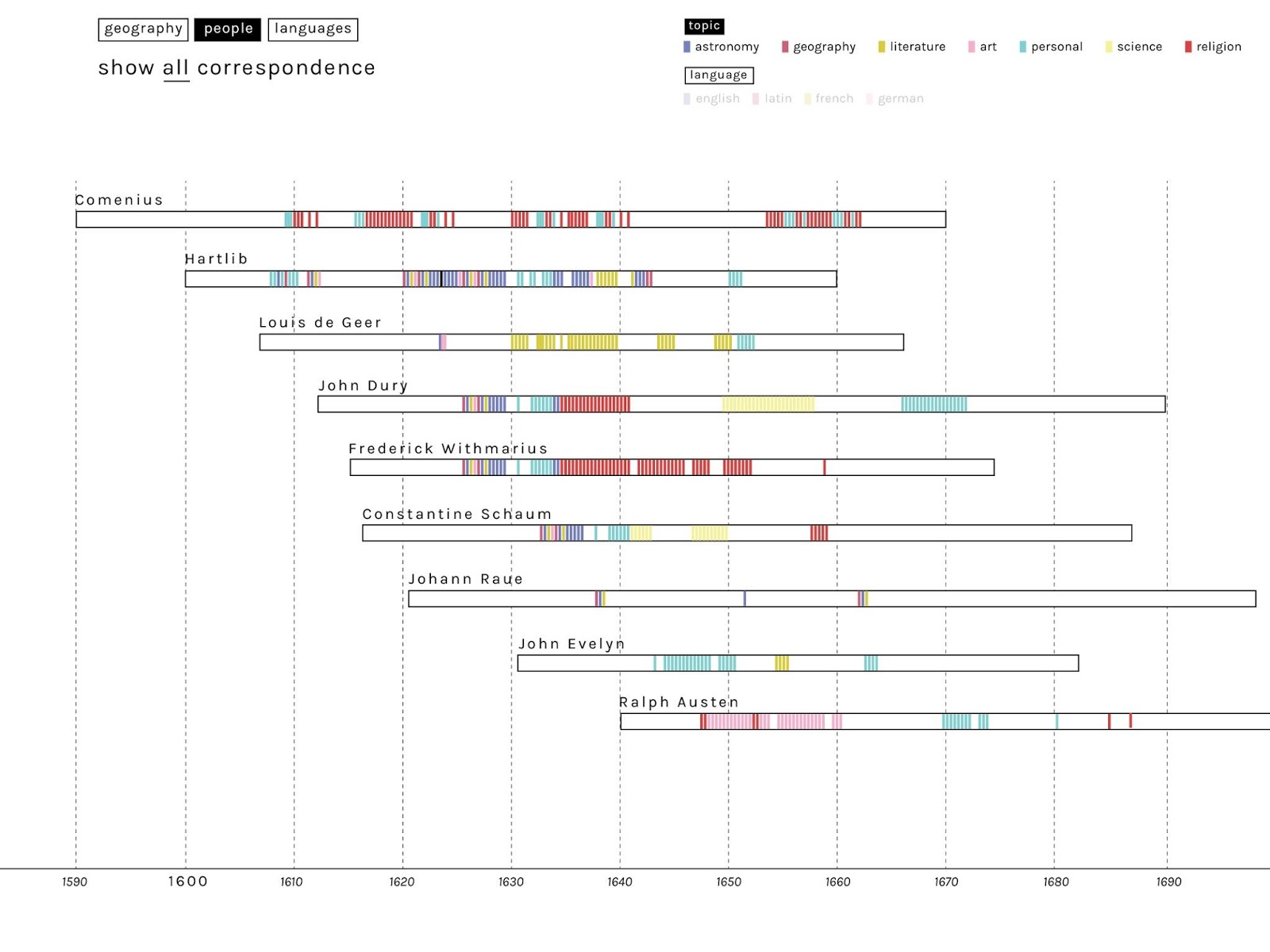
The basic concept is to display the major correspondence in a resource such as EMLO as individual horizontal bars in a Gantt-like chart. The length of the bar represents the life of each main correspondent (when birth and death-dates are known: otherwise fuzzy-logic visualization conventions can be employed, perhaps supported by automatically generated inferences).
Within the bar representing each main correspondence, a vertical line represents each letter sent. Alternatively, if the users chooses, letters both sent and received could be viewed together, perhaps represented by different colours. Since this would produce only an approximate impression of the distribution of known correspondence throughout an individual’s lifetime, clicking on a bar might produce a histogram more accurately displaying letters sent and received.
By selecting specific authors through the filtering menu it would be possible to visualize only the people involved in one particular correspondence. A more sophisticated interface could provide the user, automatically, with all the main correspondents in the system with an given correspondent, with the letters exchanged with him/her visually highlighted.
An additional refinement, illustrated below, involves colour-coding the letters by main topic of discussion. Since one letter can contain different topics, these would need to be prioritised and those letters would appear as selecting and filtering all categories involved. Obviously, this depends on the availability (a) of a standard system of categorizing topics (e.g. by academic disciplines), (b) of an epistolary data model enhanced to accommodate these topics, and (c) large numbers of epistolary records categorized in this manner. This metadata would also allow users to isolate and analyse correspondence on individual topics (e.g. Arabic or astronomy).
An additional refinement would allow users to highlight conversations between the correspondents represented. The example below, for instance, shows how a conversation thread between two individuals might be highlighted as the user hovers over a particular letter within it.

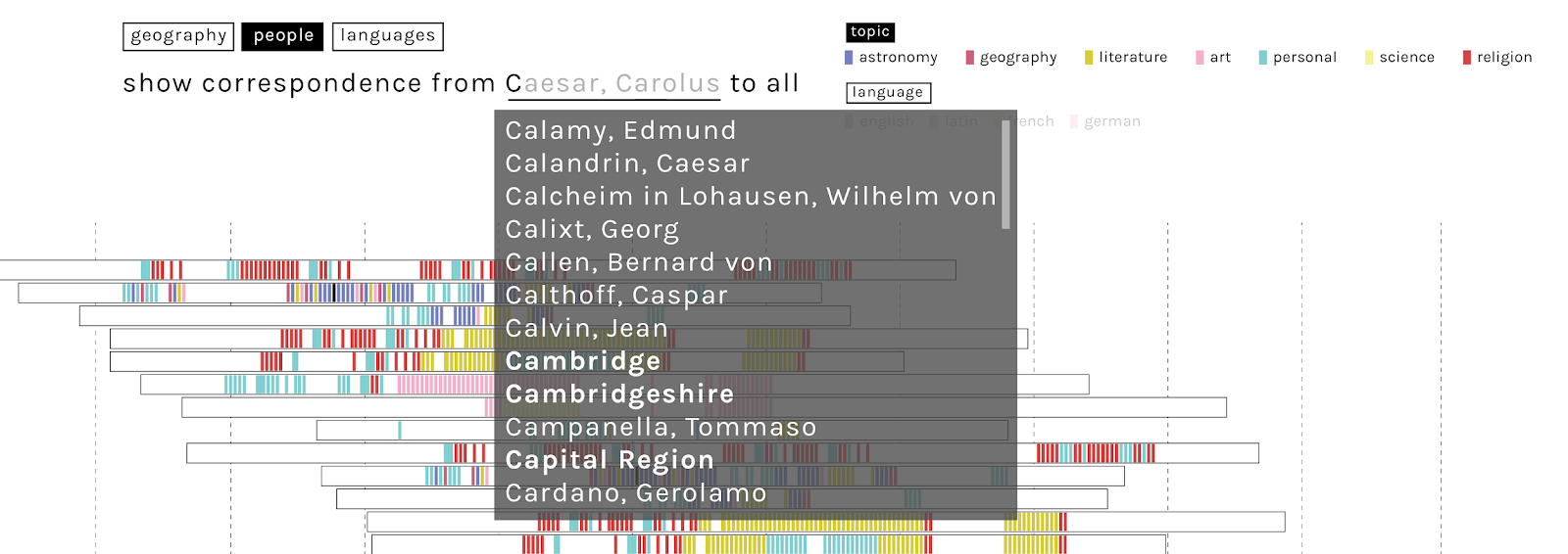
Single correspondences and single collections could be explored through free search “verbose” filtering, which would allow the user to select not just individual authors, but potentially also places and collections with autocompletion.
Clicking on any correspondent within the previous view might also produce a second view (below), designed to highlight (a) the number (and potentially the topics) of letters exchanged with a given correspondent (in this case Hartlib), and also (b) the the reciprocity of exchange. The latter is visualised by means of a double, vertical bar-chart: in this case, the lack of symmetry indicates that the Hartlib’s catalogue on EMLO contains far more letters to than from Hartlib. In all of these visualizations, the classification into topics could also be switched for the one into languages. The visualisation also allows to display the distribution of recipients into someone correspondence, pointing out the preferred correspondents.
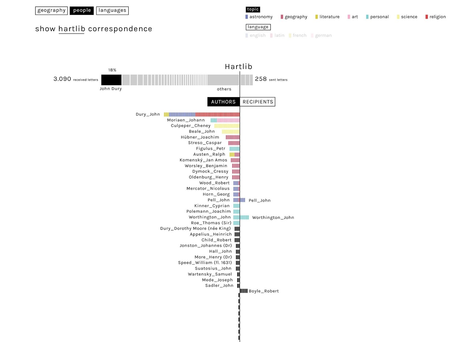
In a system including machine-readable full texts of letters, a possible further expansion would consider also the length of letters (as calculated by number of words). Automated topic modelling might eventually populate the topical data field automatically and calculate the number of words devoted to each topic.
Languages
The different languages characterising certain collections inspired an additional exploration. In the case of Hartlib’s correspondence, several different languages were used, and a significant number of letters used more than one language (up to 3).
In the example below, the different languages used (by selected authors, or within entire archives, selected collections/ time-spans) have been visualised with a graph: the size of the circles is proportionate to the number of letters in the archive in each language, the co-occurrence of two languages within the same letter is represented by the links or edges, and the the frequency of language co-occurrence is represented by the thickness of edges.
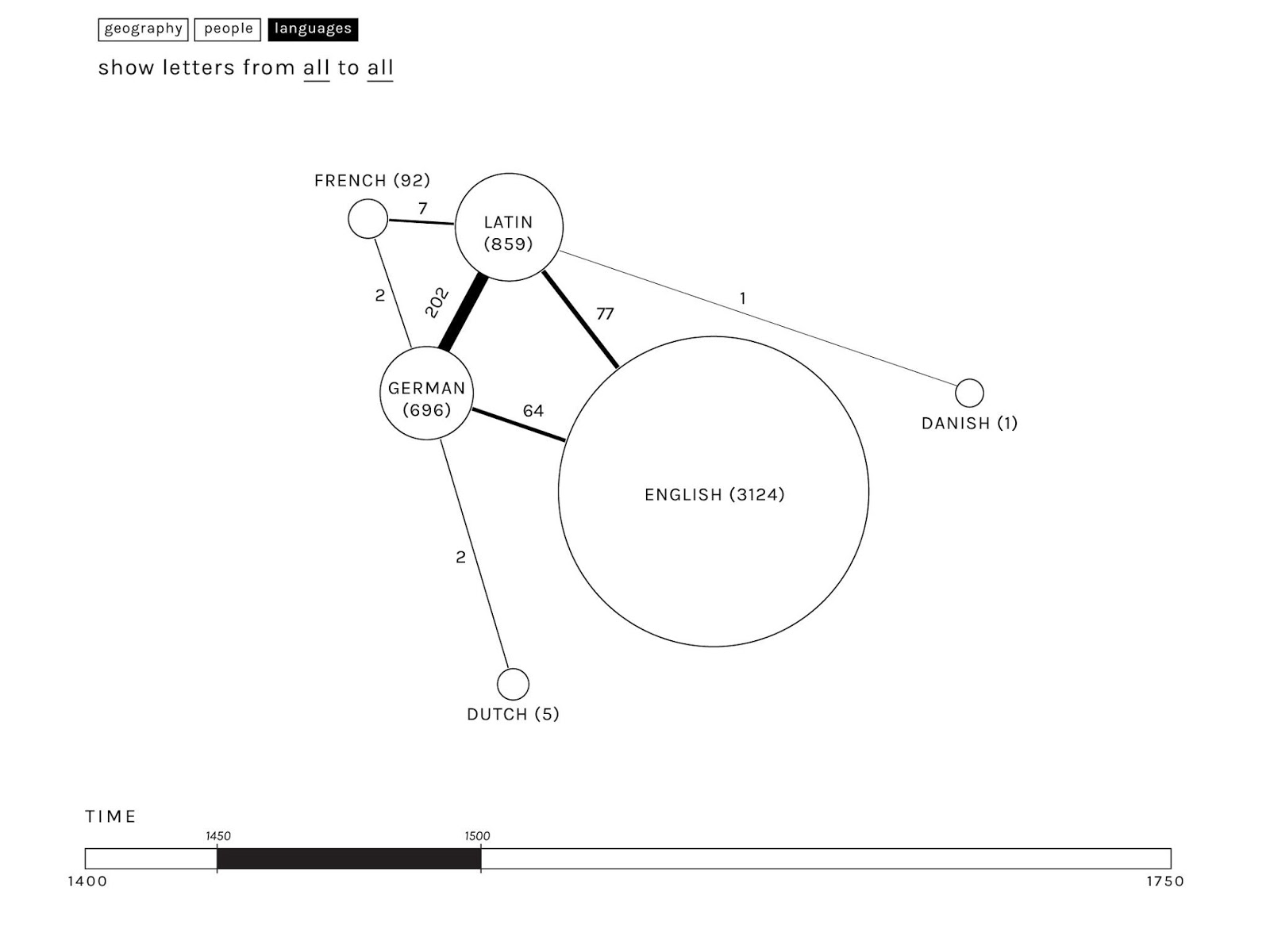
As the resulting graphs are not expected to be particularly complex (few letters are written in more than two or three languages), the changes in the linguistic panorama over time could be easily explorable and comparable.
A further interesting exploration would include the proportion of each language (in terms of number of words) within multi-language letters, to give a better approximation of their relevance within the corpus.
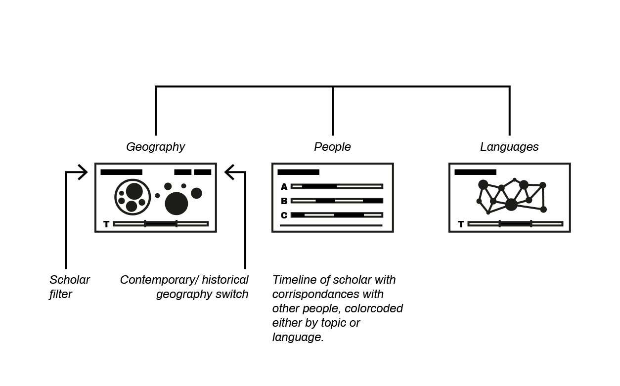
Project Diagram
Conclusions
The workshop offered an excellent occasion for understanding the exploring the potential contribution of data interaction design to the exploration of existing data, the development of fresh research questions, the potential for refining and populating data models, and points of departure for the development of visual browsing in a web-based system.
Although only an initial exploration, the mockups already give a good representation of the underlying data of Hartlib’s correspondence and illustrate how the main browsing functionalities could be structured. However, additional analysis of the same dataset, beyond the time constraints of the workshop, is required to develop the proposal more fully. In particular:
-
The assumptions about different geographical notations and granularities need to be verified with an expert check of groups and the hierarchies outlined so far.
- The temporal dimension, and specifically the possibility of automatically inferring approximate time-spans in all cases where time information is missing, needs additional work as well. It will also be interesting to refine the way fuzzy temporal intervals are modelled and displayed in the interface at both the overview and drill-down levels.
- Data on people can be enriched using reconciliation of personal names with authority files that are connected to the LOD cloud, such as VIAF.
This work should go in parallel with the improvement of the visual mock-ups, informing design decisions that best represent the underlying complexity of the data. A desirable next step would be to translate the mock-ups into partial proof-of-concept interactive apps that can be quickly made accessible by scholars for evaluation and feedback.
In doing so we would aim to develop the building blocks of a comprehensive beta application that in the future could be extended not only to all the other records on EMLO but also to other kinds of data beyond correspondence. In our view, this will progressively allow scholars to rely on a system that doesn’t simply facilitate the discovery of relevant information, but represents a fundamental component of their research toolbox.
The design solutions presented been also suggest the value of developing additional dimensions of the EMLO data model, for instance for capturing broad topics. If implemented effectively, this could further support the creation of a community-based platform for research around early modern correspondence. Within this context, visualisation would function as a reasoning tool and a motivation for scholars to enhance the richness and quality of data, thus contributing not only to a specific collection but to humanities research more generally.