Visualisations with memory
Visualising correspondence networks that retained ‘memories’ of past states through a case study of the ego-network of Desiderius Erasmus.
Project Leader: Howard Hotson
Design Researchers: Serena Del Nero, Michele Mauri
Scholars: Alex Butterworth, Howard Hotson, Christoph Kudella
About the project
Static visualisations normally display all the movements or correspondence of a lifetime as if they had taken place simultaneously. Dynamic visualisations, cycling through one instant at a time, typically do not retain an impression of past movements or transactions. Hence the need to develop visualisations with ‘memory’: that is, visualization which retain some fading indication of previous movements or transactions while highlighting current and recent ones.
Workshop Group 3 addressed the challenge of visualising configurations of correspondence networks that retained such ‘memories’ of past states through a case study of the ego-network of a single significant individual in the early Republic of Letters, Desiderius Erasmus.
This network is reconstructed from the known correspondence sent and received by him throughout the course of his life (1466-1536), a total of nearly three thousand letters, written in Latin. In certain respects, this data set is representative of those contained in the EMLO archive: ego networks predominate since centred on individual recipients whose correspondence was preserved; the extant correspondence is not always reciprocal; while the lack of uniformity of access to postal networks distorts the distribution of letters. The susceptibility of the data to network analysis is therefore limited and caution was exercised during the design process.
Aim of the project
The designated challenge for Design Sprint group 3 was to create ‘animated’ visualisations that preserved the ‘memory’ of networks: that is, how contemporary scholars working with a corpus of letters can retain a productive awareness of past activity within a network relative to the current temporal focus of their research.
During a process of co-designing visual interfaces to its designate task, the Group paid incidental attention to how the conventions it developed for individual ego networks might be extended for application to multiple intersecting correspondences and itineraries.
The research agenda was set by a combination of (a) Kudella’s description of the data with which he had worked during his PhD and the limitations of existing visualisation tools in representing the temporal dimensions of already complex data, (b) Hotson’s summary hypothesis regarding the history of Erasmus’s network as a dispersed but coherent group centred around an influential individual during his earlier life, which split into (two) distinct confessional groups during the Lutheran reformation, between which Erasmus increasingly found himself stranded.
The research addressed the design question of how visual conventions might be devised to represent two (or more) network states, simultaneously and comparatively, as required by Kudella’s research: ie. what is happening ‘now’ and what happened previously.
Additionally, it sought to evaluate the design produced according to how effectively it supported an interrogation of Hotson’s historical hypothesis regarding the impact of the Reformation on Erasmus’s own Republic of Letters: that rather than becoming trans-confessional, it splintered.
Case study
The domain expert in the group was Dr Christoph Kudella (University of Groningen), who had recently completed a PhD concerning the correspondence of Erasmus and who supplied a copy of the data gathered during that work for experimental use, while Professor Howard Hotson (University of Oxford) led the group, affording a contextualising knowledge of the broader historical domain, and both close knowledge of comparable correspondence networks and ownership of the visualisation agenda in his role as Director of Cultures of Knowledge and PI for the COST Action.
Viewing Letters
- One icon represents one letter.
- The order of icons is chronological.
- The shape of icons distinguishes letters sent (e.g. circle) and letters received (e.g. a triangle) in a given place.
- The colour of an icon indicates how recently it was sent (we cannot indicate date of receipt because we do not have the data: eventually, this might be calculated).
- Discrete shades are better than continuous colour gradients, because they allow comparison between places.
- Three shades allow the display of several different periods while leaving each one visually distinct. For example:
- black = current instant (which might also represented by a pulse)
- red = 10% of the entire timespan viewed
- orange = 11-40% of timespan
- yellow = 41-100% of timespan
- Selecting a specific letter reveals
- metadata in a pop-up box and
- location of the other correspondent (e.g. Erasmus).
Viewing Correspondances
-
Rectangular boxes collect icons for all the letters send to / received by specific individuals within the timespan.
-
Selecting an individual person-box reveals:
- Other locations of the individual during the timespan selected;
- Bar graph, displaying all letters sent to / received by this individual with Erasmus throughout the selected timespan (as highlighted within the entire correspondence?);
- Location(s) of Erasmus recorded in the metadata of these letters.
Viewing Places
- Places represented in one of two ways: as
- clusters of letters: i.e. large boxes containing individual letter icons arranged chronologically. This will result in coloured bands giving a sense of the history of Erasmus’s correspondence with this place during the timespan selected.
- Selecting a location reveals bar graph showing all letters either sent vs received or exchanged with individual correspondents in that location;
- If Erasmus resided in that location during the timespan selected, letters sent or received by him there are also graphed.
- Clusters of people: i.e. larger boxes which cluster the smaller person-boxes (containing letter icons) together as tree diagrams.
- Bar graphs (as above) and also locations of correspondents (including Erasmus) indicated by metadata, during the timeframe.
- clusters of letters: i.e. large boxes containing individual letter icons arranged chronologically. This will result in coloured bands giving a sense of the history of Erasmus’s correspondence with this place during the timespan selected.
- Problem of clustering. When the density of data in a particular area is high, place icons (whether clusters of letters or of people) merge to form a single, larger cluster.
- These merged clusters must be distinguished visually from single place icons (e.g. by a darker external border).
- When users mouse over these merged clusters, they reveal that they are composed of several component parts.
- When users zoom in, merged clusters resolve into place clusters.
Ego-network of correspondants: radial view
The Ego-Network of Correspondents: Radial View (ENCORV) is a force-directed monadic display presented as dashboard element in dynamic relation with the configurable Time and Event Slider with Histograph (TESH), a persistent panel between this view and the Cartographic and Cartogrammic Memory of Correspondence (CACMOC)
The ENCORV represents three dimensions of data:
On the radial axis:
- Temporal (or spatial) ‘proximity’ of correspondents to Ego by spoke length (centrality >)
- Correspondence [TESH : Toggle to correspondence by individual histogram]
- Frequency of correspondence: > designated threshold for designated time period
- Regularity of correspondence: > designated threshold for designated time period
- Significant difference in frequency/regularity relative to previous period: exceptionality
- Co-location [TESH : Toggle to period(s) of co-location by individual histogram marker]
- Extent of time co-located with Ego by city
- Frequency co-located with Ego by city
- Physical Distance from Ego location [TESH: Toggle to correspondence by individual histogram]
- Logarithmically
- Non-logarithmically
On the circular axis:
Clockwise hierarchical subdivisions (D) ordering by selection (O), priority ordering (and possible other configuration (C)) of:
Chronology (O)
- (Most) recent correspondence, within designated time frame
Activity Level (O)
- Total correspondence, within designated time frame
Spatial Categories (hierarchy) (D, O)
- Top-level administrative (D)
- Nation state (D)
- City (D)
- Shortest distance to [border] (O)
- Territorial contiguity of states (O)
Religious Status
- Of location
Professional Status/Institutional Affiliation
-
Of correspondent (primary)
(note: where multiple, secondary professions, possibility to display potential presence in other professional categories on selection of individual)
Icon for individual correspondent:
- Position on radial spoke: semantics variable by context
- Segmented colour gradient: correspondence with Ego during designated period
- Anomolous status of individual (e.g. discrepancy between religion of individual/location)
NOTE: Requirement, for future consideration: To track significant mobility within each configured display over time: eg. Movement of individual(s) between cities, confessions, or professions. How to visualise effectively?
The TESH displays, by default, a histogram view of the overall ‘memory’ of ALL correspondence within the selected period. Within this view it may additionally represent Vertical bar:
- Date of single (or multiple) selected letter(s)
- Dates of all letters from/to selected correspondent(s)
Split into multiple layered histograms:
- All letters sent by Ego
- All letters received by Ego
Design process
The design process followed the outline structure of daily priorities advocated for Design Sprints, with the interdisciplinary team exploring multiple possible solutions during the divergent phase before focusing more narrowly on a solution that retained geo-indexical reference for both correspondents and correspondence but with the potential to accommodate other, integrated forms of data presentation.
It was recognised at an early stage, based on the prior experience of Dr Kudella in preparing visualisations for his PhD dissertation, that a more general challenge preceded the specific challenge of recording and presenting ‘memory’ in the network: the relative illegibility of traditional, geographically spatialised network visualisation, which degenerate into a ‘hairball’ of criss-crossing lines, even with quite limited data sets.
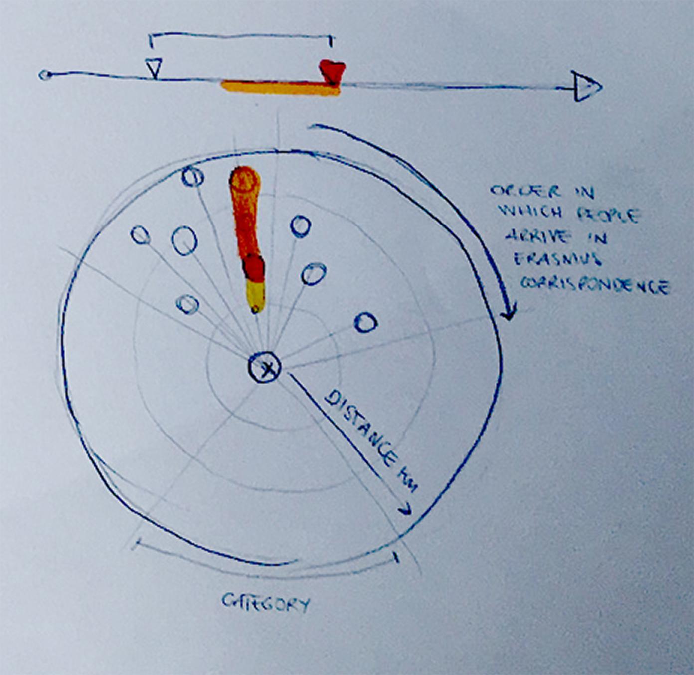
To address this challenge, a range of possible solutions were considered during the first two days, including a ‘radial’ representation of the Ego Network (fig.1). This conceit placed Erasmus at the centre, his individual correspondents as the end-point of spokes radiating from him and the spokes themselves representing, by their length, different dimensions of the spatial and temporal relationship between those correspondents and Erasmus, through their letters.

Fig.1 Early sketch of radial visualisation of ego-network, with Erasmus placed centrally. The proposed radial diagram proposed elaborates on this sketch idea in various respects.
It was agreed that the radial representation held significant promise for enriching our visualised understanding of memory in Erasmus network but that without considerable refinement it was liable to misreading: the mobility of both Erasmus (as Ego) and many of his correspondents would led to a ‘reading’ of high dynamism in the relative e.g. geographical distance between A and B(s), at the risk of distorting a more productive account of their spatial relationship as a whole.
Attention then shifted to a map-based visualisation which could represent multiple levels of resolution in the individuation/aggregation of data points - for individual places, people, instances - with the notion of ‘cognitive zoom’ invoked to enable animated transitions between levels and across a cartographic to cartogrammic spectrum (from the prioritisation of a conventional map projection to that of the conceptual space of correspondence dispatch and reception).
At every stage, reference was made to past examples of good practice in data visualisation as well as to novel examples of experimental visualisation that might inform the design process.
User journey: non-expert user
User profile: a non-expert user entering through a collaboratively populated union resource such as EMLO, with minimal knowledge of the correspondence in question, and needing to move from a general orientation to more specific investigations.
-
Entry point: list or visualisation of all catalogues on the system.
-
First step: select correspondence (in this case: Erasmus of Rotterdam) and visualise in conventional mode. Result: far too confusing to be readily intelligible.
-
The default view should provide material with which to gain an overall impression, including:
- A timeline, showing the distribution of letters to and from the correspondent from the first to the last letter in the catalogue. The default view should split bars into letters sent (below) and letters received (above). It should be possible to separate and split these, and to zoom to full screen (as on EMLO: e.g.)
- A map, displaying the complete correspondence in a single image in conventional fashion (e.g. like Palladio: number of letters indicated by size of circles, overlapping where necessary, with directionality indicated by curved edges).
-
Some basic information and statistics: very brief identification of main correspondent, number of letters, main topics / keywords.
-
Basic functionality:
- Timeline: The user can define any portion of the timeline for further study in one or both of two ways:
- By moving pointers along the timeline, to define a rough period;
- By manually inputting precise start and end dates into boxes provided;
- By selecting major events from the life of the main correspondent from a list derived from the prosopographical metadata. These events might include major
- changes of place (e.g. Erasmus moves to Basel);
- career-changing events (e.g. Erasmus publishes the Adagia);
- events in the wider world (e.g. Luther’s 95 Theses / Diet of Worms)
- Map:
- Zoom functionality is needed to explore areas heavily populated with data (e.g. the Low Countries in the case of Erasmus).
- Iconography can be altered to explore different dimensions of the data. In what follows, a user journey is outlined using the ‘visualisation with memory’ functionality to investigate the summit of Erasmus’s career with increasing levels of detail.
- Users can turn on the display of boundaries to determine which cities call within which jurisdictions.
- Timeline: The user can define any portion of the timeline for further study in one or both of two ways:
-
Second step: user selects briefer period to study (e.g. 1508-1518):
Result: still very difficult to interpret, even for the expert user.
-
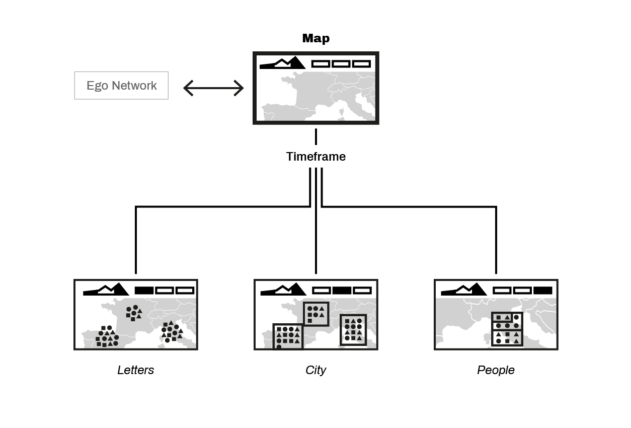
Third step: user switches from default mode to ‘memory’ mode for places. This has three immediate effects:
- Erasmus’s timeline for 1508-1518 is divided into three chronological slices, according to the pre-set proportions noted above. The user can then adjust these to the major divisions of Erasmus’s life. In this case, they are set to 1508-12, 1513-17 and 1518.
- The map then visualises these data in terms of places to which Erasmus sent letters and from which he received them. The letters are arranged in chronological order
- either as a spiral (with new letters added at the centre) resulting in a roughly circular arrangement;
- or as a rectangle (with new letters added at the top left corner).
-
The map also distinguishes between letters sent and received.
Result: four cities of roughly equal size (London, Antwerp, Leuven and Basel) – represented by dots of almost identical size in a conventional visualisation – are now clearly distinguished, and can be compared across two new dimensions.
- Chronology. Erasmus corresponded intensively
- with London throughout the entire eleven-year period (1508-1518);
- with Antwerp primarily in the middle period (1513-17);
- with Louvain most intensively within the very recent past (1518).
- The correspondence with Cambridge is also densely clustered around the period of Erasmus’s residence there (prior to 1513); while the correspondence with Rochester is relatively current (due to the foundation of the English ‘collegium trilingue’, Corpus Christi College, by Erasmus’s friend, the Bishop of Rochester, Richard Fox, in 1517).
- Directionality.
- In 1518 letters sent by Erasmus to London dominate overwhelmingly; during the previous period, in which he was frequently resident in England, letters sent to Erasmus from London outnumber those send by Erasmus to London.
- Additional functionality. Clicking on an individual letter
- brings up the record for that letter
- highlights the time of sending on the timeline, and
- indicates on the map the location of Erasmus at the time of sending.
- Chronology. Erasmus corresponded intensively
-
Fourth step: switch to ‘memory’ mode for people. This has three immediate effects:
- Functionality:
- In this mode, the individual letter icons are clustered according to the people with whom they were exchanged.
- In the boxes designating individual people, the letters are arranged chronologically, with the most recent letters are in the top left and the oldest in bottom right.
- These boxes are then clustered together as a ‘tree diagram’ representing a city.
- Mousing over a person-box reveals a histogram showing the chronology of their correspondence with Erasmus throughout his lifetime, but with the selected period coloured in the same way as the icons on the map
- Clicking on a person-box also highlights other places from which they exchanged letters with Erasmus during the period being studied and the locations of Erasmus when the individual letters were sent.
Result: two cities of roughly equal size (London and Leuven) – represented by dots of almost identical size in a conventional visualisation – are now clearly distinguished by another dimension: number of correspondents
- The 78 London letters are exchanged with 20 people (average: 3.9 letters per correspondent). Two thirds (47) are exchanged with only 3 people; and only ten people are represented by a single letter.
- The 63 Leuven letters are exchanged with 43 people (average: 1.5 letters per correspondent). None exchanged more than five letters, and 32 are represented by single letters.
- Functionality:
-
Fifth step: aggregating data on adjacent cities.
- Problem: Most maps of correspondence have dense clusters of correspondents in the main areas of activity of the chief correspondent. In a conventional visualisation, this results in overlapping circles. In a mode which visualises individual letters, a different solution is required.
- Solution: One solution is suggested by the gl http://glammap.net/glamdev/maps/1.
- In this mode of visualisation, each city is visualised as a square, within which letter icons would be arranged in chronological from top left to bottom right.
- When insufficient room is available to visualise adjacent centres, their squares are merged. Merged squares are distinguished by a thicker black border. Mousing over a merged square provides an impression of the number of centres merged within in it. Zooming in allows the user to see how those centres are distributed geographically.
-
Project Diagram

Conclusions
The design process exposed a number of challenges which the group effectively addressed by adhering to a tightly defined agenda in designing the prototype, while generating and recording additional ideas for possible further development and integration to the core design.
The prototype showed considerable promise in addressing the central challenges of the group’s designated task: to represent multiple temporal states of a correspondent’s network in a manner that was legible to a scholar and supported their process of exploration and enquiry.
One example of the benefits of animation in managing complex multi-dimensional data was offered by the ‘cognitive zoom’ that allowed different compositions of level of detail and semantics to be displayed, relatively, within a single, inflected display. This provided an effective means to combine the legibility of a cartographic display and the advantages of familiarity that it brings - notably the east of applying existing geographical knowledge to its interpretation - with the denser informational potential of a cartographic representation.
A further example of the potential benefit of animation was indicated by the partial development of a timeline panel that was reciprocally responsive to changes in the cartographic display, while affording multiple representational functions; these included the setting of time frames for analysis, and the use of this frame as a ‘playback head’ for temporal animation of the cartographic display. This timeline panel additionally provided a useful anchor that could remain consistent between views and between tools (e.g. should the radial view be integrated).
It seems likely that an automated transition between states of cognitive zoom, contextually triggered according to the line of exploration pursued by the user, could be implemented. However there was no opportunity, within the scope of the workshop, to implement or evaluate a dynamic data-driven prototype
In this, the findings of this Group, grounded in a broad exploration of a tightly defined agenda, reinforces those of Group 1 concerning the value and promise of an approach to visualising the Republic of Letters that links a suite of data-faceting tools, with fluidity of movement between different modes of representation.
The output of the group was a prototype design that addresses the core challenge identified. It shows sufficient promise to suggest the benefit of further development and testing, as well as an additional phase of design to expand its functionality, perhaps to include additional facilities and to refine the timeline display, and to consider its application to other data sets. It may also provide a solid foundation for the visualisation of data concerning multiple, interrelated or comparative ego-networks, although this too will require a further phase of intensive design. Areas for future consideration include:
-
Mobile Ego
How to optimise the legibility of any visualisation of Erasmus relative to the cartogram of correspondence.
-
Multiple Egos / Expanded Networks
How to extend the design to allow the meaningful exploration of two or more overlapping ego networks, in parallel and comparatively: e.g. Erasmus and Dantiskus.
-
Contextual events
How to represent contextual events in the timeline that may be uploaded as pre- determined data sets.
-
Contour Maps: Political Boundaries
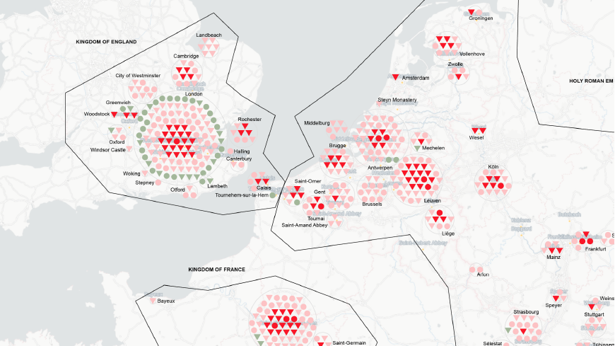
Use of D3 contour maps to create lassoed contours for administrative/state groupings around letter clusters (figs. 2.1, 2.2)

Figs. 2.1 Geometric bounding of territorial affiliation, with individual letter icons to represent both dispatch (circle) and receipt (triangle) using variant colour-scheme for temporality/memory, clustered around city location using spiral algorithm.

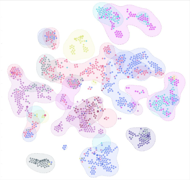
Fig 2.2 Visual reference for use of contour maps to indicate irregular and overlapping bounding of territorially areas by e.g. administrative coherence or confessional dominance
Practice
The workshop re-confirmed the value of the ‘design sprint’ methodology, following a first iteration a year earlier that had involved some of the same participants, and the benefit of close and intensive collaboration to both historical scholars and practice-base designers. The decision to pursue a narrow but rigorous focus was effective in producing a quite refined draft design, though less effective in generating an abundance of divergent possibilities for further investigation: a higher priority in an first than a second ‘sprint’ workshop.
A possible approach to reshaping second-stage ‘sprints’ would be to schedule the first two exploratory/divergent days as something closer to a ‘sandbox’ in which fluid teams generate and filter approaches around themes that have emerged from the first sprint, with individuals gravitating to those with which the feel the greatest affinity and to which they could contribute most fully, during a Day 2 ‘convergent’ period, prior to a final three day ‘sprint’ to implement the designs.