Premises

The future has arrived: text to image Ai is here, we can now generate images from simple text descriptions.
Tools like Dall-e and Stable Diffusion are rapidly spreading and growing consensus among millions of users.
But behind the facade of a simple and fun technology there are some significant ethical concerns that aren’t known to the public.
These technologies are believed to be neutral and objective, but actually they act as amplifiers of social and cultural issues.
Eye to AI is a project that merges the wider debate on the myth of neutrality in technology to the urgent theme of climate change.
It is important to note that it was conducted on a sample of images which could potentially expand infinitely. Also, we we believe
the same approach could be expanded across other topics who deal with identifying the main issues revolving around society through
the eye of an Ai. This research project is part of the 2022-2023 Final Synthesis Design Studio at Politecnico di Milano, MA in Communication Design.
Txt-to-
img Ai
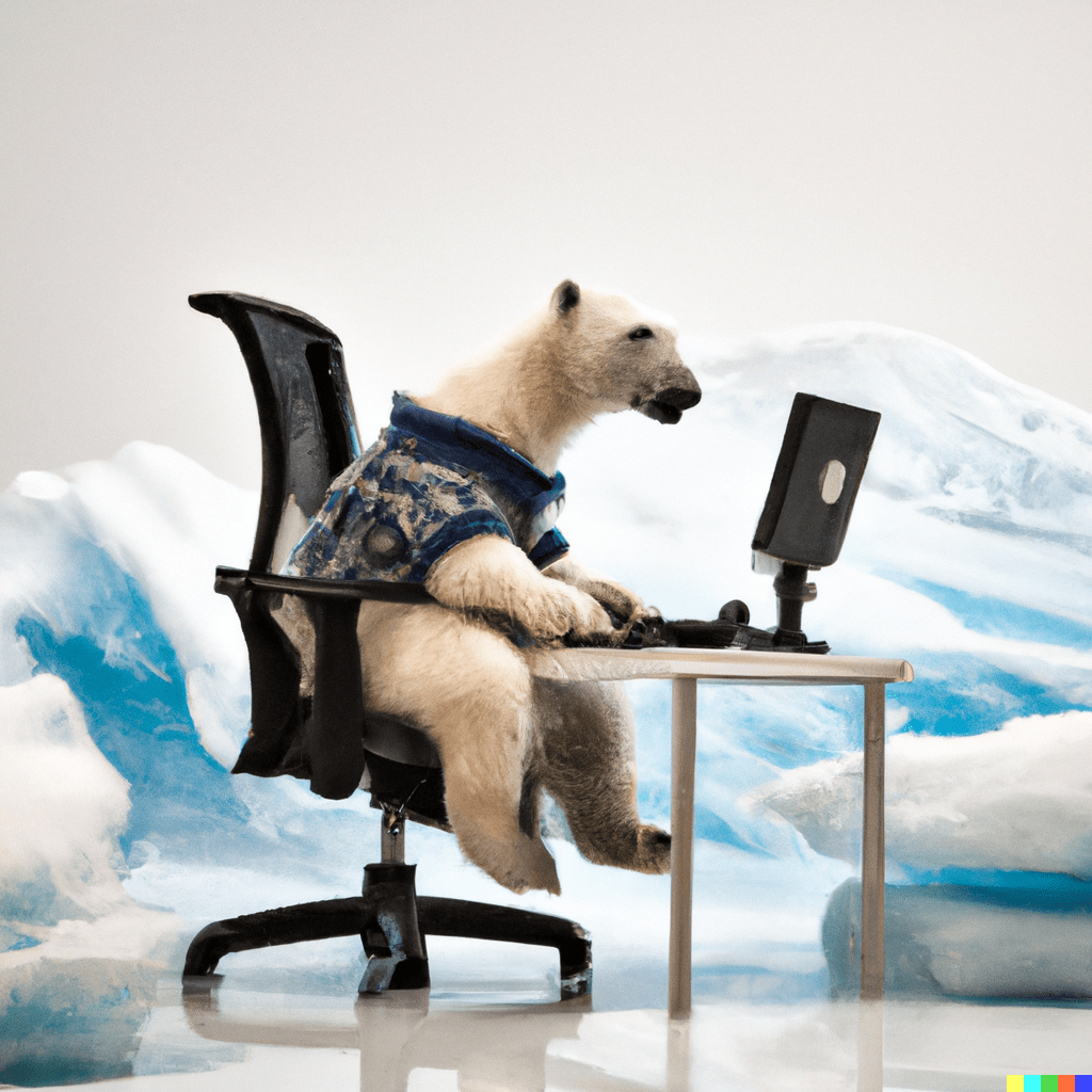
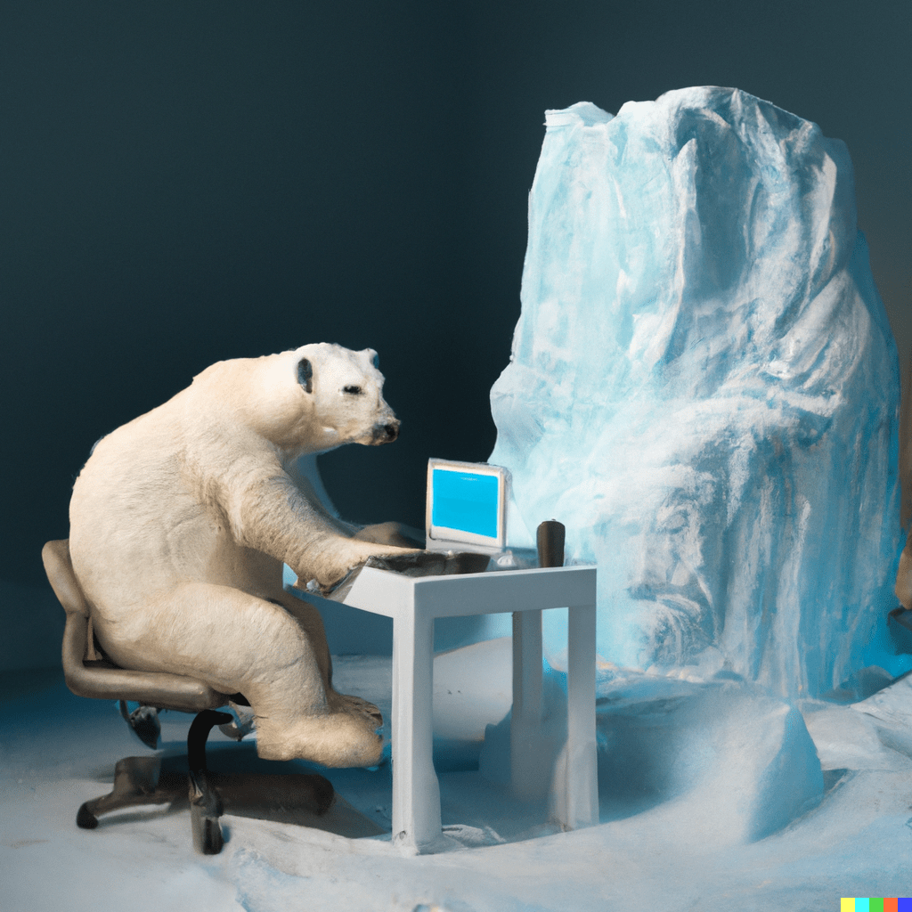
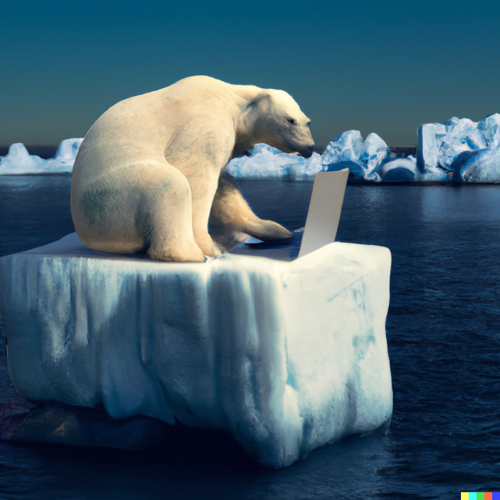
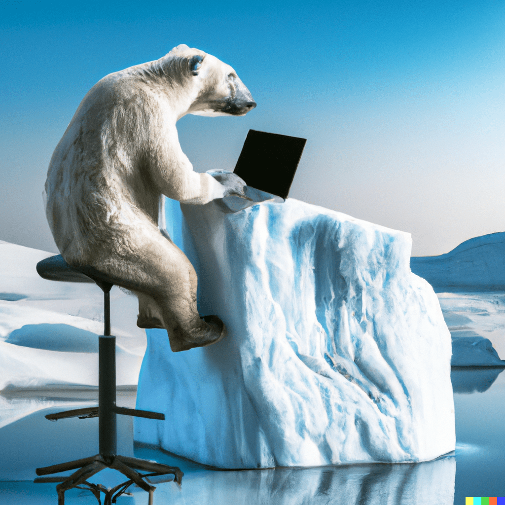
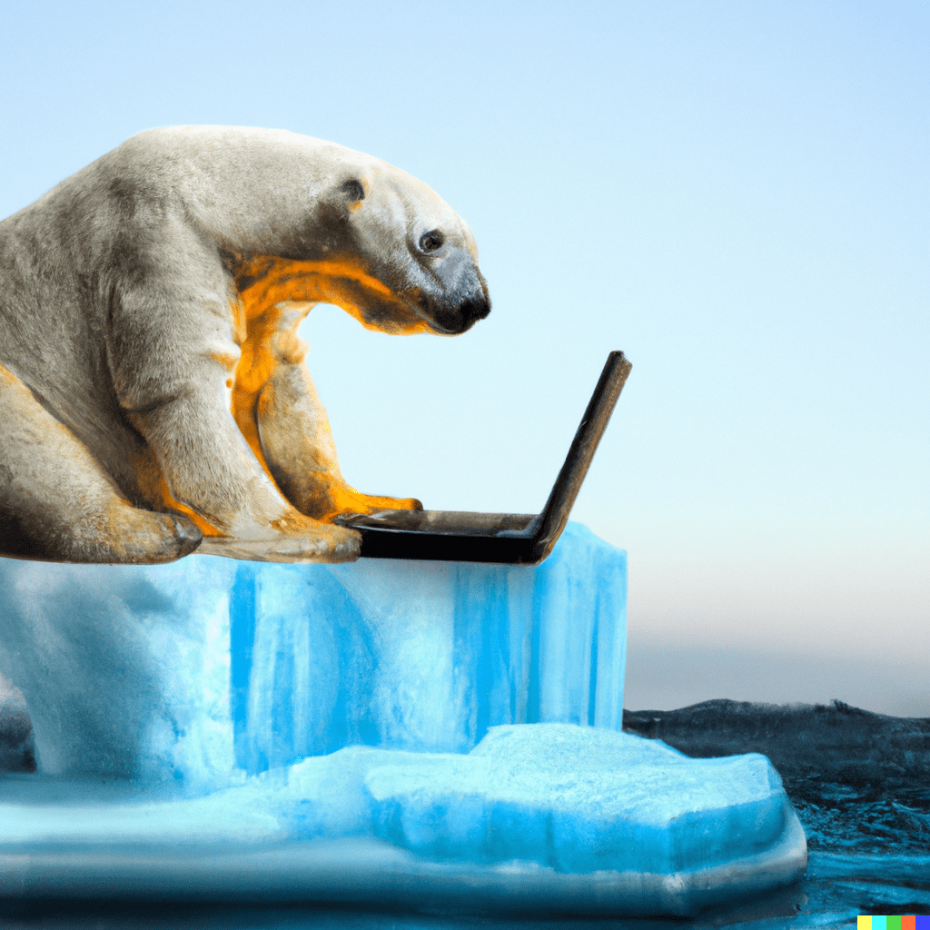
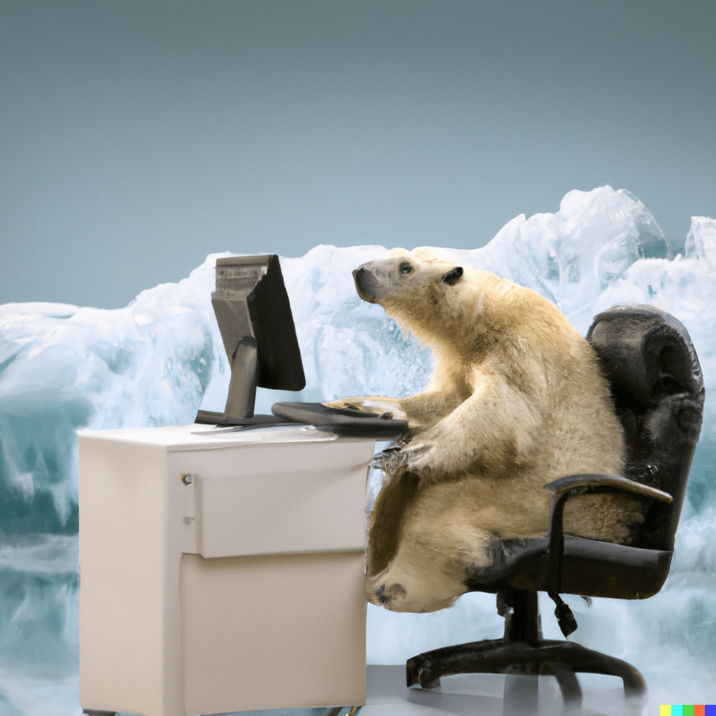
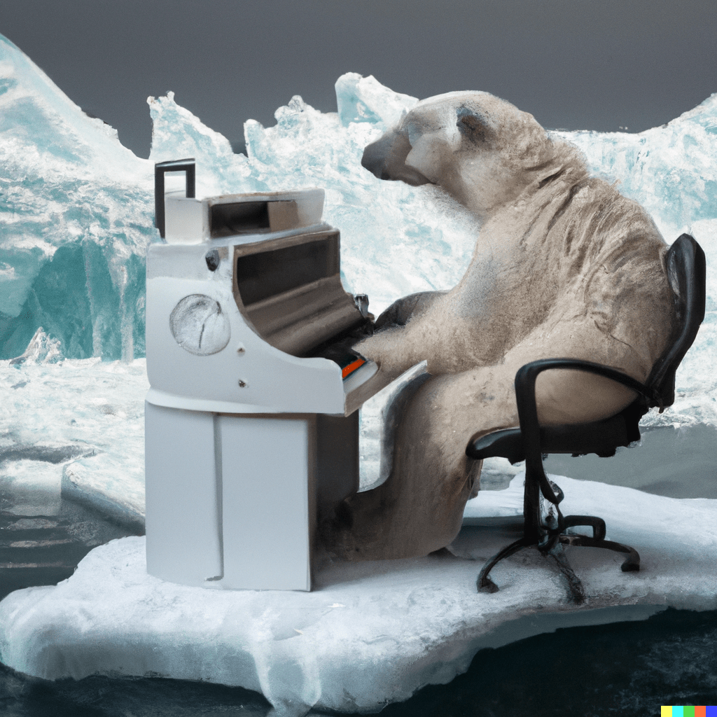
Ai generated images are the focus and starting point of the project. In order to understand why, you need to get a rough idea of how text to image Ai works.

Being the output the last step of the process, it means that by analysing Ai generated images we can get insights of both the training set that was used to build the model, and the elaboration that goes on inside the “black box”, making them particularly useful for our purpose: reading biases in climate change imagery.
Process
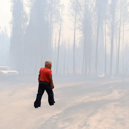
For the whole project we used Stable Diffusion, an open source Ai that, unlike other systems, has no limits in the amount of generable images. To make the process faster we used AUTOMATIC111, a Google Colab that allows to generate a batch of images from a single prompt. Prompts are fundamental: they represent the instructions you give the machine in order to get the desired image. To build a consistent dataset of climate change imagery we created a prompt map whose goal was to range among climate change related topics. We started from defining 4 main sub-topics related to climate change, from these we derived 25 prompts. Each prompt was used to generate 20 images, making a total of 500 images. As the aim of the project is focused on society biases, we tested prompts that were able to generate people in their outputs, which was not easy. For this reason the amount of prompts is not distributed equally among the sub-topics: it varies depending on how meaningful it was in terms of people-generation

Once the dataset was ready we proceeded with the actual analysis. Following the protocol below we started with keeping the high level organization of the images aligned to the sub-topics used for the prompt generation: general topic, impacts on people, daily solutions, worsening issues. Afterwards we started to look for patterns and biases, this step was performed manually. This observation led us to define clusters of biases and sub-biases. The following scheme displays an example of the process:

We ended up with 8 main biases and from these we derived 18 more sub-biases, more specific on different aspects. These observations refer to the subjects noted during the analysis.

Some of the identified biases and stereotypes are striking, such “white people as heroes”, others are less evident, such as “groups stand doing nothing”. In displaying these results to the user we had two necessities: be clear on the observations and use a language that could catch the reader’s attention easily. In order to achieve both results we adopted a mixed strategy: the main biases are expressed through catchy sentences, whereas the specific sub-biases are more descriptive of the issue involved.
Design choices
During the analysis process it emerged that the information to be conveyed through the website concerned two areas: prompts and biases. In order to display both of them clearly we organized the exploration of the website in a way that is both structurally and visually capable of displaying those kinds of information in an effective way.
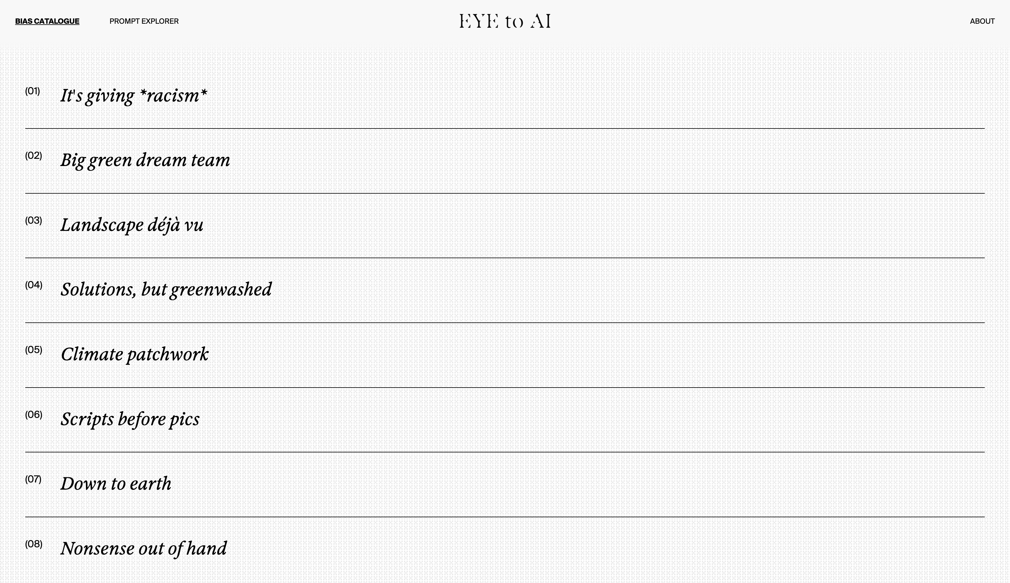
[ BIAS CATALOGUE interface ]
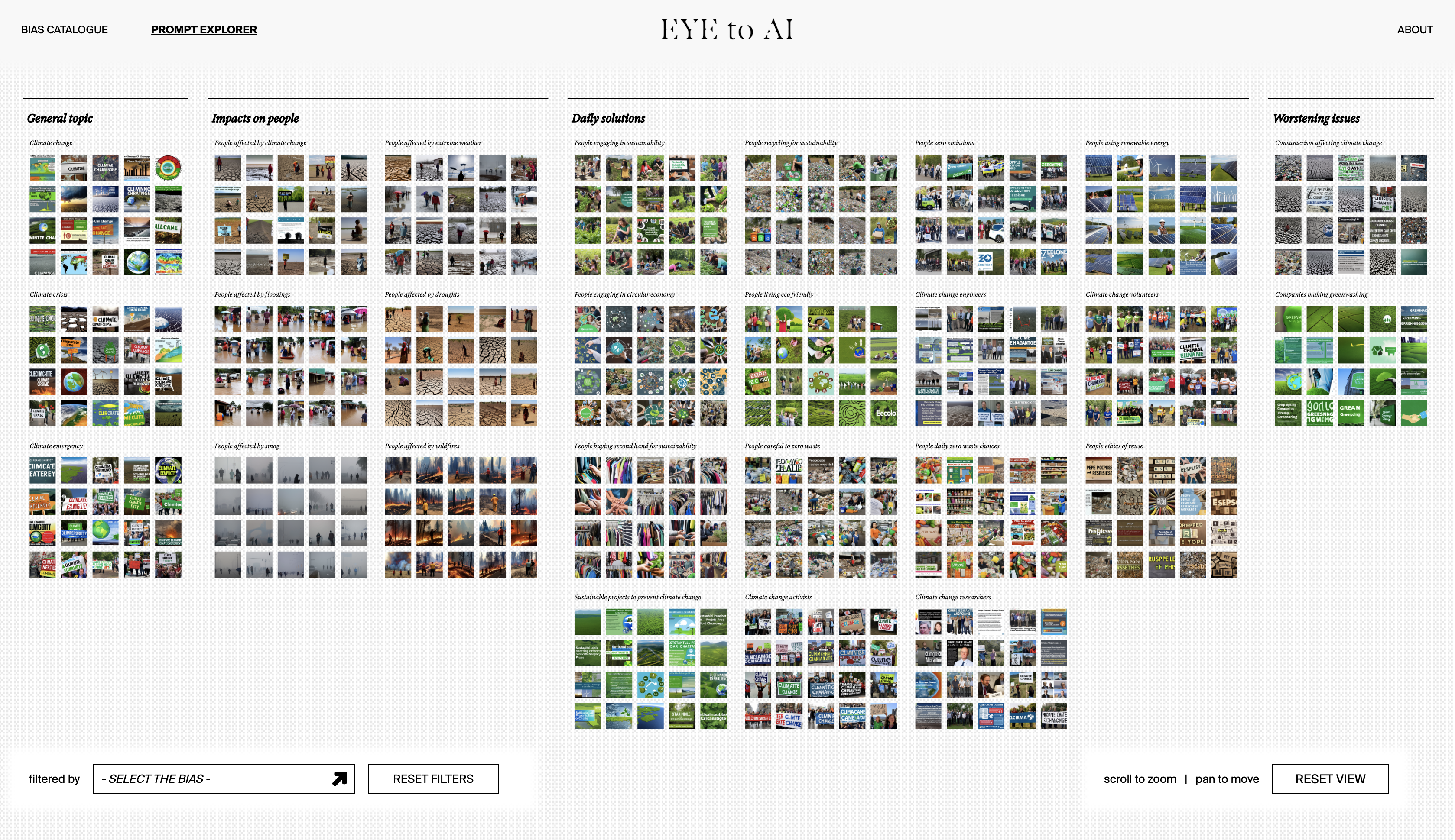
[ PROMPT EXPLORER interface ]
The first section is the BIAS CATALOGUE. It was designed with the intention of displaying all the biases at the same time in order to give the user an overview on the contents as well as show the distinction between the identified patterns. When entering each bias the possible interactions are a horizontal scroll through the images and a zoom interaction. The scroll express the insisting repetition of the dataset; the zoom allows a multiple point of view on the images: seeing them all together from far away helps with showing the consistency of the bias; looking at them closely reveals some details that are fundamental in understanding the biases.
In some cases it was also important to underline the relationship between subject and context within each image, when this occurred we treated the image as a gif and the different elements that composed it were isolated.
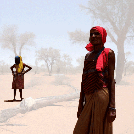
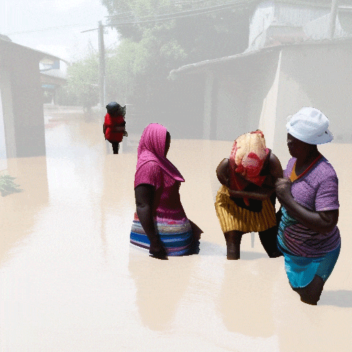
The second one is the PROMPT EXPLORER: it shows all the images together and emphasizes the relationship between original prompt and observed biases by making clear how they are distributed in the overall dataset. This correlation is particularly relevant as some specific prompts are the main origin of some biases. A striking example is about ethnicities: whenever the prompt is about people suffering from climate change effects it is mainly black or asian people that are generated. In order to express this correlation we opted for an explorative tool that allows to zoom and pan around the space and in which filters can be used to exclude some images.
The Team
[ Anna Cattaneo ]
[ Yiyuan Hu ]
[ Lara Macrini ]
[ Nicole Moreschi ]
[ Leonardo Puca ]
[ Silvia Sghirinzetti ]
[ Ce Zheng ]