Introduction
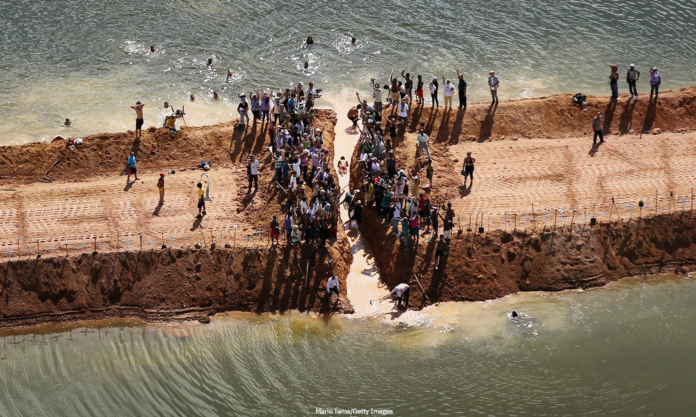
During the 2017 London Bridge attack, while people were trying to escape from the area, prices of Uber races began to rise, until they doubled their normal price. Many people were outraged: what until then had been an accepted mechanism (more demand, higher prices) suddenly proved unacceptable. The choice of price was not managed by human beings, but by an algorithm, and in a short time it was disabled.
This is just one example of how digital platforms that now pervade our community, by mediating our access to information, generate sometimes unexpected results that challenge social conventions. It also represents just the tip of the iceberg, the most explicit evidence of the radical and widespread impact that information and communication technologies - particularly the Internet and the Web - have on society.
While in the last decade the concerns were mainly user-centered, thinking mainly to the outcome for the individual (e.g. privacy loss), in the last few years we have seen how all these technologies are having consequences on society as a whole. Home sharing services are reshaping the real estate market, and perhaps cities. Social networks have been tweaked to influence and push propaganda in the democratic processes, or misused to organize mobs against minorities. Biometrics data, useful for unlocking the screen of our phones, brings also racial biases. Self-Driving cars, approaching in the near future, will impact on urbanization as well.
These issues do not have clear and unambiguous solutions and generate dense and complex debates that interweave alliances and oppositions, involving many different actors through digital conversations. At a first analysis the situation stalls: complexity, by definition, is impossible to reduce without losing its wealth; at the same time, it remains incomprehensible without its simplification. As communication designers we can - and we should - contribute to the understanding of these phenomena and orienting possible (re)actions. As complex and controversial problems can not be faced by a single actor, we can represent and share the debate that defines and nourishes them so that any stakeholder can find its own position.
The studio-course is structured in different phases, on a path that explores different dimensions of data analysis, information and communication design. Students will start by representing the theme using structured data and information produced and shared by reputable sources, designing a first visual synthesis. At this stage, to ensure a correct relationship with the data, statistical notions and tools are introduced. In the second phase we will focus on the debates that feed the controversies around the selected topics by using unstructured data and information produced and shared by non-institutional organizations, communities, collective entities or individuals and activists via the Internet. Finally students will design a (data) experience with the aim of engaging a broad public in understanding the complexity of the issues at hand.
The different phases of the course require to identify the most suitable communication languages and tools, both digital and physical, to exploit their specific potential and to synthetize all the competences acquired.
Transversally, the concepts of social complexity, the role of statistics tools and methods in the visualization process, and the idea of visualization as intersemiotic translation - such as narrative and discourse - will be deepened. The "visual discourse" in its various forms of manifestation will be then considered as an argumentative strategy, in which narration and dramatization complement the direct communication of data and information. Rhetorical-argumentative figures, in particular those based on analogy and metaphor, will be applied - consistently with the different design moments of the lab - as both knowledge tools and communicative devices, exploiting the potential for facilitating access to cognition.
Objectives
At the end of the course, students will have gained:
- Knowledge in the data visualization, information visualization, information design disciplines, and the role of communication design;
- Knowledge and use of the visual variables and application of communication design to visualization of data and information;
- Knowledge on tools for data manipulation (Excel, OpenRefine) and for the creation of visual structures (RAWGraphs, Gephi);
- Knowledge on data harvesting/scraping (Web Scraper Chrome Extension) and data collection through APIs;
- Knowledge on basic concepts from statistics and softwares for their application (R);
- Knowledge of the rhetorical-argumentative figures (especially those based on analogy and metaphor).
Course structure and deliverables
The course will be divided into three main phases in which students will be working in groups. In addition, every student will be challenged with two individual assignments.
Students will be introduced to the information design and data visualization domain through iterations of a set of interrelated activities: picking appropriate sources, constructing a coherent narrative, dealing with unstructured data, communicate, share and engage by designing for advocacy.
The three phases have different goals and outputs, giving students the chance to experiment on how to design visualizations for different kinds of purposes and publics. The supporting themes, tackled from a different perspective in each phase, are: the role of the designer as an author, data handling and its implications, the rhetorical value of data visualization.
First phase: Data as Material
Creating an infographic from reputable official sources
In this phase students will be asked to identify datasets available from official sources (Eurostat, governmental open data portals, scientific publications, etc.) and from those they will have to design visualizations to provide an overall view, “institutional” of the chosen issue.
The first phase will tackle data handling and translation for the creation of visualizations; highlighting the theoretical and technical competences needed. It will acquaint students with how to work with data in a tabular format (cleaning, aggregation, lookup). There will be a basic introduction to Statistics, defining its objectives and highlighting why an information designer needs to master it. Traditional methods from the design field will be used in order to analyze and represent complex datasets. This module will also provide students with the basic theories of data visualization, following its development and core principles.
Output of this phase is the design of a series of visualizations - both for a web format and a printed edition - that represent a first perspective or angle to access the chosen issue.
Learning goals
- To manage data from the choice of sources, to analysis and manipulation of the gathered data.
- To know the theoretical context of information visualization and how to apply it to the design of visualizations.
- To choose visual variables for mapping data, design visualization, provide needed context for tis reading/decoding.
- To create simple HTML responsive pages for presenting a design project.
Second phase: Data as Artifact
Issue mapping with digital methods
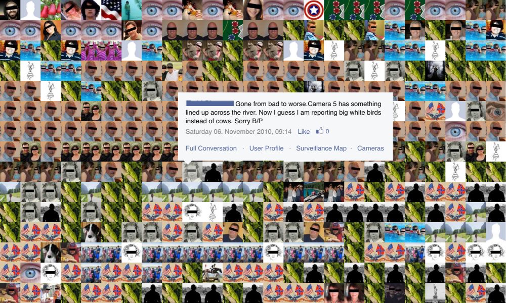
In the second phase of the course each group analyze their topic using digital methods. Digital methods are “techniques for the study of societal change and cultural condition with online data” (Rogers, 2019). Here, students learn how to map a controversial issue by collecting, analysing, and visualising data from online sources (e.g. search engines and social media platforms).
The process is question-driven: from research questions, students design protocols for data collection and analysis, and produce research findings using data visualizations. At the same time, students are also asked to trace and make explicit their process by designing protocol diagrams: flowcharts presenting research questions and research steps in a compact visual form (Niederer and Colombo, 2019).
At the end of this phase, each group design and deliver an interactive research report and present it to the class. The research report is a visual atlas (Venturini et al., 2015) of the issue under study according to the web: a mapping of the issue resonance, sources, actors, textual and visual language in different spaces of the web.
Learning goals
- To critically reflect on data collection as a design activity.
- To repurpose online digital objects (e.g. links, likes, shares, timestamps) for research.
- To design queries for data collection.
- To use data visualization as a tool in the research process.
- To design research protocols.
Output
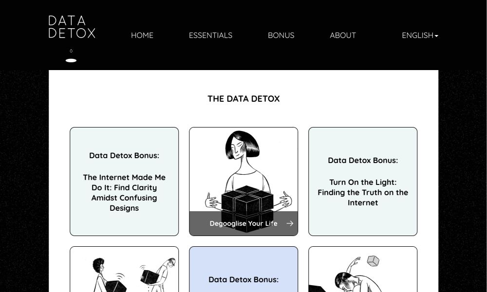
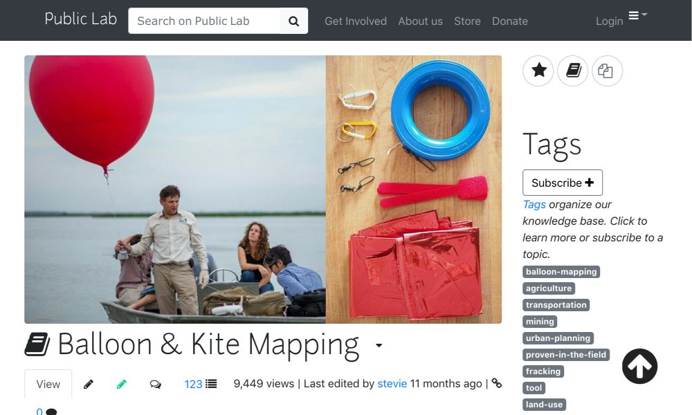
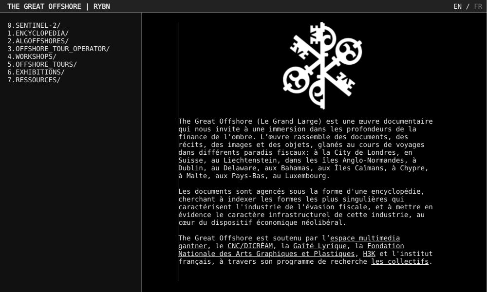
Interactive research report. Examples from previous years:
The Amazon's Damnation
Alessandra Facchin, Alessandro Ferrari, Jingjing Gui, Paula Lozano, Nicolò Marchetti, Valeria Quiroga
Hate Shades
Nicola Brignoli, Francesca Brotto, Lea Mara Fabiano, Elena Filippi, Edoardo Guido, Jacopo Poletto

The Trump Effect on Climate Change
Valeria Aufiero, Andrea Benedetti, Alessia Bissolotti, Simone Costagliola, Beatrice Gobbo

IS a brand
Serena Del Nero, Marco Mezzadra, Claudia Pazzaglia, Alessandro Riva, Alessandro Zotta
Third phase: Data Publics
In this phase, students will turn the research carried out in phase 2 into a discursive communication artifact that exposes, evidences or makes known the critical aspects of the subject to a specific public. Discursive communication artifacts exposes ideas (discourses) “capable of conveying complex perspectives and confronts conflicting values” (Tharp, B. & Tharp, S, 2018) of the subject with the aim of having audiences reflect and act on them.
Students are motivated to reflect on what the “public” means, how different groups are mobilised around various issues (DiSalvo, 2009) and how data might play a central role in the process of public formation. Students are also asked to recognize the political role of their design practices with technology and how they impact society.
The aim is for students to apply their communication design skills using data for building alternative narratives (Briones, 2019) that expose, explain and/or explore their research findings. Students are asked to delve into one or more of the research findings identified in the previous phase, and to design and craft a highly experimental digital artifact (i.e: interactive report or documentary, virus, plug-in, guides and kits) that is usable by a specific audience to act on the issue. The final deliverable is a website that contains the communication artifact.
Learning goals
- To turn a research findings based on data into a communication design artifact for the public
- Identify a specific audience and context
- To create discursive artifacts that prompt to critical reflection and action over the subject
- Experimentally reuse online digital object’s language and logics (links, likes, swaps, etc) for creating digital discursive artifacts
- To repurpose data and data visualization as components of discursive artifacts
Output
Interactive documentary

Browser plugin
Guides
Interactive research reports
Evaluation
Personal evaluation will be based on the outcome of the three group deliveries (which will be the main component), the outcome of the personal exercises, the active involvement in the team work and in the classroom. Each group delivery will be evaluated in different aspects, and the final mark will be an average of them. Since each delivery is part of a broader teaching path, the mark will be expressed in letters, representing a range of marks (A: 29-30L, B: 26-28, C 23-25, D: 19-22, E:18). In the following paragraphs, the evaluation aspects for each delivery will be listed.
Evaluation on phase 1
Work on data
Choice of sources, analysis and manipulation of the gathered data, completeness and clarity of the process.
Communication effectiveness
Ability to create a cohesive artifact that highlights general patterns while maintaining complexity and subtleties, that display synergy in the whole artifact and process.
Coherence of the webpage
The web page is designed and developed according to the blueprint, it’s able to provide an overview on the work.
Evaluation on phase 2
Data visualization
Efficiency and clarity of data visualizations, including protocol diagrams. Are the designed visualizations functional to answer the research questions? Are the protocol diagrams clear and self explanatory?
Research method
Innovation and robustness of research protocols, including query design. Is the designed research method functional to answer the research question? Is there innovation in repurposing digital objects for answering research questions? Is the data collected in a consistent way? Are the data analyses robust and clear?
Research findings
Clarity in the communication of research findings, including images and text. Are research findings understandable by looking at the visualizations? Are research findings clearly described in the text?
Evaluation on phase 3
Audience definition and consistency
Relevant, clear and detailed identification of an audience. The graphic and textual language used must be consistent with the definition of the audience.
Data based research for the public
Students should reuse some of the data from phase 2 and work with new data (if necessary) to argue and communicate critical aspects of the topic to the audience.
Experimental communication design
To use the possibilities of online digital media in a highly experimental way to design narratives that invite the audience to reflection and action.
Personal Assignment
Semiotics: Infopoetry
Objective of the assignment is the design of a defined “artifact” (without limits of languages and materials) in which students will experiment a poetic approach to the representation of data. The objective is to make people “feel” the phenomenon behind the data and not only “see” the data.
The personal assignment will be evaluated with a value ranging from -1 to +1 that will be added to the final grade in thirtieths. Evaluation criteria are the originality of the work and the ability of representing the chosen topic.
Modules and professors
The course is composed by five modules, representing the different competencies needed to train students in the information design field. The course is coordinated by professor Michele Mauri. The modules will be presented in parallel in order to provide all the necessary skills needed for a proper approach to the three phases.
Teaching assistants will support professors during feedback sessions and students in the development of the projects.
- Michele Mauri. Introduction to data visualization, information visualization, information design
- Gabriele Colombo. Issue mapping with Digital Methods
- Ángeles Briones. Data publics
- Salvatore Zingale. Semiotics
- Simone Vantini. Statistics
Bibliography
Phase 2: Data as Artifact. References
Niederer, S., & Colombo, G. (2019). Visual Methodologies for Networked Images: Designing Visualizations for Collaborative Research, Cross-platform Analysis, and Public Participation. Diseña, (14), 40-67.
Rogers, R. (2019). Doing Digital Methods. SAGE Publications Limited.
Venturini, T., Ricci, D., Mauri, M., Kimbell, L., & Meunier, A. (2015). Designing controversies and their publics. Design Issues, 31(3), 74-87.
Phase 3: Data Publics. References
Tharp, B. M., & Tharp, S. M. (2018). Discursive design: critical, speculative, and alternative things. Cambridge (Mass.): MIT Press.
DiSalvo, C. (2009). Design and the Construction of Publics. Design Issues, 25(1), 48–63. https://doi.org/10.1162/desi.2009.25.1.48
Briones, M. de A. (2019). A taxonomy of data visualization projects for alternative narratives. In L. Rampino & I. Mariani (Eds.), ADVANCEMENTS IN DESIGN RESEARCH 11 PhD theses on Design as we do in POLIMI (pp. 163-183). Milano: FrancoAngelli.
General references
Anceschi G., L'oggetto della raffigurazione, Editore: Etas, Anno edizione: 1992.
Cairo, A. (2012). Functional Art. The Functional Art: An introduction to information graphics and visualization. ISBN: 978-0321834737
Ciuccarelli P., Visual Explorations. On-line Investigations for Understanding Society, Editore: in Errea J., Gil A. Malofiej 19. International Infographics Awards. pp. 6- 23, Anno edizione: 2012.
Dalgaard P., Introductory Statistics with R, Editore: Springer, Anno edizione: 2008.
Danziger M., Information visualization for the people. , Editore: Massachusetts Institute of Technology. Dept. of Comparative Media Studies, Anno edizione: 2008.
Emerson J., Visualizing Information for Advocacy. An Introduction to Information Design., Editore: Tactical Technology Collective, Anno edizione: 2008. https://visualisingadvocacy.org/
Everitt B. e Hothorn T., An Introduction to Applied Multivariate Analysis with R, Editore: Springer, Anno edizione: 2011.
Latour B., A Cautious Prometheus? A Few Steps Toward a Philosophy of Design, Editore: Proceedings of the Annual International Design History Society (Boca Raton: Universal Publisher), Anno edizione: 2008, Fascicolo: pp. 2-10.
Masud L., Valsecchi F., Ciuccarelli P., Ricci D., Caviglia G., From Data to Knowledge. Visualizations as Transformation Processes Within the D-I-K Continuum, Editore: Proceedings of 14th International Conference Information Visualisation (July), Anno edizione: 2010, Fascicolo: pp. 445 Note: doi:10.1109/IV.2010.68
Rogers R., Doing Digital Methods, Publisher: SAGE Publications Ltd, Anno edizione: 2019.
Tufte E. R., Visual Explanations: Images and Quantities, Evidence and Narrative, Editore: Cheshire, CT: Graphics Press, Anno edizione: 1997.
Venturini T., Building on Faults: How to Represent Controversies with Digital Methods, Editore: Public Understanding of Science, OnlineFirst, Anno edizione: 2010. http://pus.sagepub.com/content/early/2010/12/03/0963662510387558.full.pdf+html
O Neil, C, Weapons of math destruction: how big data increases inequality and threatens democracy, Publisher: Crown Publishing Group New York, NY, USA, Year: 2016
Moere, A. Vande, & Purchase, H. (2011). On the role of design in information visualization. In Information Visualization 10(4) 356–371. https://doi.org/10.1177/1473871611415996