Introduction
Finally, after analyzing the academic perspective, a new research field was explored: the journalistic one . This choice was due to two main different reasons. First of all because some newspaper and database of news were found in the second chapter, during the research on terms, and they were identified as category of actors. In second place because the research question is about knowledge and the field of journalism offers an interesting pony of view, as this media is recognized for the diffusion of information and so knowledge. According to the actors found in the second chapter, three newspaper were taken in consideration: New York Times, The Guardian and Google News.
Even if the comparison with Google News is a particular choice, as it’s not a real newspaper but just a news database taken from different sites, it still gives a different point of view as, first of all is an important actor of the controversy linked with the theme news, and second of all because it still collect news with a criteria and so shows a “point of view” about the debate.
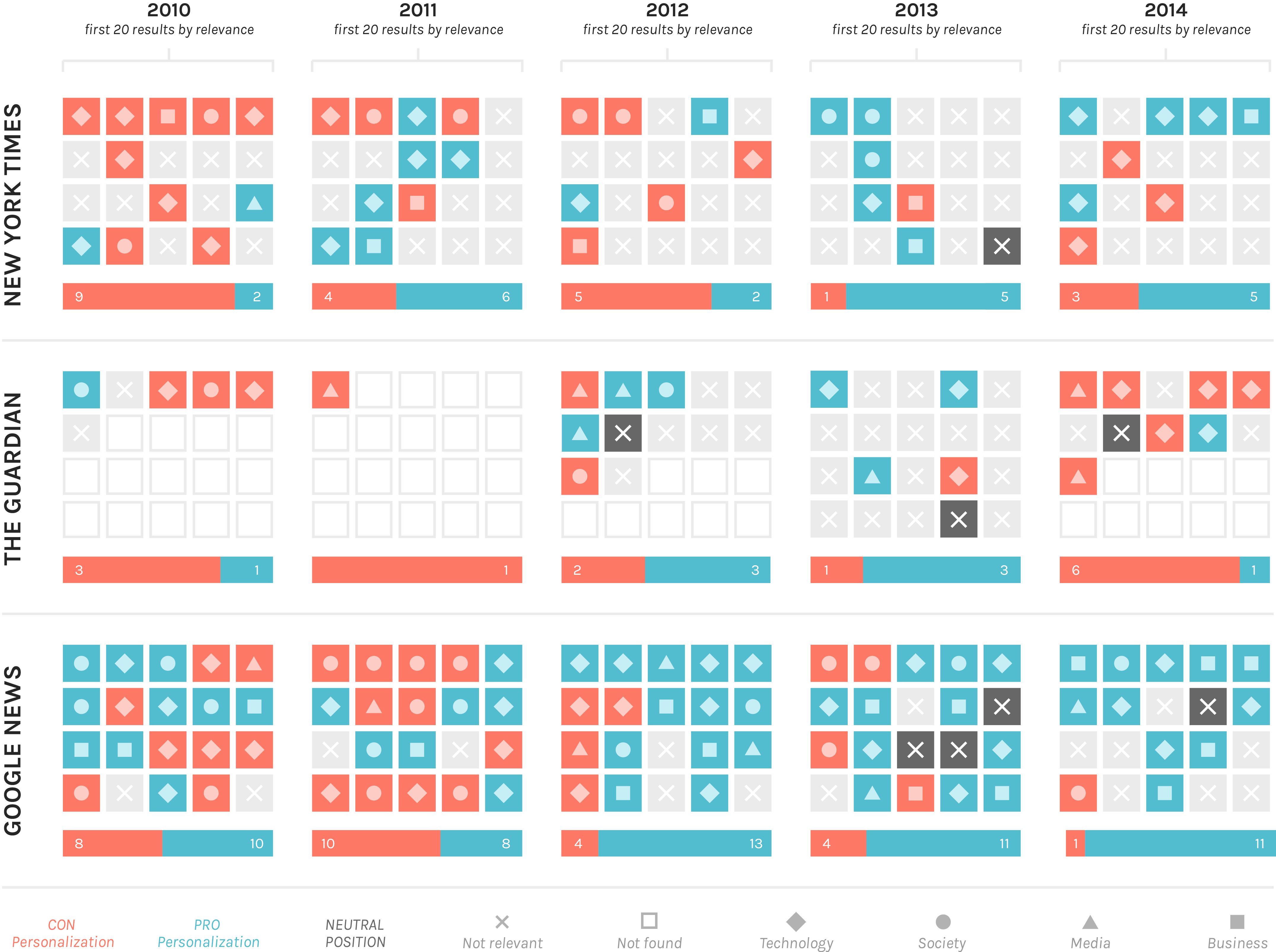
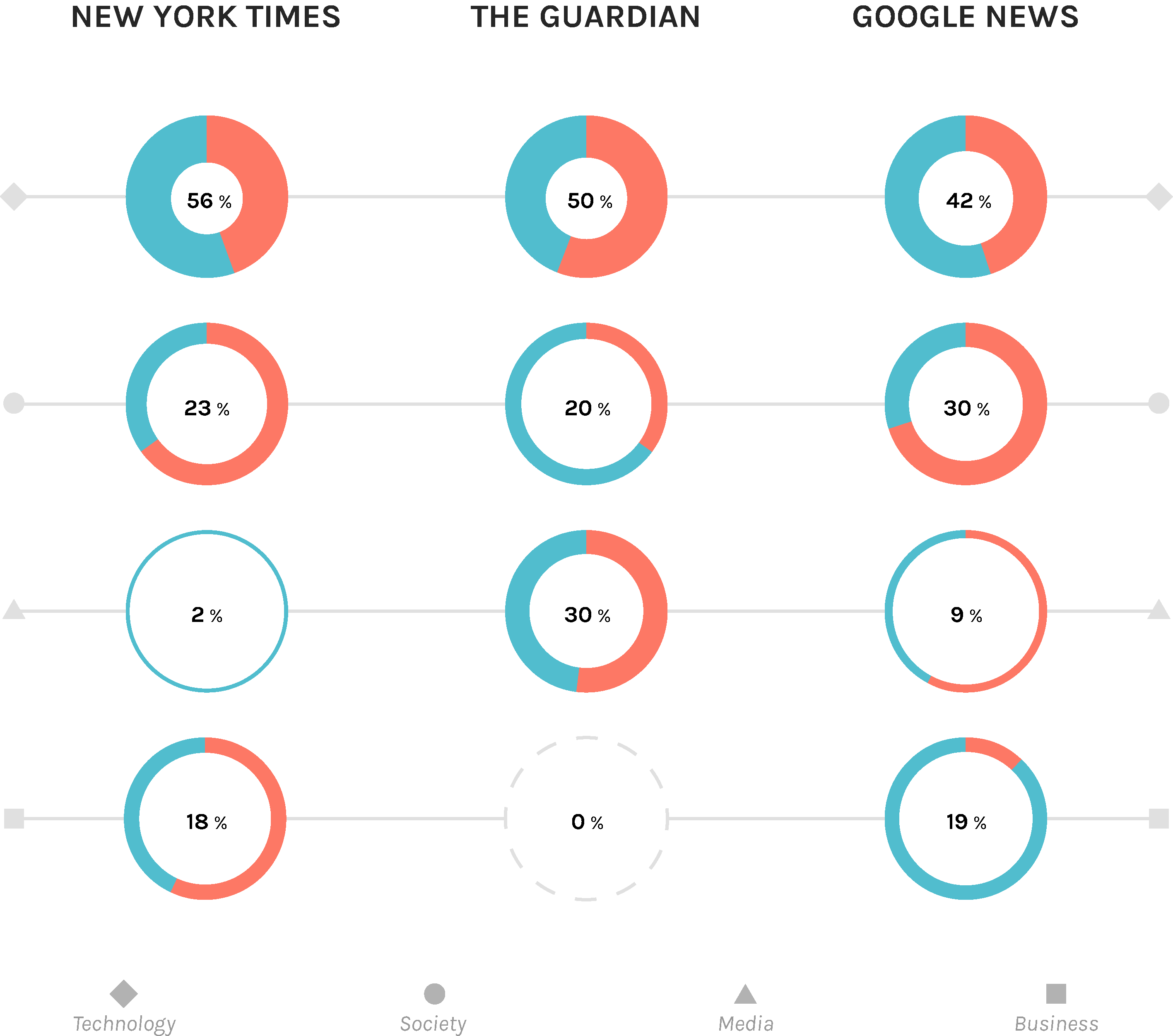
The aim of this chapter is to create a chart that shows an tries to interpretate the approach of these three actors to the discussion. In fact, there is an analysis of the articles to understand which type of position they assume and to which category these articles belong. The gap of time analyzed is from 2010 to 2014 because in 2011 the book by Eli Pariser was published and it was interesting to see also the discussion even before the filter bubble theory was developed.
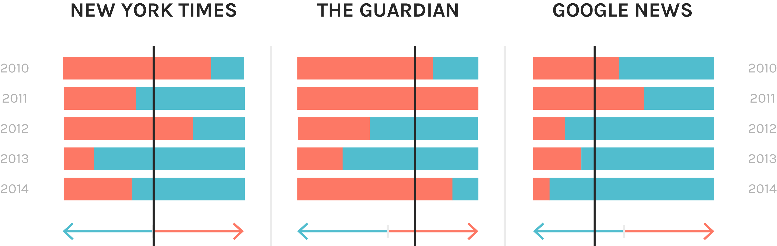
 The next relevant thing displayed on the overall chart is the percentage of articles Pro and Con on the total. From this data it was possible to assume the "trend" of the three newspapers, discovering that the New York Times has a balanced number of Pro and Con articles (so it is a neutral situation), The Guardian has slightly more Con articles and Google News has more Pro personalization articles.
 Comparing the distribution of Pro and Con articles by year it’s possible to see that for the New York Times and The Guardian the trend is unregular during the five years analyzed. These fact can coincide with events, such as the Facebook change of personalization policy in 2010 that is reflected in number of Con articles in the same year for the New York Times.