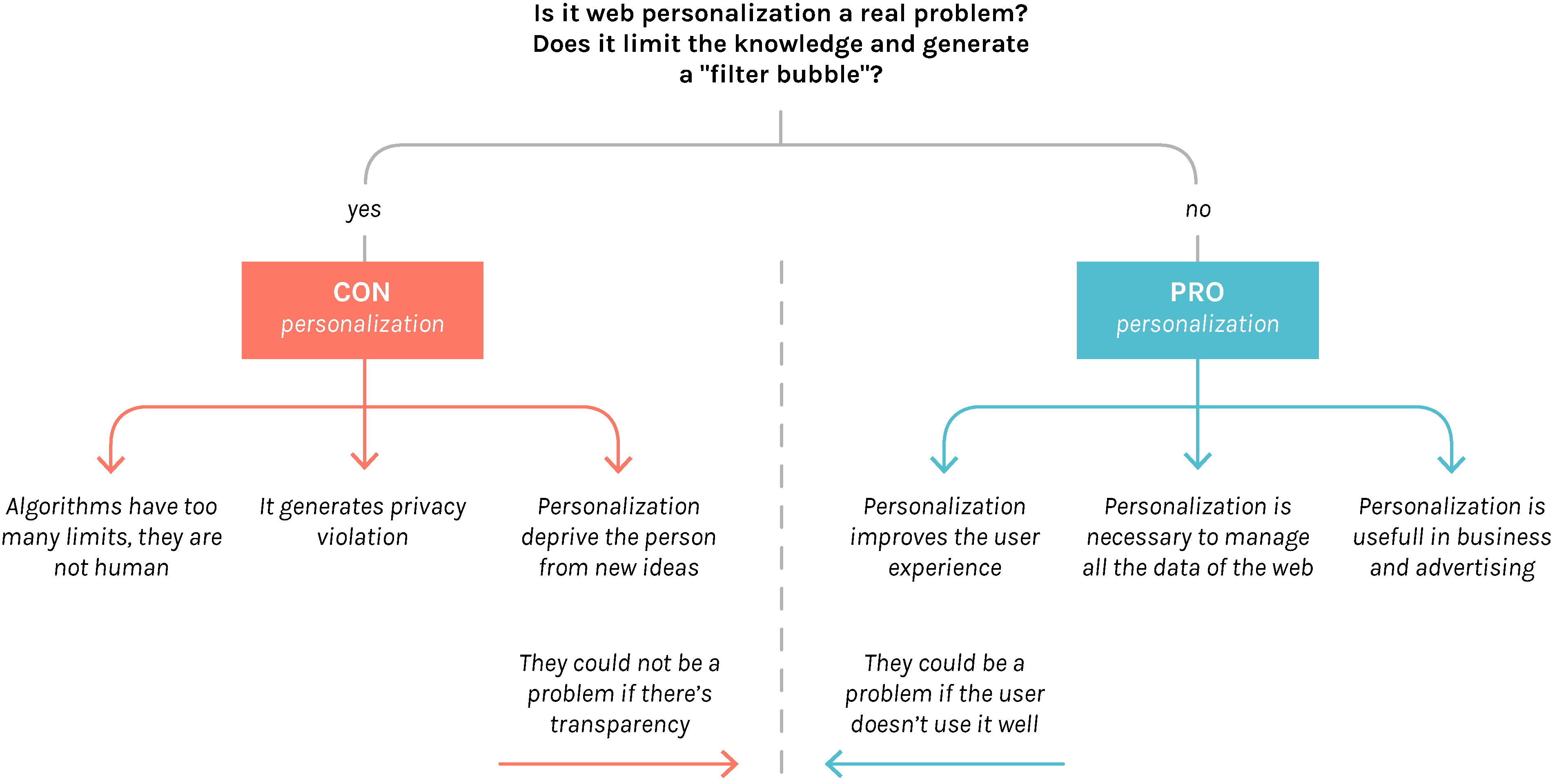
Starting from the queries that could answer better the research question “Is personalization generating or limiting the knowledge of the user?”, it was possible to gain a general view on the dispute. The field of research used to start approaching to this debate is Google, as it is the largest and most used search engine. The aim of this chapter is to create a map of terms that identifies the debate positions, so to figure out what characterize the sides and to understand the debate actors.
Even before the terms analysis , it was necessary to identify a debate “shape”. In fact reading the opinions and the discussions inside the corpus web pages, two positions emerged: Pro personalization and Con personalization. These two arrays are identified by the speaker position about the question: “Is the web personalization a problem?”. Both of these camps bring different arguments for their opinion. However, there are nuances in the positions which show how sometimes, despite a Pro or Cons position, who is speaking tries to give solutions to the dispute.
How to read the visualization
The visualization shows the most used and relevant 75 terms for each of the two positions on the debate about web personalization: PRO personalization, represented by the blue color, and CON personalization, in red.
Each bubble stands for a term: the color represents, as already said, the position on the debate while the size is the relevance of that word. Some bubbles are displayed with both colors as that word belongs to both sides. In this case bigger is the area of one of the two colors, more relevant is the importance of that word for that side.
So, for example, some words like “Pagerank" and “Non-isolated User” are characteristic only for the Pro side (as “Filter Bubble” and “Personalization vs Privacy” characterizes only the Con side) while “Facebook” and “Control” are relevant in both positions (even if with a different importance).
How it has been done
This chart has been realized with a corpus of 83 webpages, found with five different queries linked with the web personalization debate on Google.com (check the protocol for more details). From the text of each url, two lists of terms (one for Pro and one for Con) were extracted with Sven. From all terms only 101, based on the parameter TF IDF, were selected as really relevant words (49 are in common between Pro and Cons and 26 characterize one or the other side). In the end the visualization was created reworking the data (in a Jason format) with Biforce.
Findings
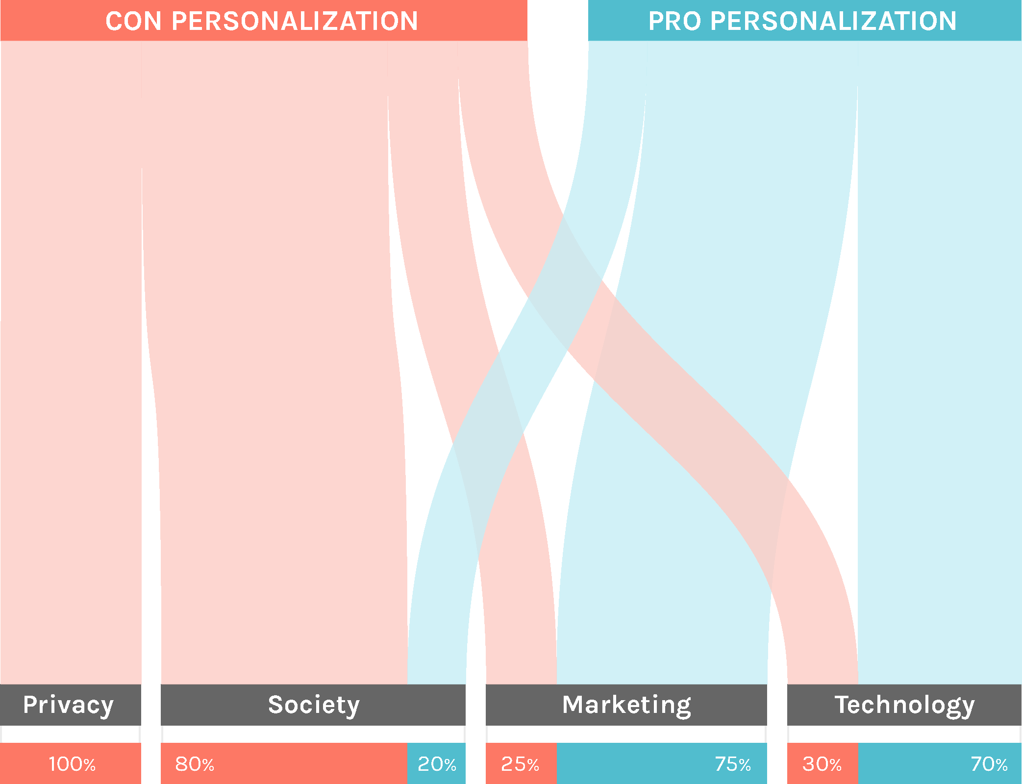
Division by categories
The first thing that emerged from the analysis is that Pros and Cons speak with different “languages” and in different areas: the first position argues more about technology and marketing while latter face more social topics. The graph represents the Pros and Cons distributed in four categories: Technology, Marketing, Society and Privacy.
Two levels of lecture
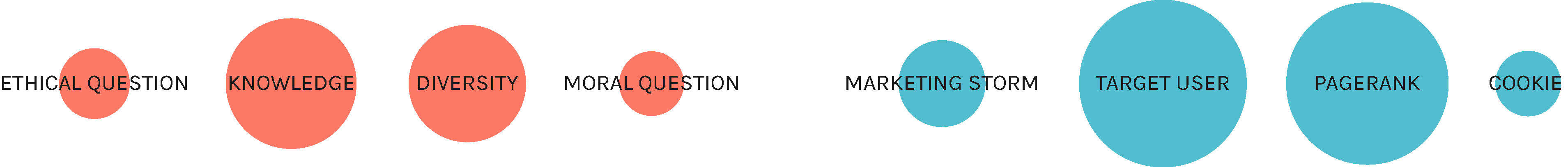
The analysis of terms is helpful to understand the dispute hot spots, that can be identified in two levels: the comparison between terms that belong to only one of the positions and the terms that are used by both sides but with two different frequencies.
The first level, not only identifies the characteristics of the two sides, but also confirms the position division by category. Terms like “Marketing Storm” and “Target user” that appear only in the Pro part are inside the technological and marketing fields, while, words as “Diversity” and “Knowledge” are from Con part and are more social.
The second level of interpretation, maybe, is even more important than the first one because identifies a strong debate and difference between the two positions. Words such as “Facebook” and “Privacy” that can bring to some considerations. The term “Facebook” is more relevant for Con side maybe because of all the discussion about its frequently changing algorithm. Instead “Privacy”, that should be more relevant for the Con side, is actually more used by the Pro position.
The actors
This terms were also useful to extract the actors, so that it was possible a new level of comparison and reflection.
Four actor categories were detected as relevant in the debate: Technologies, as it’s impossible to omit this aspect from the discussion, News, necessary to answer the possibility to achieve knowledge and that will become a cue for the fourth protocol, Services, that are maybe the main actors of the debate, and Personalities.
The chart shows the terms that are also actors of the controversy and they are divided not only in categories (Technologies, News, Services and Personalities) but also by the two position in the debate, that it’s represented by the color. Some bubbles are grey with a colored stroke, it means that that word belongs to both Pro and Con sides.