Introduction
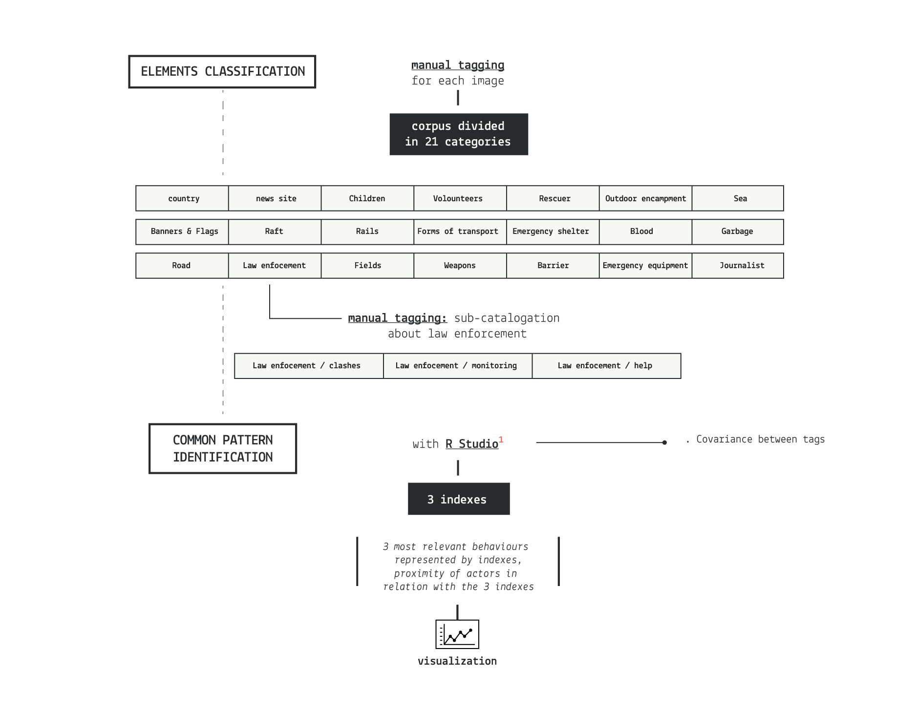
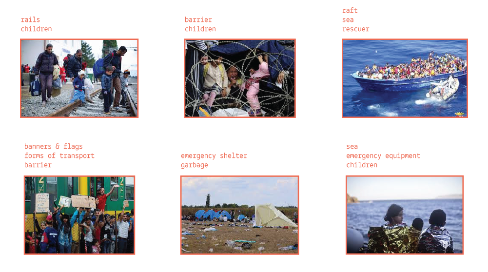
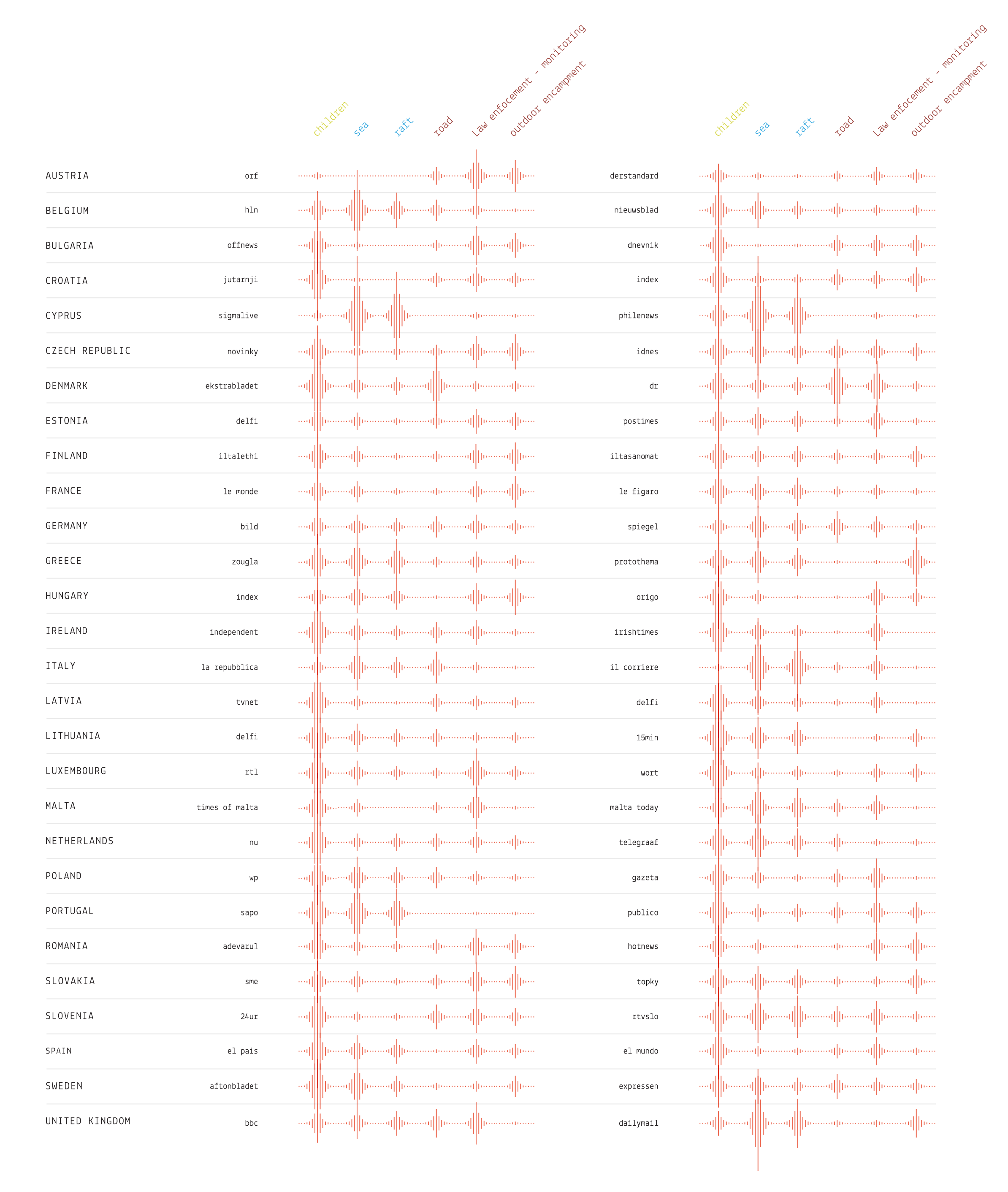
Grouping together the images made us realize that often the same elements were appearing over and over throughout the corpus. From this starting point, we wanted to find out which segments of the migration phenomenon were given the most importance. So we decided to manually tag the 2.800 pictures corpus, highlighting 21 elements: children, volounteers, rescuer, outodoor encampment, banners and flags, garbage, forms of transport, emergency shelter, blood, sea, law enforcement, barrier, road, raft, rails, weapons, field, emergency equipment, journalist.
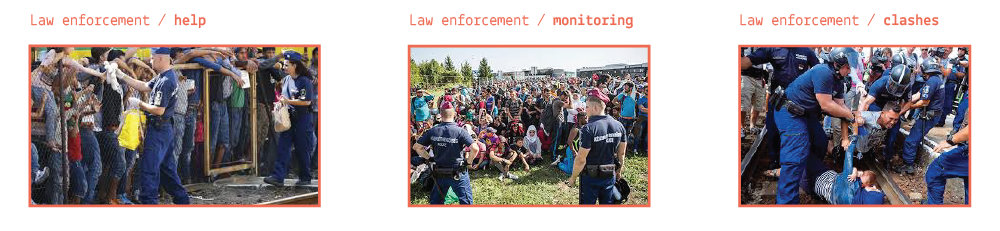
During the process we noticed that for some tag, for example law enforcement, a further subdivision was needed. As a matter of fact, the police was portrayed quite differently: from the kindest gesture to the most brutal repression. This is why we divide the law enforcement tag in three different concepts:
- law enforcement / help
- law enforcement / monitoring
- law enforcement / clashes
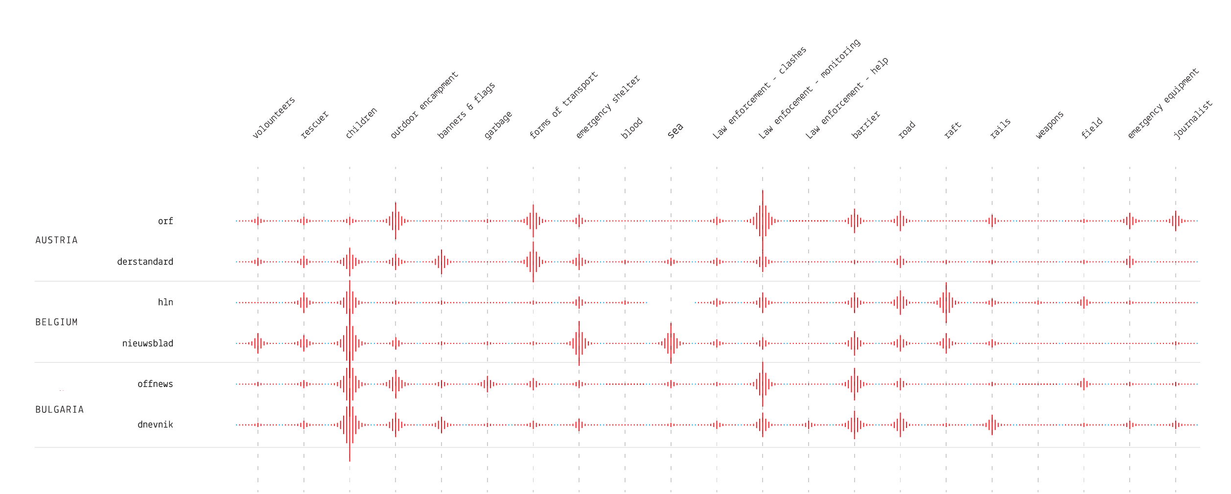
With the results in our hands, we tried to visualize them in order to better observe any pattern in the choice of elements made by different actors.
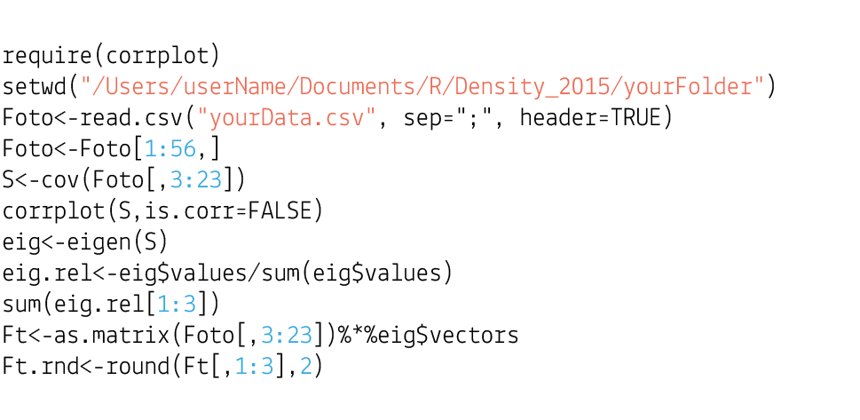
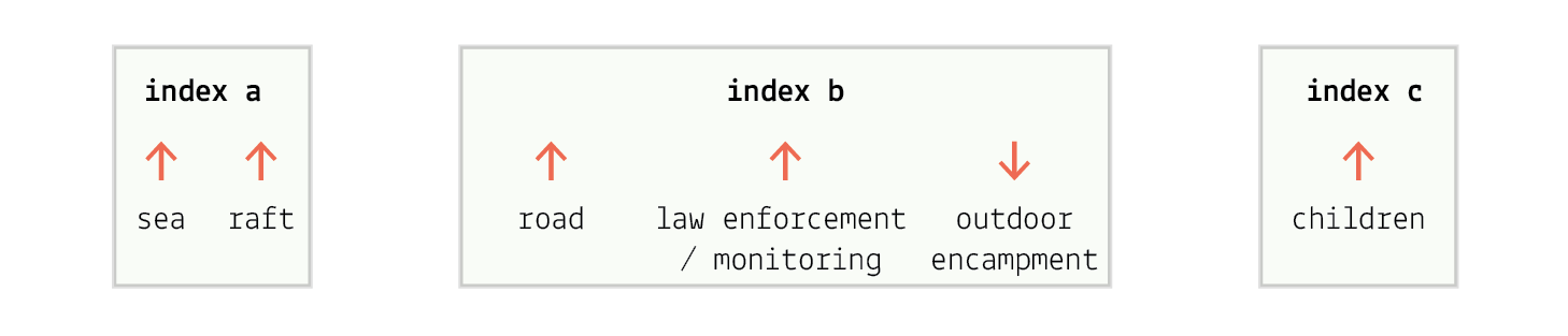
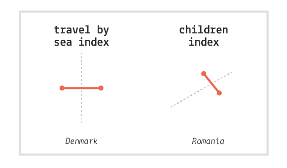
Even though one of our objectives was to find interesting patterns in the use of images, the high number of variables made it difficult for us to isolate common behaviors between actors. This is why we decided to take it a step further and take advantage of the power of statistical tools such as R. With the help of the notion of covariance, which represents how much two random variables change together, we were able to extract a few indexes that represented in a good way the phenomenon. (It’s important to note that the covariance can be either positive or negative, depending on the mutual behavior of the two variables). We were able to isolate three indexes that together covered an adeguate cut (about 75%) of the phenomenon:
- the tag sea that grows with the tag raft
- the tag children, strong on its own
- the tags road and police-monitoring, which go up when outdoor encampment lowers.
Of all the tags we defined, only six where visualized at the end because they were relevant enough to describe the entire phenomenon.
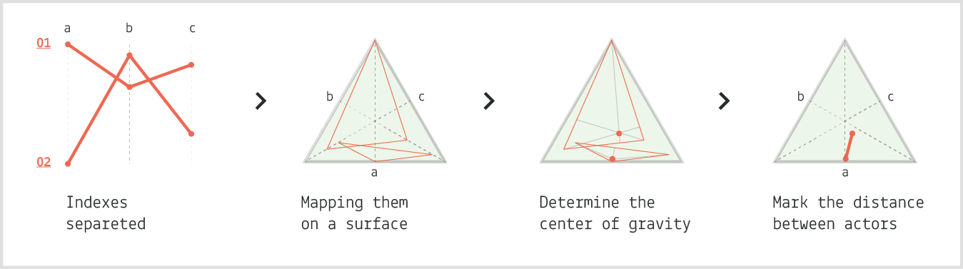
After defining these indexes, the R software rearranged the 56 actors according to the three behavioral models, giving a score to each of them. The actor with the best score is the one that follows the most that particular index, vice versa the lowest score is given to the actor that is the furthest away from that behavior. Viewing the indexes isolated wasn’t enough, so we combined them visually on an equilateral triangle to map the average actors’ conduct in relation with the european migration crisis. Once all the actors where on the triangle, we thought that it would have been interesting to highlight the gaps between actors of the same country or owned by the same person/company.