Description
After we saw the result of the topics in the previous question, we wanted to know more about the speakers to see if there a specific group that are more likely to discuss on a specific topic.
The topics in this visualization are same as that in question01, information of 10 speakers. The x-axis of this graph refers to topic, and the y-axis refers to speaker. Orange refers to Google.us, blue refers to Google.my, and yellow refers to Baidu. The largest number(23) of results are on “ecomomy” discussed by journalist. Besides, the number of topics that one speaker touches on ranges from 1 to 11 (13 topics in total). (6, 2, 9, 11, 8, 7, 4, 3, 1, 2) What’s more, we found it interesting that scholars in academic area touches 6 topics but none of them is from Baidu results.
Protocol

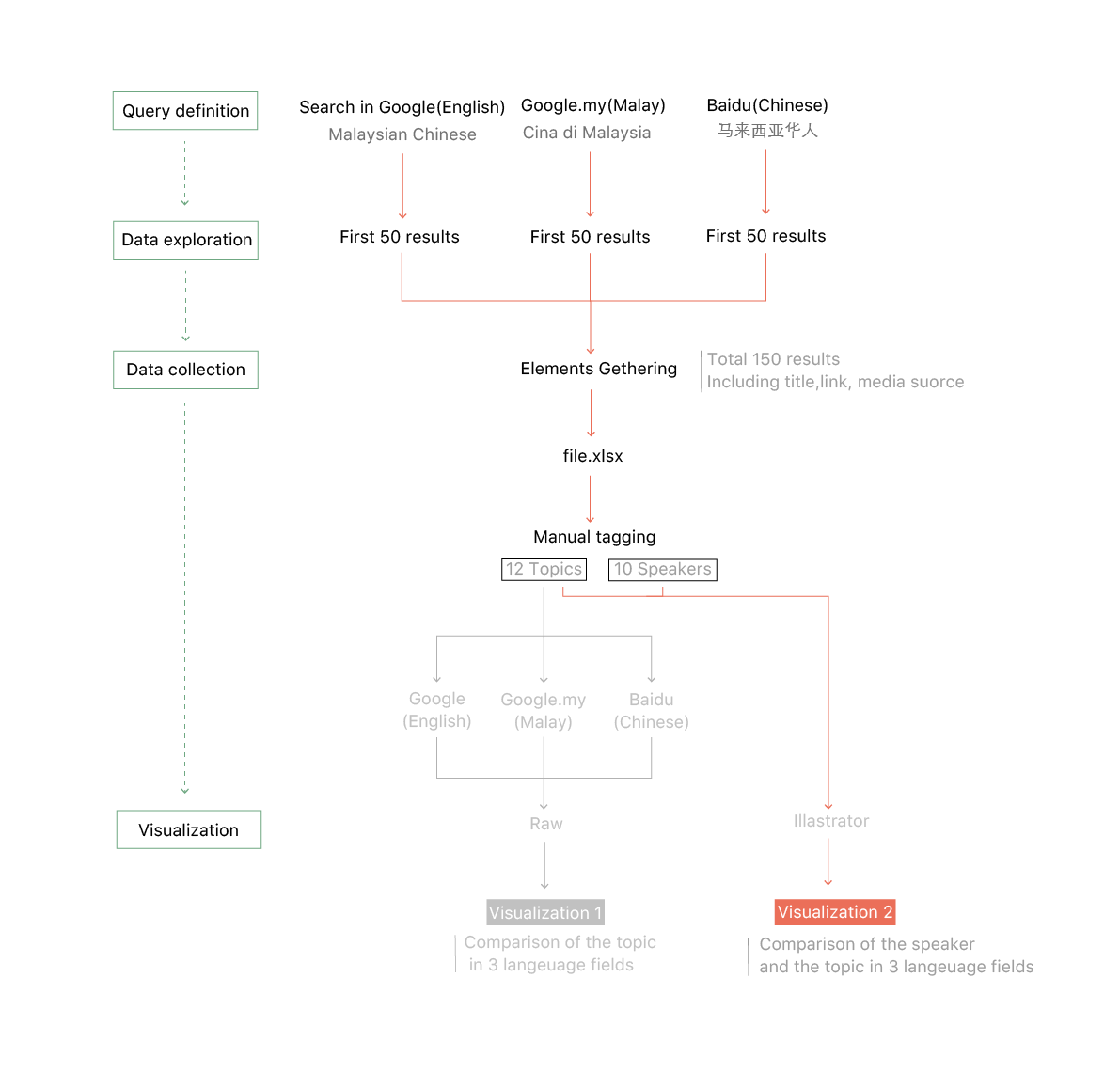
With this question we want to know who are speaking and what they talk about, so we use the same dataset of the last question. And to make the visualization about the speakers and topics, firstly we tagged the speakers manually in excel. (10 speakers in total) Then we selected the actors of speakers and topics to make a chart manually in Illustrator and chose different colors to represent the results from different websites.