Principal Component Analysis
Litong Sun, Lucrezia Spapperi Gestri, Manman Li, Ran Lin, Ye Li, Yiheng Zhong, Yijia Gao
The principal component analysis is a statistical technique for analysing large datasets that may contain many dimensions—mainly used to define the relationship between unrelated variables. We frequently encounter many samples with unrelated variables, hobbies or personalities are composed of many complicated factors, and no associations or pattern exists between them. In this case, we use PCA as a method of data analysis to determine the data in a clearer and more visual format. This poster made by Group 1 shows the aspiration of 21 people to spend their weekends.
See the posterK-means Clustering
Silvia Altamura, Ana Doric, Wanlin Li, Jessica Moreschi, Martina Paggi, Matteo Repetto, Lucrezia Valentini
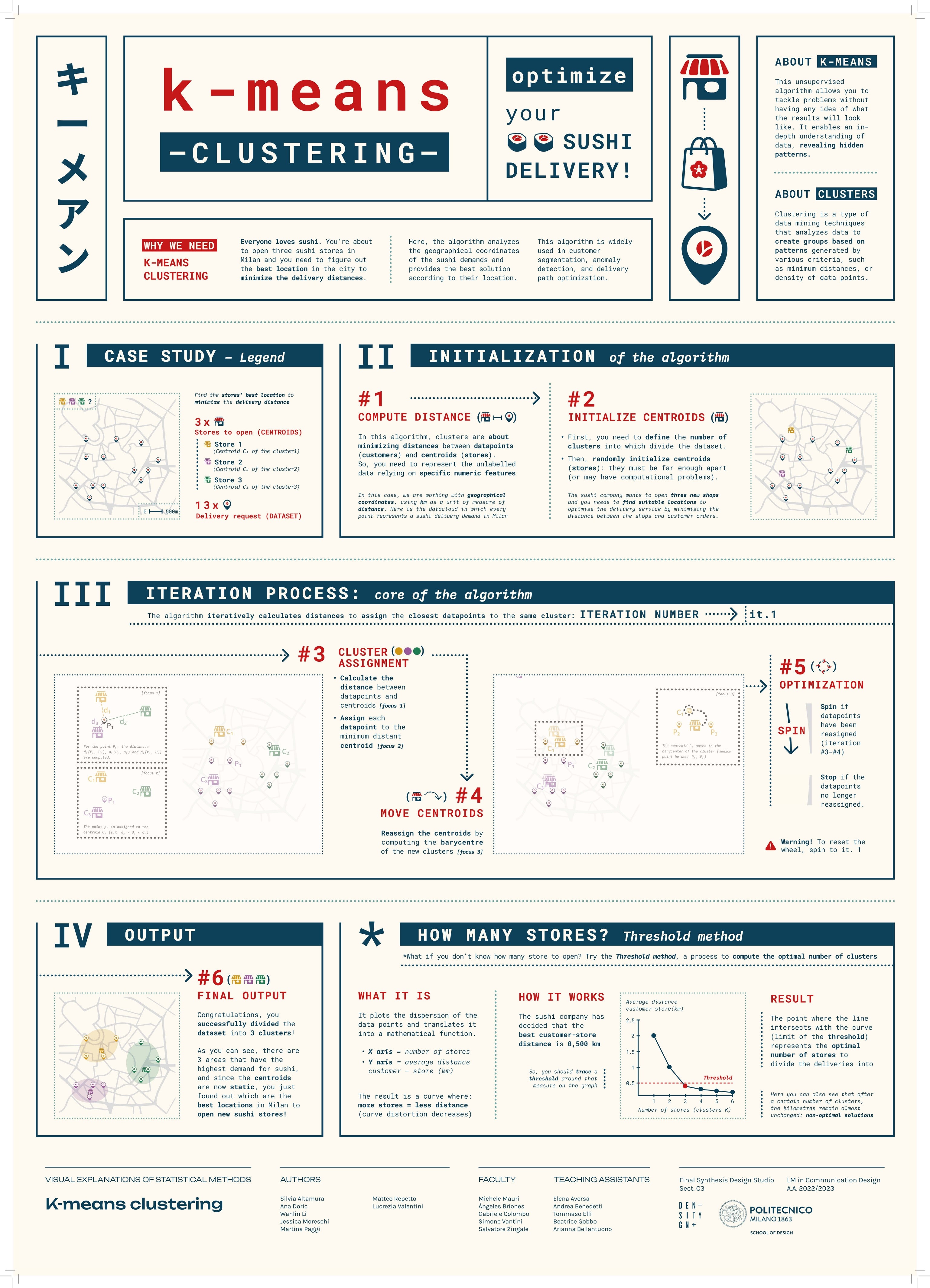
K-means Clustering is one of the most popular unsupervised machine learning algorithms. Its purpose is to cluster similar data points and discover underlying patterns by searching for a fixed number of clusters in a dataset. The algorithm works iteratively to assign each data point to one of clusters based on feature similarity. It can be used for behavioural segmentation, inventory categorisation, sorting of sensor measurements and detection of bots or anomalies. The poster done by #DD18Group2 explains the algorithm’s mechanism by clustering sushi deliveries to find the optimal locations for new restaurants. It is possible to analyse order distribution in a specific area and find out where the most saturated zones are. The core of the poster is a wheel mechanism that engages the audience in the explanation of the algorithm.
See the posterClassification Trees
Giulio Alessandrini, Alexandra Chiojdeanu, Andrea Corsini, Greta Cozza, Miguel Gashi, Alessia Mattesini, Ana Muço
A classification tree is a sequence of binary decisions that lead to a prediction about the class (interpretation) of a data (an object). Having a training dataset, is it possible to build a tree by identifying sequential splitting rules, creating more homogeneous subgroups time after time. A good classification tree is built by finding the best splitting criteria and choosing the right time to stop splitting, in this way it is efficient and it not tends to overfit the initial dataset. This poster aims to explain the process of constructing and running a classification tree with an example taken from the daily life of a student in an exam session: by looking at the number of stickers on students' computers and the number of exams they have to study, try to guess the study course they belong to.
See the posterBiclustering
Giovanni Bonassi, Cecilia Buonocunto, Martina Bracchi, Silvia Casavola, Vlada Ershova, Kateryna Lapshyna, Matteo Visini
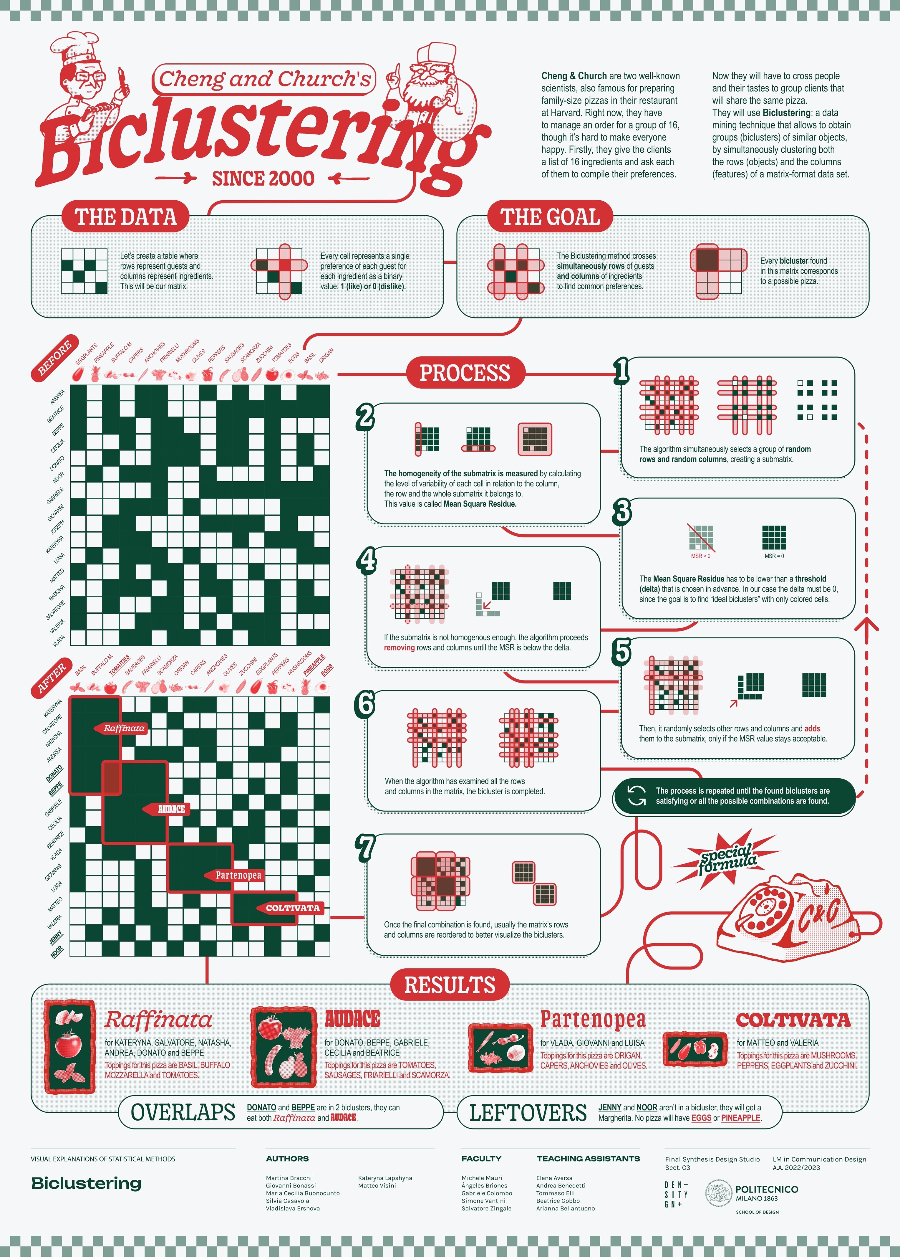
Clustering is a classic data mining technique that divides groups of objects into groups (clusters) of similar objects, united by certain features according to given criteria. A particular type of clustering is biclustering, a technique that allows to simultaneously cluster both the rows (objects) and the columns (features) of a matrix-format data set. The most popular biclustering algorithm was introduced in 2000 by Y. Cheng and G. M. Church, who applied to biological gene expression data. This poster shows an example of the algorithm’s operations using a simple and familiar example: a group of people and the ingredients they like on pizza.
See the posterCommunity Detection
Kangying Chen, Giuseppe Defilippis, Stefano Gubiolo, Maria Martinuz, Donato Renzulli, Antonio Sacchet, Yuying Tang
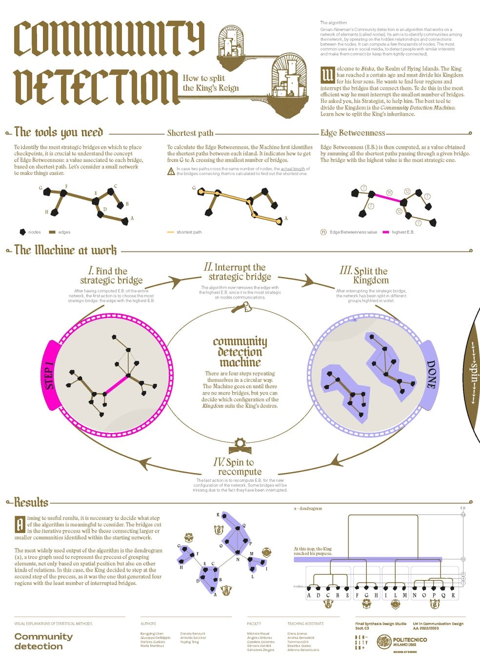
Girvan-Newman’s Community detection is an algorithm that works on a network of elements (called nodes). Its aim is to identify communities among the network, by operating on the hidden relationships and connections between the elements. It can compute a few thousands of nodes. The most common uses are in social media, to detect people with similar interest and make them connect (or keep them tightly connected). This poster presents two holes in the middle that allow the user to turn a wheel which shows the steps of the iteration of the process. The algorithm is in fact based on the repetition of a certain action: cutting the edges with the highest edge value (edge betweenness). Through the movements of the wheel it is possible to see how this happens and happens again until there are no longer communities to identify.
See the posterKernel Density Estimation
Anna Cattaneo, Yiyuan Hu, Lara Macrini, Nicole Moreschi, Leonardo Puca, Silvia Sghirinzetti, Ce Zheng
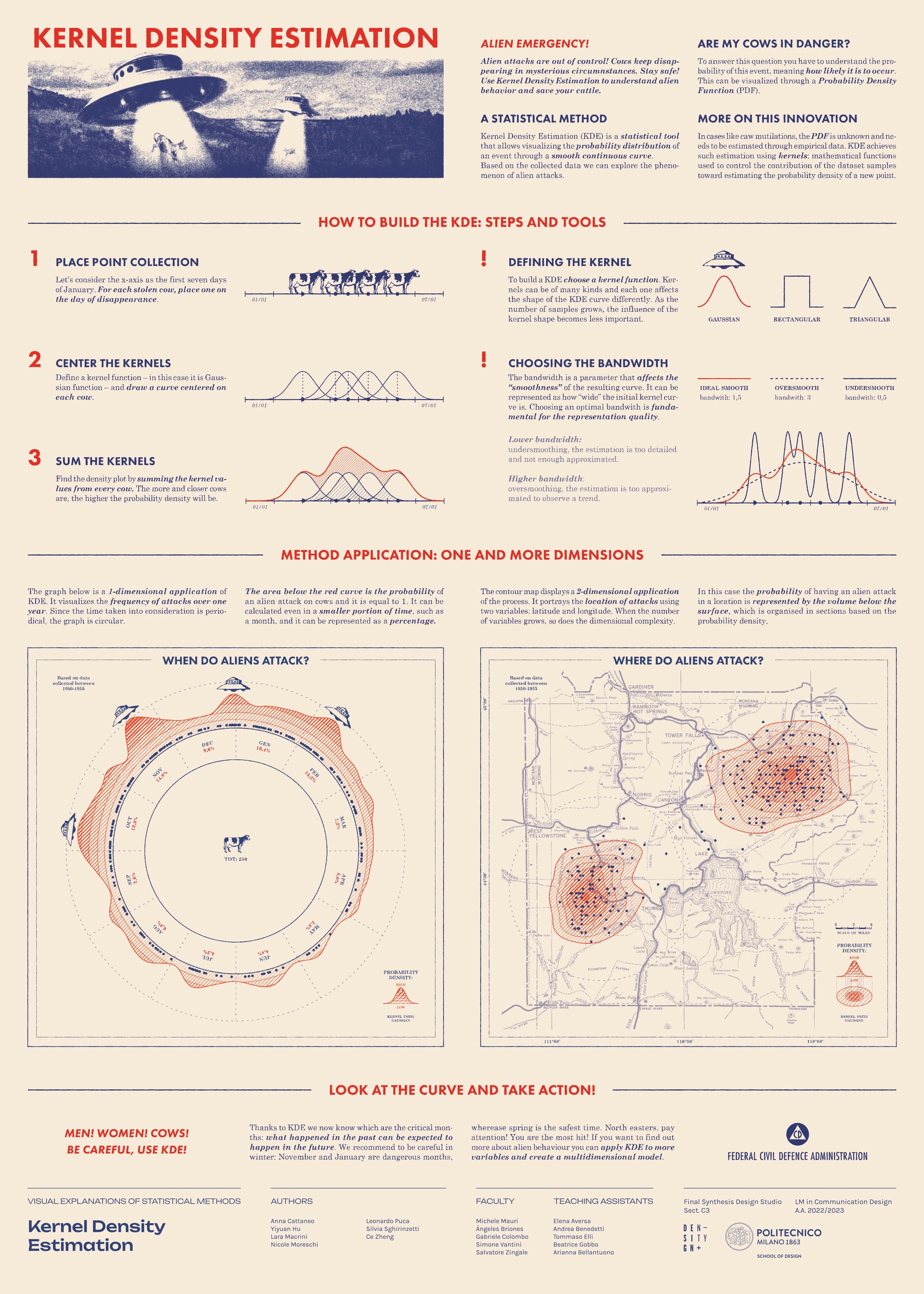
Kernel Density Estimation (KDE in short) is a statistical method used to represent probability density with a simple smooth representation, starting from a given dataset. It allows to estimate the probability of an event, meaning how likely it is to occur, based on empirical observation of a particular phenomenon. What we wanted to achieve in this poster is a clear understanding of the practical utility and the versatility of this tool. For this reason, we decided to apply the method in two examples: the first displays the frequency of an event in a specific time interval (1-dimensional), while the second shows the location of the event (2-dimensional). To better explain the method, we used a simple and funny metaphor: alien attacks (cow mutilations), a stereotype that almost everyone has in mind.
See the posterK-Nearest Neighbors Classifier
Andrea Benedetto, Simone Cerea, Camilla Guerci, Surabhi Gupta, Haleh Nobar, Alessandro Pedriali, Yousef Taffal
The K-Nearest Neighbors Classifier is an algorithm that uses similarity to make predictions about the grouping of unknown data. In other words, based upon the characteristics of a certain number (K) of known elements that are the most close-by (Nearest Neighbor) to new unknown data, it predicts the category of it (Classifier). The poster guides the reader in understanding how it works as if they were starting out a new career in a video game in which it’s necessary to guess whether unknown ships are enemies or allies. By following the steps given by the crew captain, they are thus given a thorough explanation of the prerequisites, the calculation and the process of verifying and optimising its accuracy, along with a couple of insider tips.
See the poster