Corpus Analysis

Medical Universe vs Online Community: Internet and Digital Addiction Scatterplot

Introduction

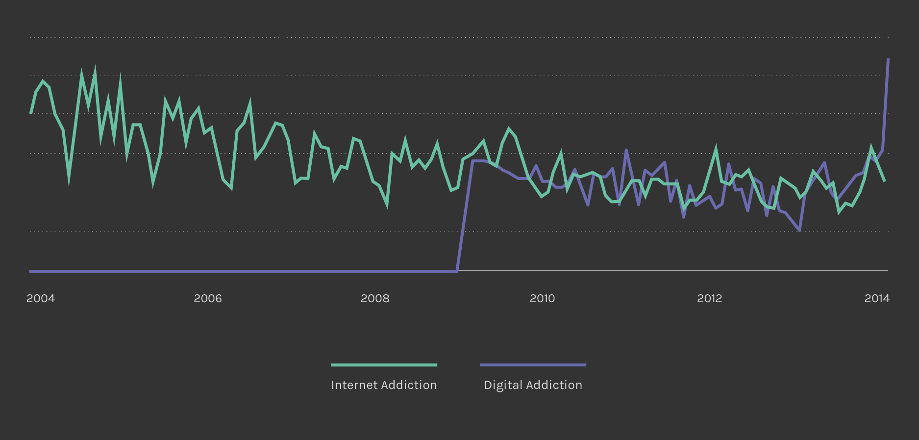
After agreeing on the queries “Internet Addiction” related to the medical world and “Digital Addiction” referred to the online community, we analysed Google results in order to have a complete mapping of the phenomenon. For each query, the first 100 results have been taken and tagged according to website, author, geographic location and year. We realised that the speakers are mainly located in the USA, while the query “Internet Addiction” is related to less recent results, as can be also seen from Google Trend (see the image below).


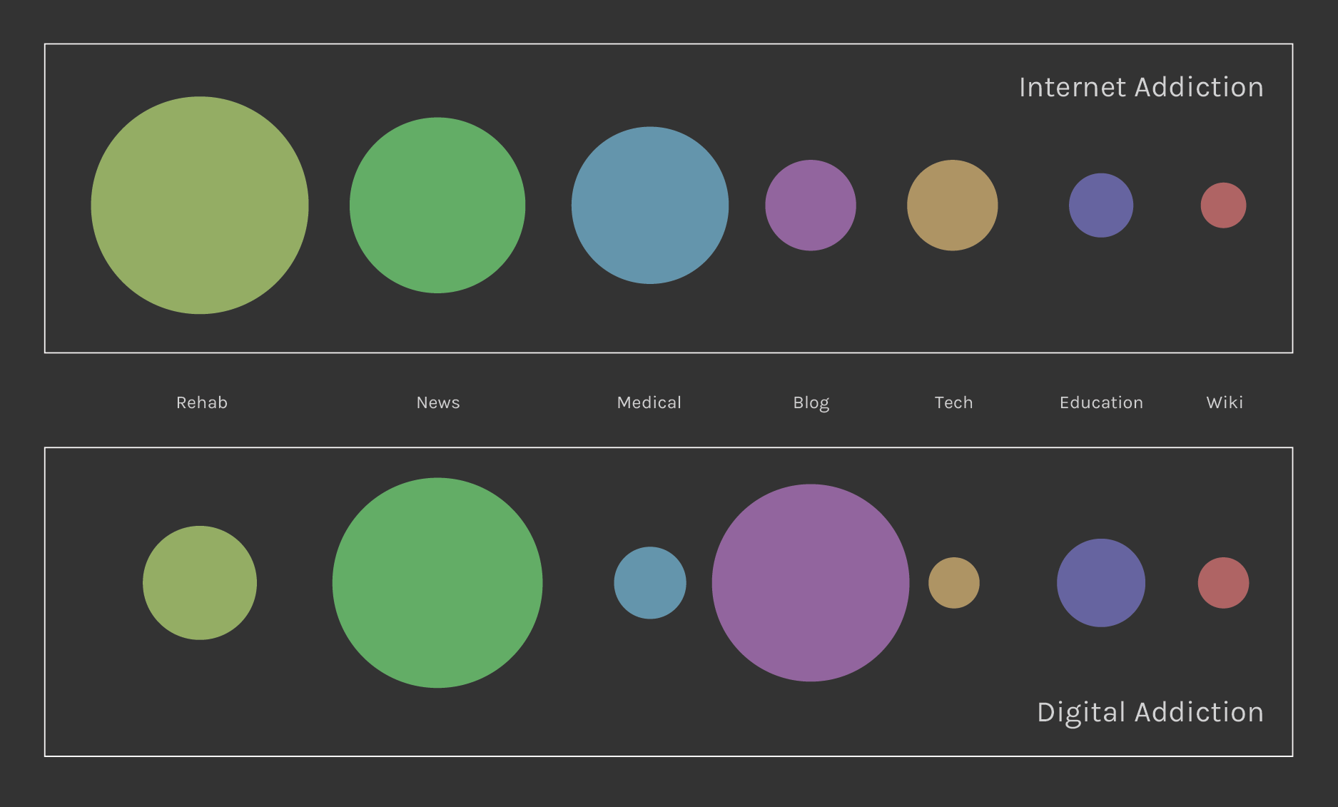
Substantial is also the difference between the quantity of websites found for each query: mostly clinical and scientific for the first one and lots of blogs and news website for the second one (see the image below).


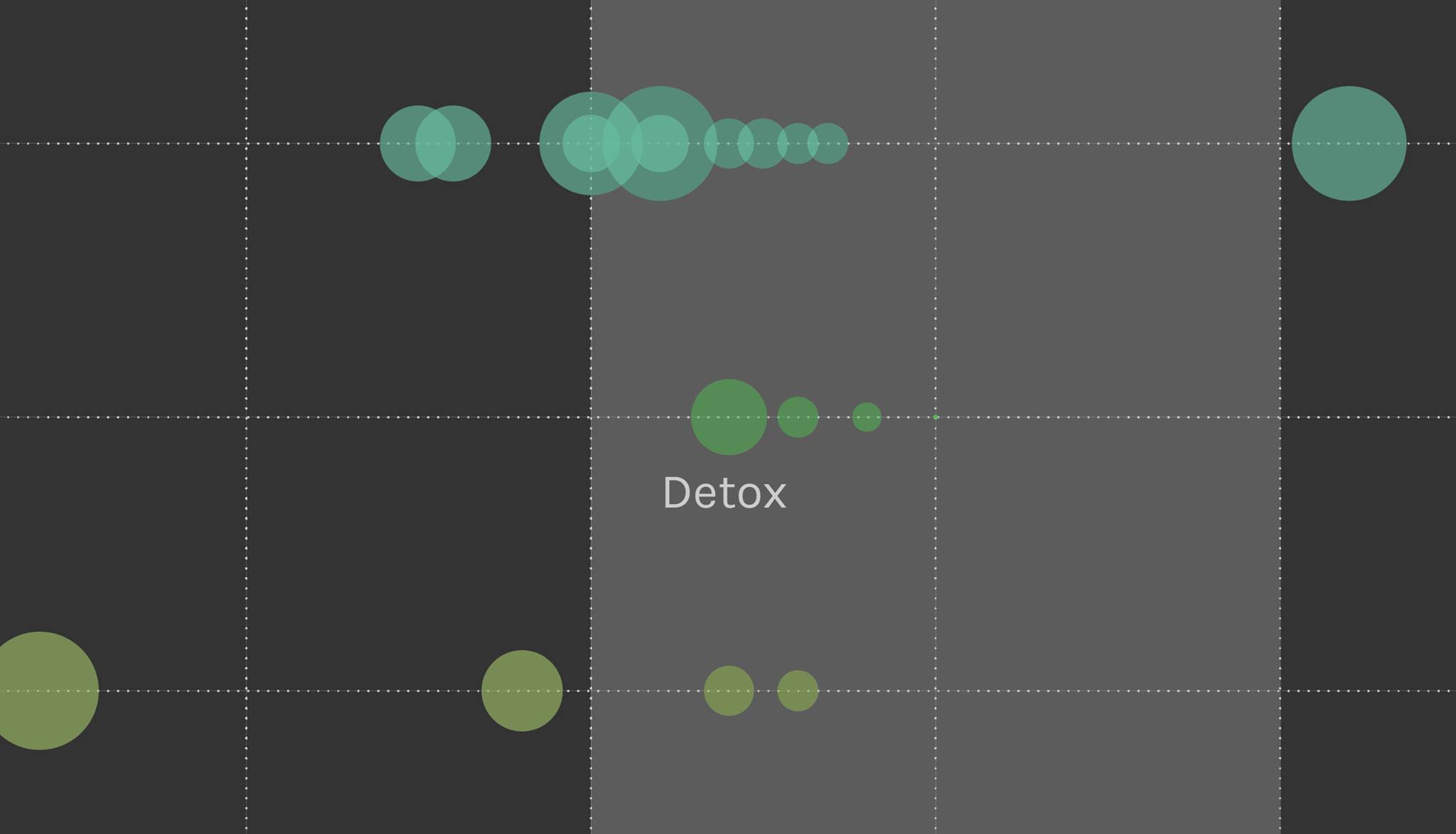
Next step has been more qualitative: after extracting all the texts, they have been read in order to understand how the issue is discussed. We analysed their text frequency to understand the semantic importance of the most used words, which have been tagged into meaning categories. According to the results found we finally built the scatterplot.

How to read the visualization

The scatterplot shows how a specific word belongs to a semantic category (such as colour) and to one of the two queries considered (negative values for Digital Addiction and positive values for Internet Addiction). The dimension is related to the frequency that world appears in the whole corpus. The more a word gets closer to zero, the more it represents some kind of mutual semantic area between the medical world and the social dimension. This area is the see-through one highlighted between the two worlds.

How it has been done

All datas have been taken from Google, using the incognito window navigation. Once the links have been extracted using Zup, all the texts have been extracted and analysed using Sven. The TF and TFIDF analyse has been then cleaned using Google Refine and a value of frequency has been assigned to each word. To create the scatterplot, we calculated the difference between the frequencies, obtaining a value determining the position of the word on the chart, either on the positive or negative side.

Findings

The scatterplot confirms our initial idea of the spread into two sides about the same phenomenon: words linked to the medical field are located on the Internet Addiction side, which lacks of words belonging to social media or more recent technologies, giving the phenomenon a negative meaning and more family and teenager related, using comparisons such as drugs and alcohol. Places and behaviour don’t show any particular attitude.

The most relevant result is the position of the word “Detox” (see the image below) which belongs more to the social side, against what we were expecting. This evidence, combined to the Amazon results, made us change our research direction and stimulated a deeper analysis about the topics of rehabilitation and dis-intoxication from the Internet.


Digital Detox is also present in the Wikimindmap of Digital Addiction, but is not present in the Internet Addiction one (see the image below).


Metadata

Timestamp: 22/11/2014 - 12/12/2014

Data source: Google

Related Protocol

Download data (4MB)