Description
The visualization shows three different groups, one of closed sites, one of the sites from which information cannot be obtained as being part of bigger platforms, and finally the sites which are currently online.
At first glance we can notice how, in most cases, the traffic is generated by the direct connection to the site by the user, followed by the organic search of the site. This demonstrates the fact that the users already know the site they want to access and connect directly, or search for its result on search engines, organically inserting the keywords within them.
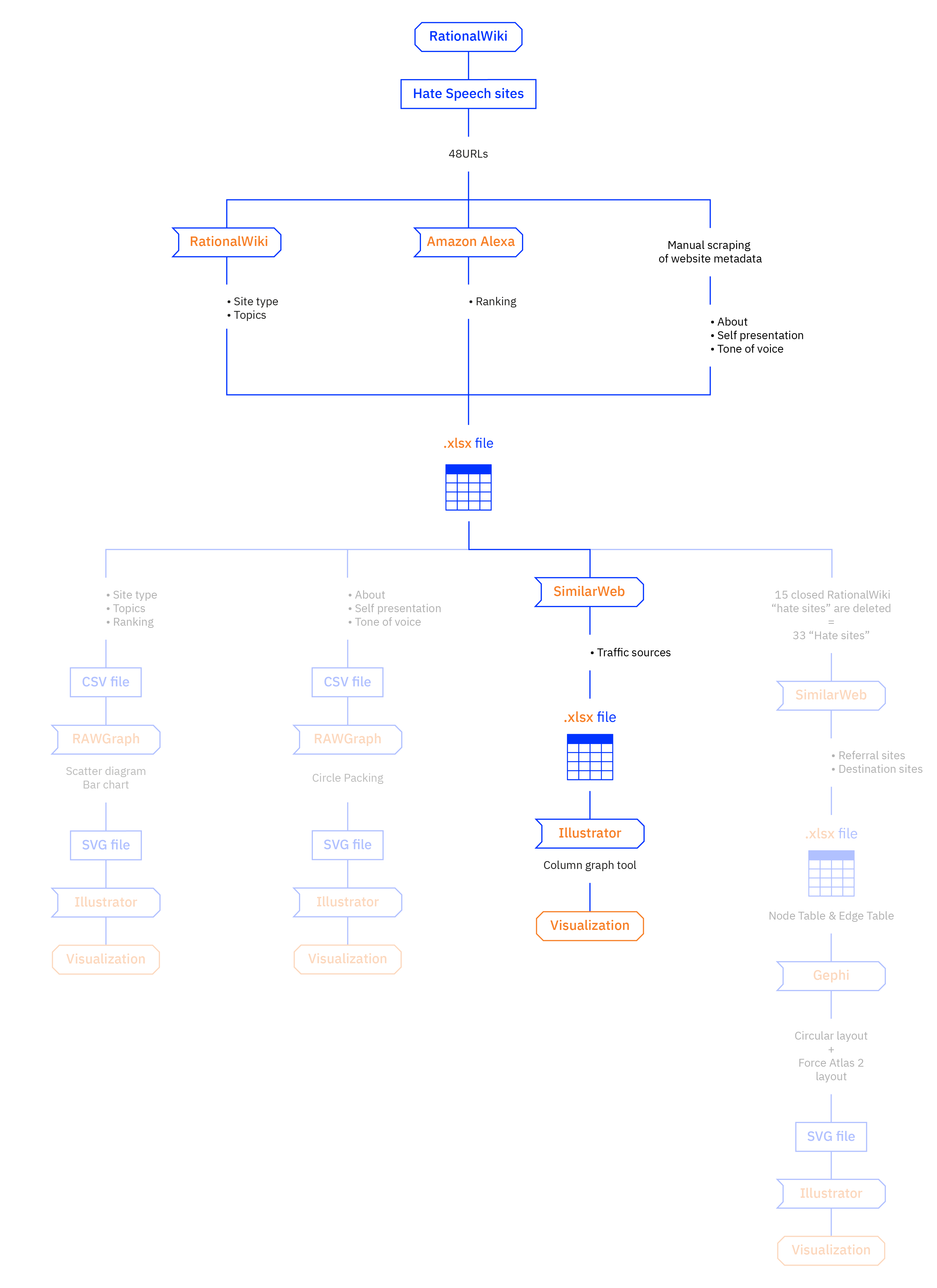
After seeing which categories belong to the 48 “Hate Sites” found on RationalWiki, which are their main topics, and how they define themselves, we finally focused on the user who visits them. The intent was to investigate how effectively the user reaches these sites, since we observed a great lack of homogeneity of the rankings proposed by Alexa.
So, we designed an interactive mosaic plot chart of the sites that are currently online, using the collected data. Through SimilarWeb we were able to trace the global ranking of the sites, and the main sources of traffic in October 2018. Each proposed category has different specific characteristics:
- Direct: Traffic generated by users from direct connection to the site
- Referrals: Websites that are sending traffic to these sites
- Search: Traffic generated from organic reach
- Social: Traffic generated from social networks
- Mail: Traffic generated by mailing lists
- Display: Traffic generated by paid display ADV
Protocol

To develop this protocol, we relied on the SimilarWeb tool. Initially it was taken into consideration only to verify the ranking proposed by Alexa, but then we realized the rich amount of additional information it proposed compared to the latter instrument.
In this protocol we specifically focused on the traffic sources for the different Hate Sites. Since on SimilarWeb the traffic sources are expressed as a percentage, we opted to use a mosaic plot chart. After having extracted the percentage values and having arranged them in an Excel file, we exported and inserted them in Illustrator using the “Column Graph Tool”, where the graph was then drawn up.