Description
From this visualization it’s clear that “Hate Sites” link and connect to each other, creating an actual Hate Echo Chamber. When the toggle is pushed, it underlines that among the most relevant sites of the echo chamber there are a lot of alt-right and far-right sites—like Fox News, Breitbart, The liberty Daily, Voat, White Right Hub and others—so it becomes evident that there is a real connection between the hateful sites and the extremist ones.
If we consider the traffic share of the referral sites that are still opened—as we have seen in the previous protocol—it is possible to identify with the use of SimilarWeb tool the leading referring ones and the leading destination ones. By connecting these sites with the hate ones, we have tried to identify a Hate Echo Chamber through which the user can observe the connections between them.
The graph displays the Hate Echo Chamber by positioning the 33 Hate Sites defined by RationalWiki in a circular composition, while the referral and destination ones align themselves around them. If they assume an external position in the map it means they only have one connection with the Hate Site related to them. Instead, if they are placed in the central area of the graph, it means they have a higher number of connections.
The nodes’ size depends on the number of connections that each site has with the others, therefore on the relevance in the Hate Echo Chamber. The color defines the category: the RationalWiki Hate Sites are orange, the referring ones are lilac, the destination ones are blue and the ones that are both referral and destination are purple. The edges are colored with the same method and the arrows are used to enhance the direction of it.
Moreover, we have designed a toggle to highlight the most relevant sites in the Hate Echo Chamber. The sites that have only one connection are shown in gray color to position them in a second level. The mouseover helps reading the graph, by underlining the connections between the nodes.
Protocol

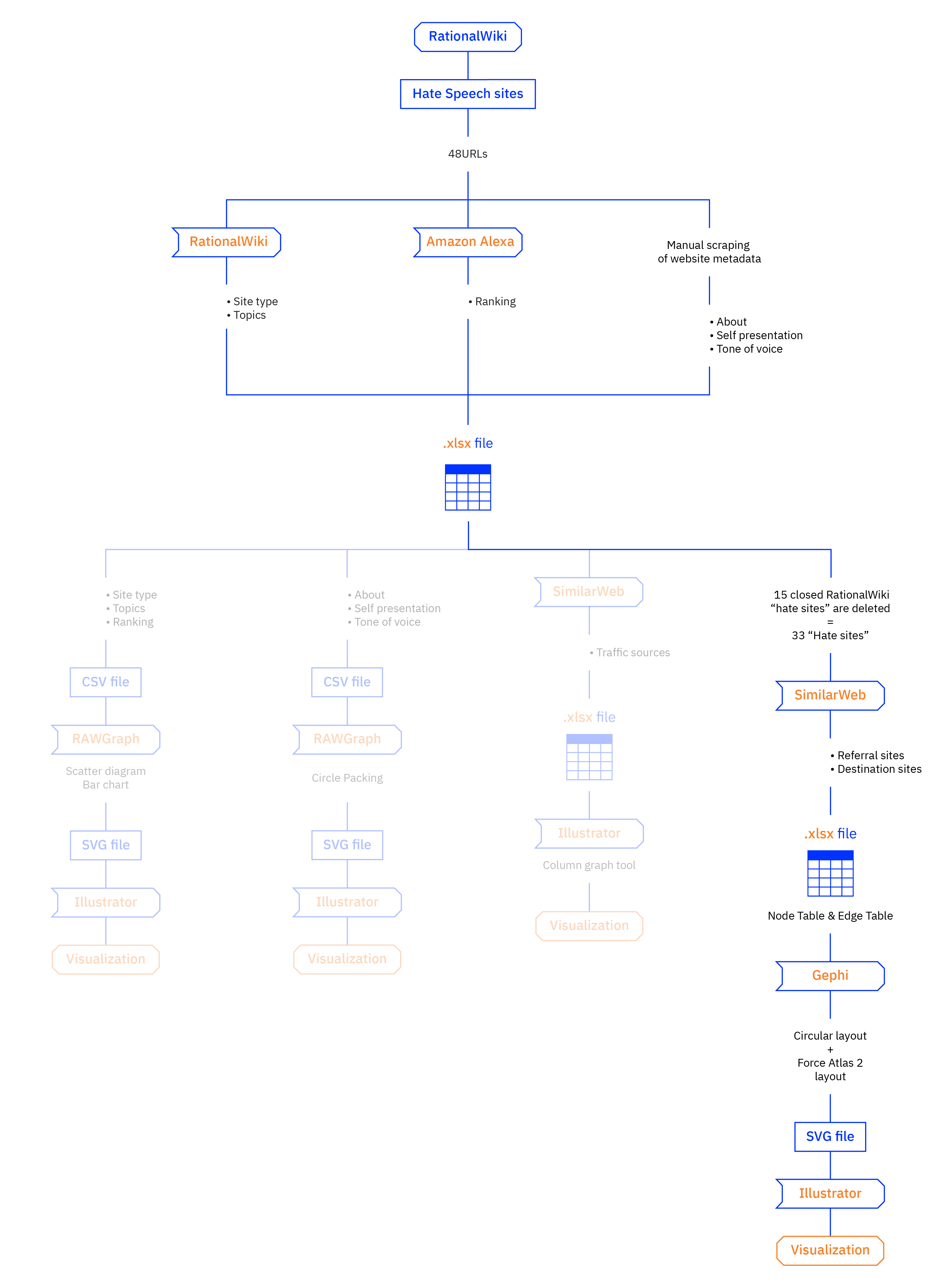
We started our analysis from the data of protocols 3.1 and 3.3. We searched for the referral sites and the destination sites with SimilarWeb for each RationalWiki “Hate Site” and we collected the results in an Excel file. We decided to leave empty spaces in the Excel file when SimilarWeb didn’t find any referrals sites nor destination ones and when the sites we found were irrelevant.
Afterwards, we imported a CSV file in Gephi in order to design the visualization. In the nodes table we assigned an attribute to each site: “hatred”, “in”, “out”. In this way we created the levels to filter the data with the software. We used the Circular Layout plug-in to position the “hatred” nodes in a circular composition, then we locked them and we positioned the remaining nodes using the Force Atlas 2 layout. We adjusted the parameters and then we exported an SVG file. We used Adobe Illustrator to manually improve the network visualization.