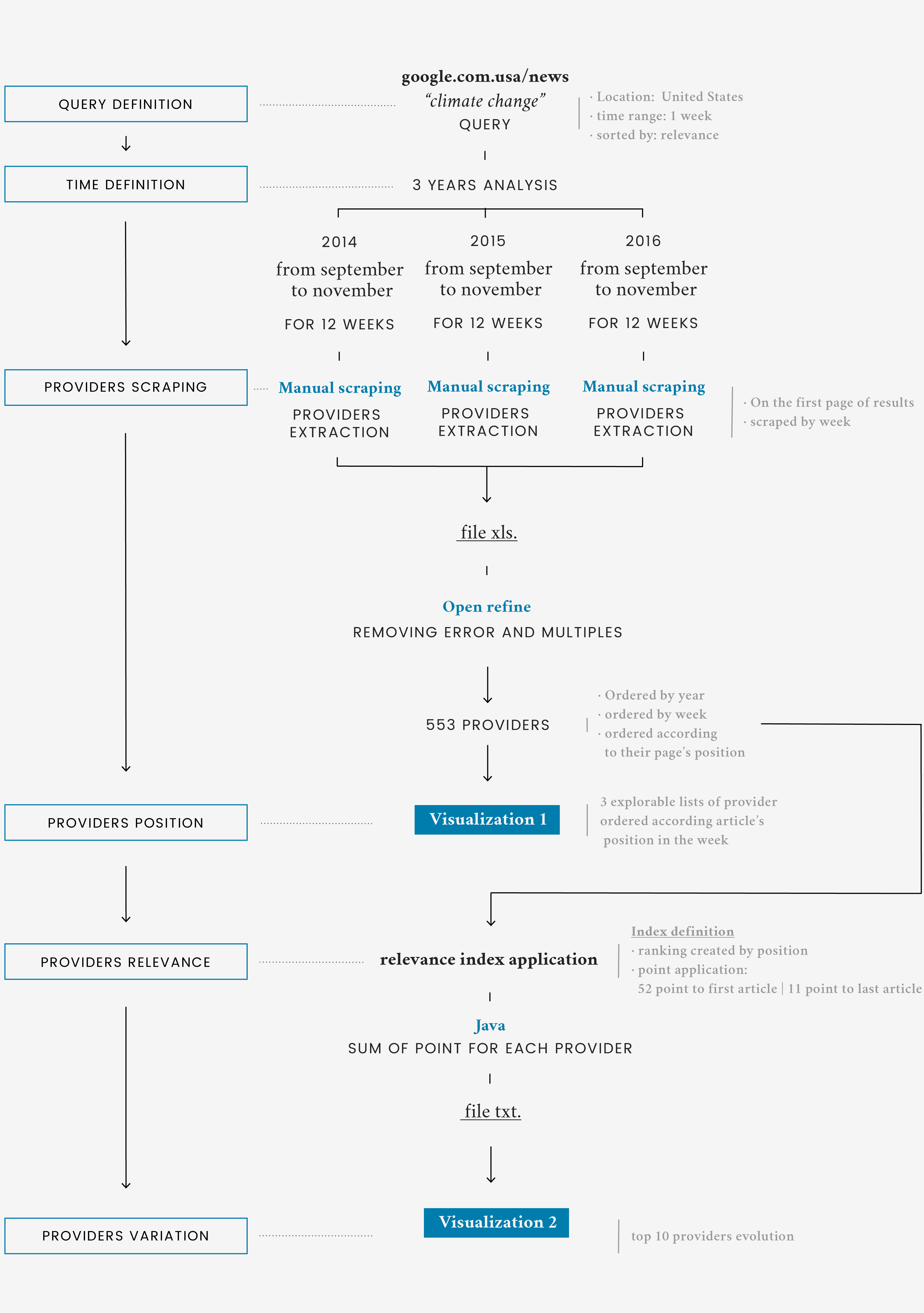
Description
Once the news outlets were identified as a relevant medium with which the user informs itself, the focus of the research shifted to them. The aim of the analysis was to understand who the most relevant news providers were and how each one of them influenced the debate around climate change. The result is a bump chart where the top ten providers are ranked on a vertical scale, based on their relevance during the three years analyzed.
It’s possible to note that all but the first two positions change through the years, with some providers appearing or disappearing costantly. Only four providers appear in all three rankings: The Guardian and New York Times, which occupy the first two positions; The Huffington Post and Los Angeles Times that vary their position through the years. Generally, the variation in the three ranks do not seem tied in any particular way to the presence of Donald Trump in the debate.
Regardless the number of articles remains somewhat constant during the three years, it’s possible to notice that The Guardian, once taking a great lead on the other providers, in 2016 is not as relevant as before.
Providers position on Google News
To have a much more global view of the research results, in the second visualization all articles scraped are shown, highlighting the articles from the most relevant providers. Each rectangle represents an article, and it’s positioned as it was on the page of Google News during that week. Once an article appears in the highest position, it’s not an indication of relevance per se. Through the relevance ranking, it was intention of the research to ponder both the total numbers of articles and its position on the page.