Description

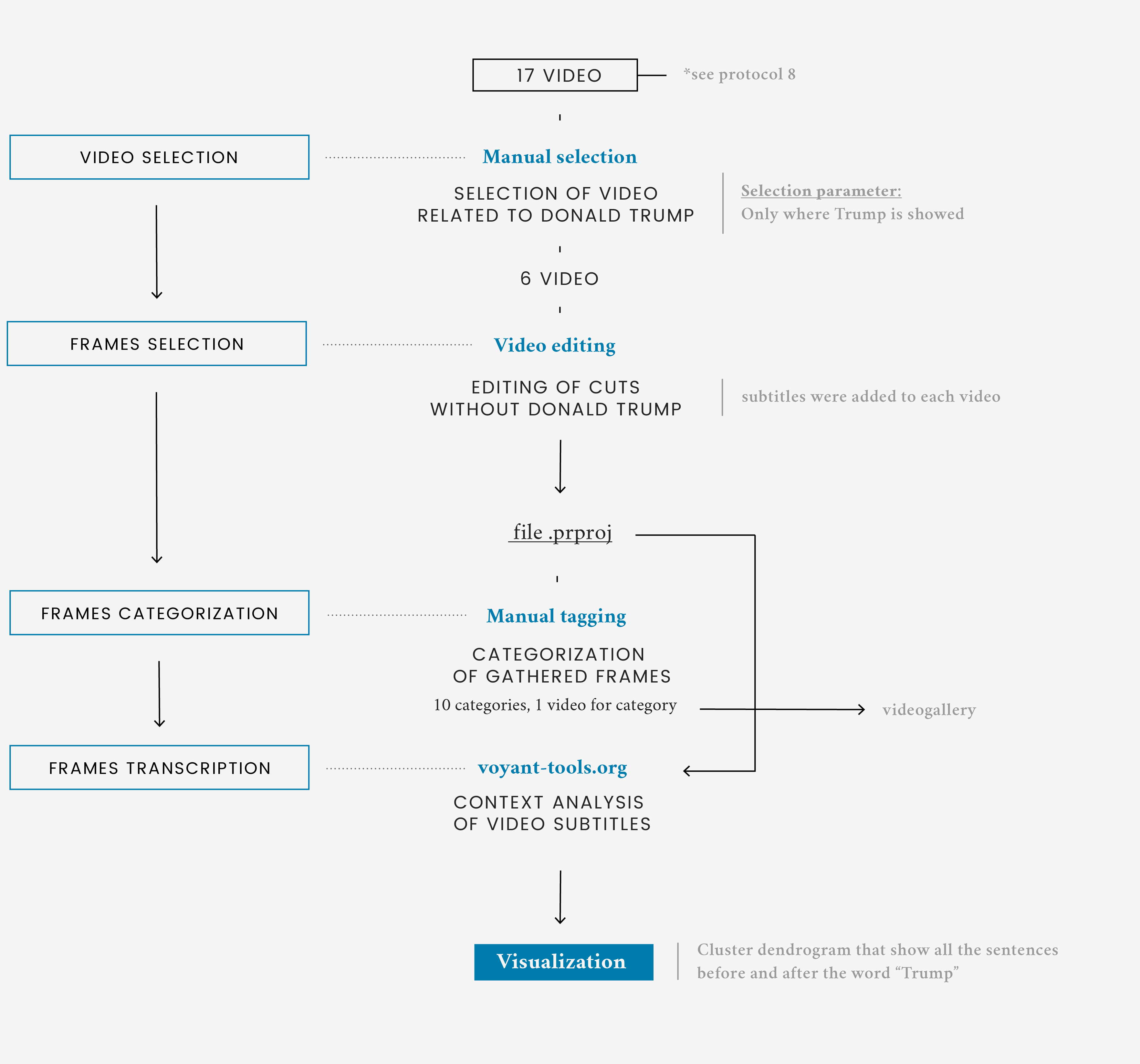
Trump’s scenes corpus selected in question 8 were only a little part of the total amount of scenes shown by the news providers. Analysing the remaining parts of the videos, the focus was on both on words and images.

The first visualization is a compilation of all the scenes not containing Trump directly speaking. Every video is a mix of scenes extracted from the starting corpus categorized by what is visually shown. Under every video there’s a bar showing the amount of time taken by the single category. The most relevant categories appear to be politics, anchors and Trump. These two last categories shows direct comments of anchormen and some scenes where Trump is shown but doesn’t speak directly.

In the second part, starting from the keyword "Trump", the visualization shows how the sentences in which he appears are articulated. Every sentence is categorized by tags related to the content.
The aim is to show a qualitative analysis of the context that revolves around Trump and climate change according to the providers by presenting both the exact sentences in the videos and a first categorization of the similar elements.

Protocol

Videos shown by the news providers are not only about reporting Donald Trump speeches, but also about constructing images around the topic. With the aim to understand what the providers says about Trump and climate change, the same corpus of video (question 8) was analyzed in all the cuts in which does not appear Donald Trump speaking. The analysis was split in two parts: one about the pictures and one about the spoken words. Both of them helped to have a global view of the investigated matter and was conducted together.

Both of them helped to have a global view of the investigated matter and was conducted together. About the words, the subtitles extracted from the videos (question 8) were analyzed with the context analysis of Voyant tools. Chosen “Trump” as main word of the analysis, the tool collected all the sentences in which it appeared. The sentences were divided by Voyant in two segments, left and right, according to their relative position to the main word “Trump”. Looking at the sentences, it was clear that some of them were very similar, both in the form and in the content. Each segment was then manually categorized, according to these similarities.

At the same time every single scene was categorized by topic, according to what could be seen on screen. Each cut of a specific category was then put together with the others and the subtitles were added during the editing. The result was a playlist of ten videos, one for each category.

Data

Data source: Google News, Voyant Tools

The dataset is composed of a series of excel files that were used to tag and subtitle each video, that were then used to time the quantities of each category.
The subtitles were then analyzed by Voyant Tools, which the result was a connection of elements in a flow.