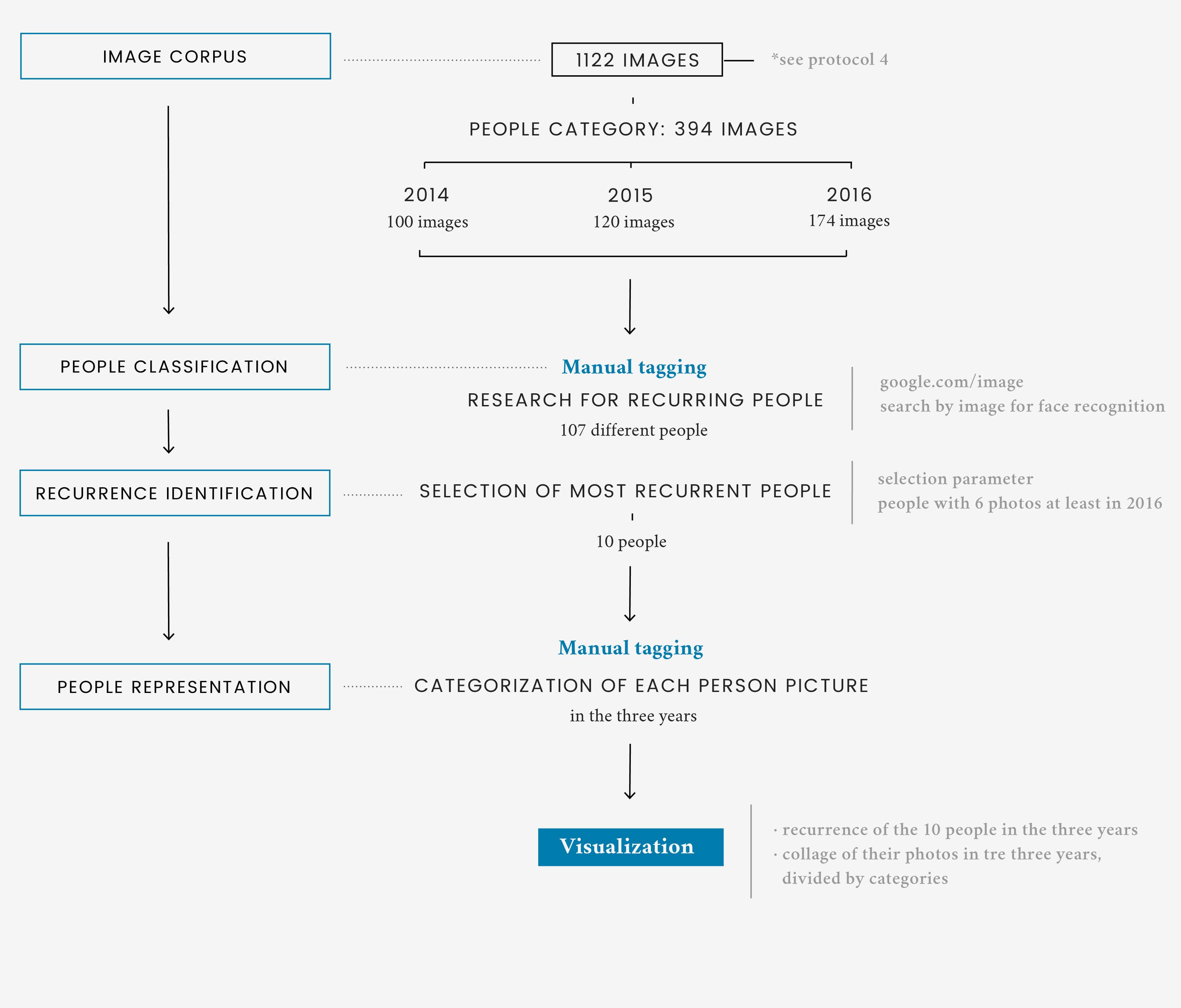
Description

Among the images collected within the articles corpus, there were also many photos portraying people. These photos are visualized separately from the rest of the corpus with the aim to analyze how providers represent the actors in the climate change discussion. The first part of the visualization shows how the actors have changed over time in terms of quantity. Some people are represented with about the same amount of pictures. It’s the case of Barack Obama, that is always present in the three years.

Other people, such as Donald Trump, Leonardo DiCaprio and Hillary Clinton, record a sudden rise in 2016. In order to better investigate the causes of some of these trends, the second part of the visualization shows the actual images that portray the actors, divided by category and by year. The categories are organized by what is shown in the photograph itself, and they are arranged from the most populated to the least.

Protocol

Starting from the previously analyzed corpus of images, all the pictures portraying people were isolated and explored separately. The aim was to investigate, both quantitatively and qualitatively, how human actors were represented by news providers. Each photograph was manually tagged according to the main subject or subjects depicted in it. In order to make the process easier, the subject of the pictures were searched using Google images, which in many cases allowed a faster facial recognition. In order to analyze the most relevant actors of 2016, the only images selected were the ones portraying the same people for at least six times in that year.

The selected images have been then subcategorized according to the way in which the actor is depicted in the photo. The analysis has been carried out manually for each actor for three years.

Data

Data source: Google News, Google US, Aylien

The corpus of these images was part of the previous question's corpus. It was extrapolated and separated from the rest in order to analyze it more in depth.