


Description
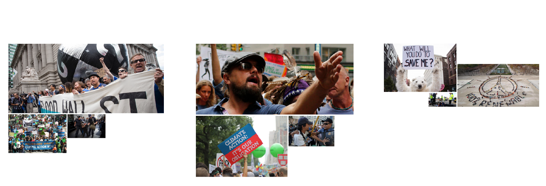
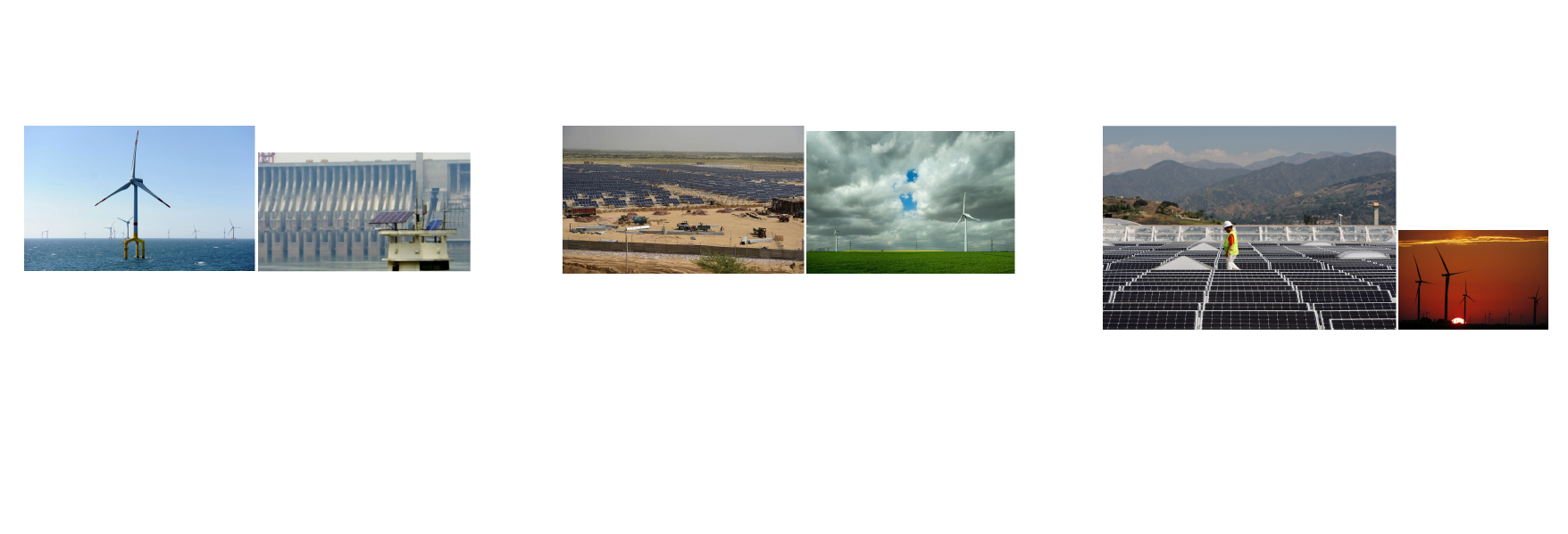
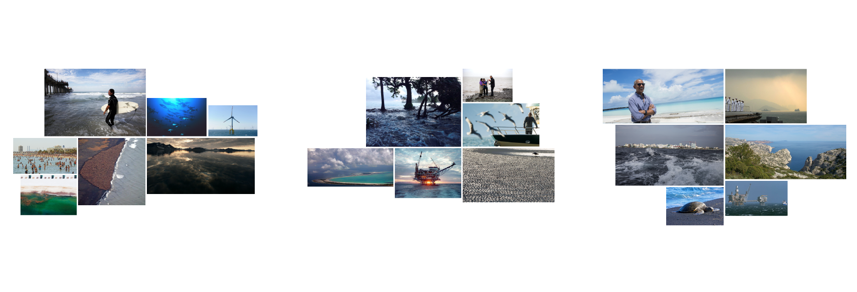
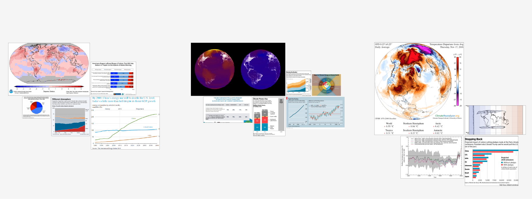
The articles scraped from the web, while talking about climate change with words, described the controversy also with images. This visualization aims to show how climate change, a scientific phenomenon that most people reading these articles don't experience first hand, is visually represented by the internet news outlets.
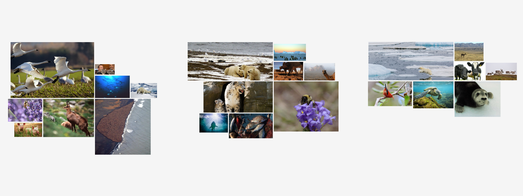
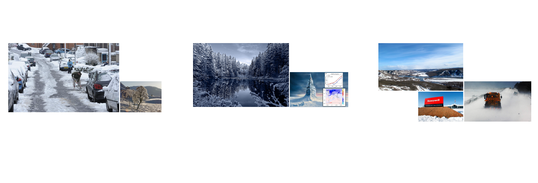
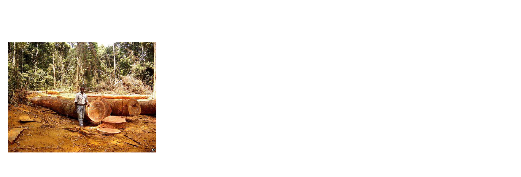
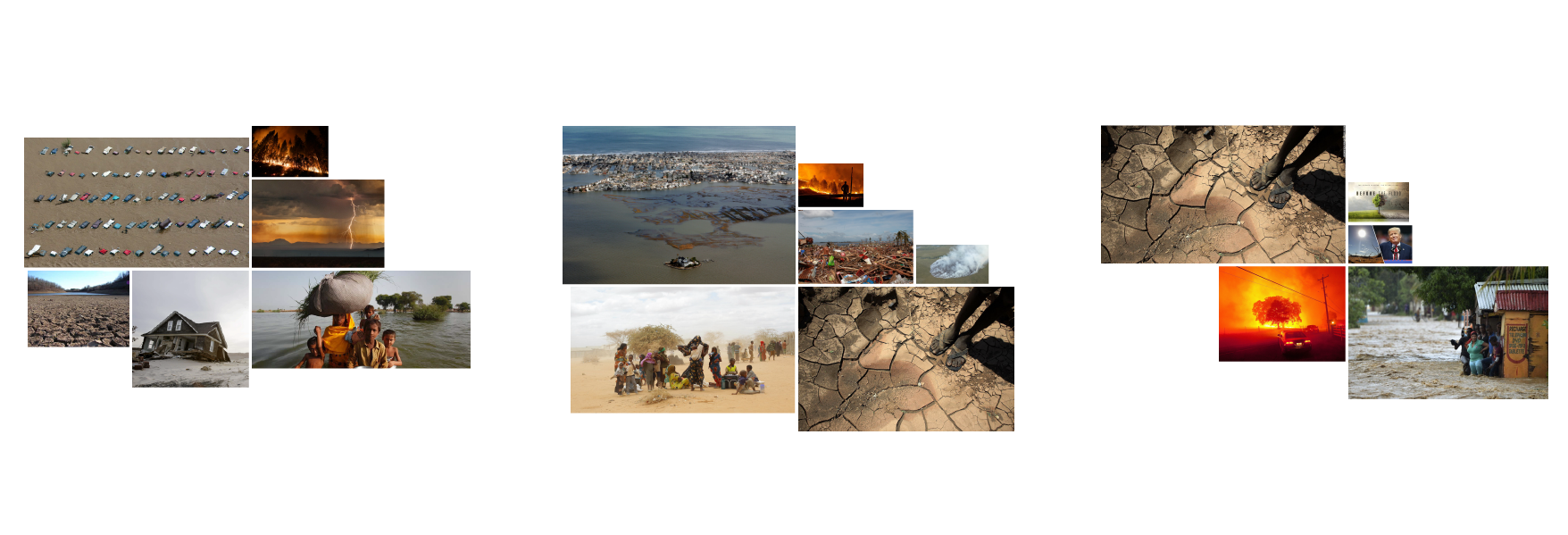
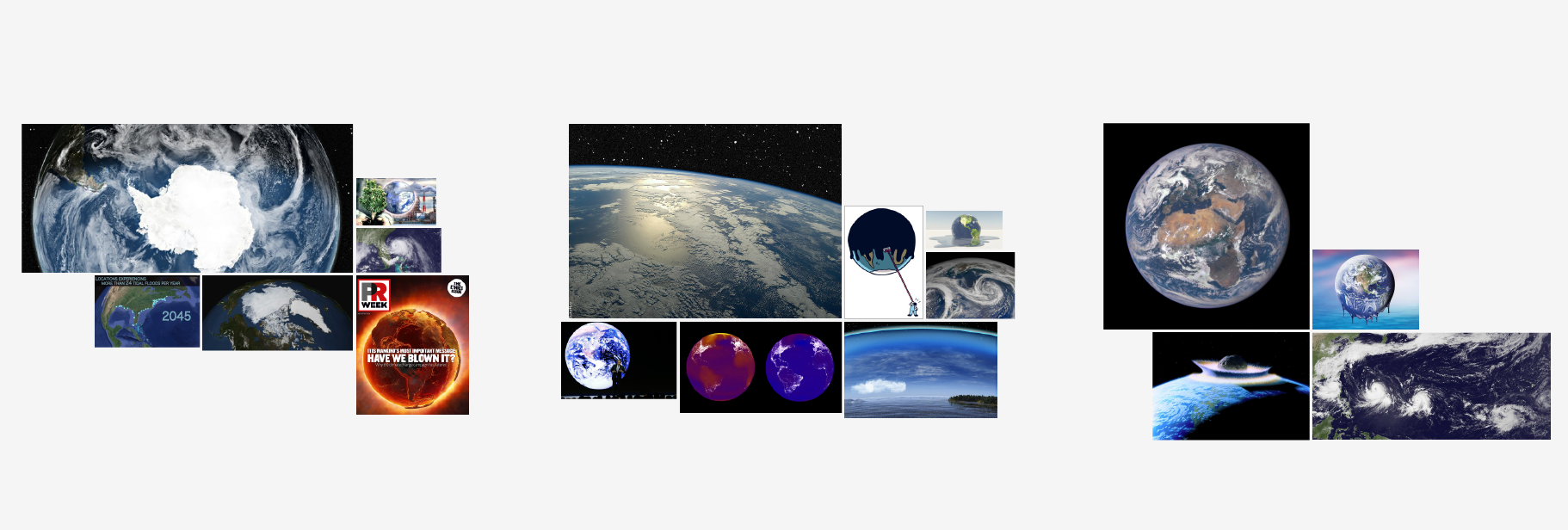
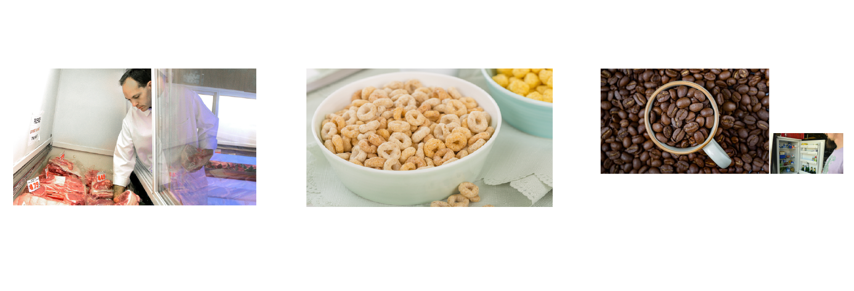
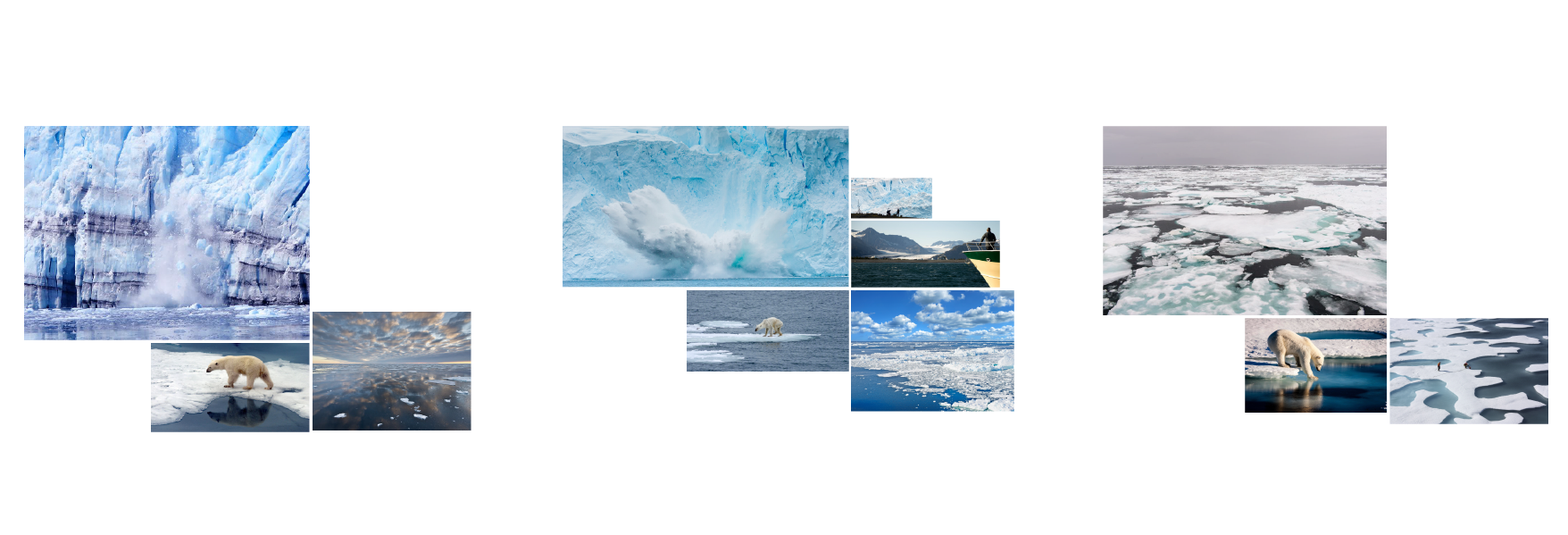
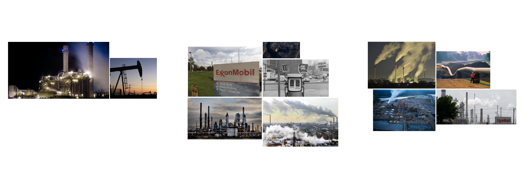
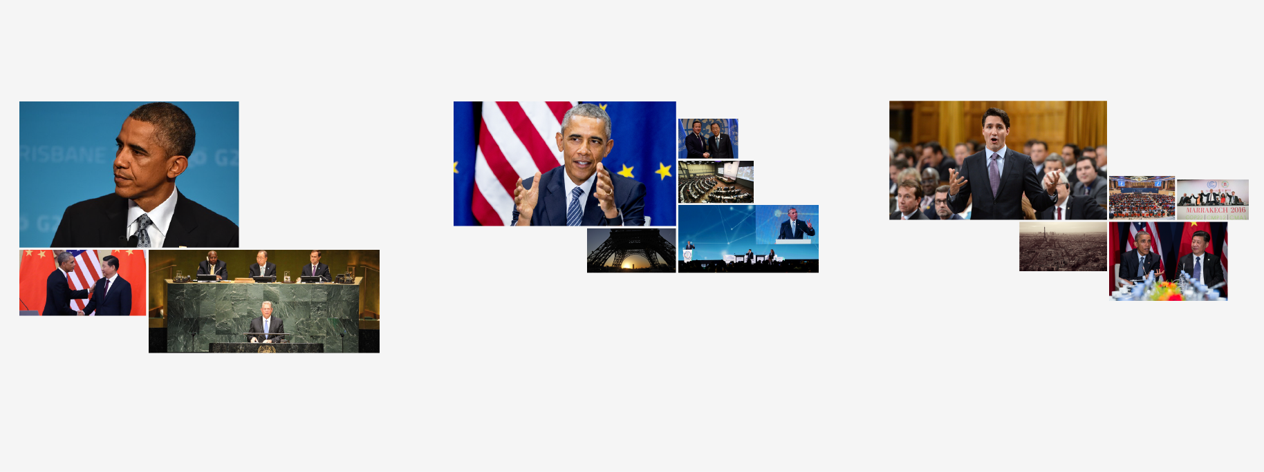
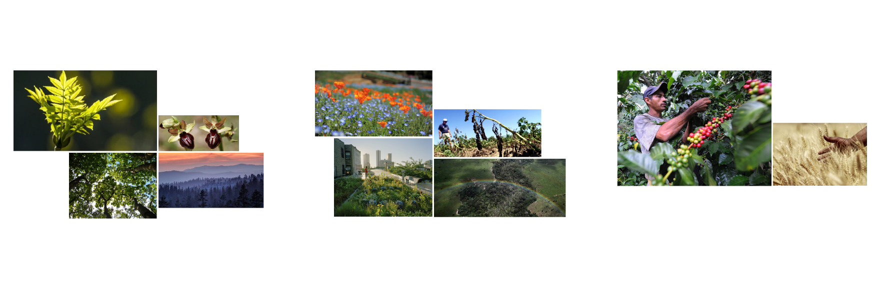
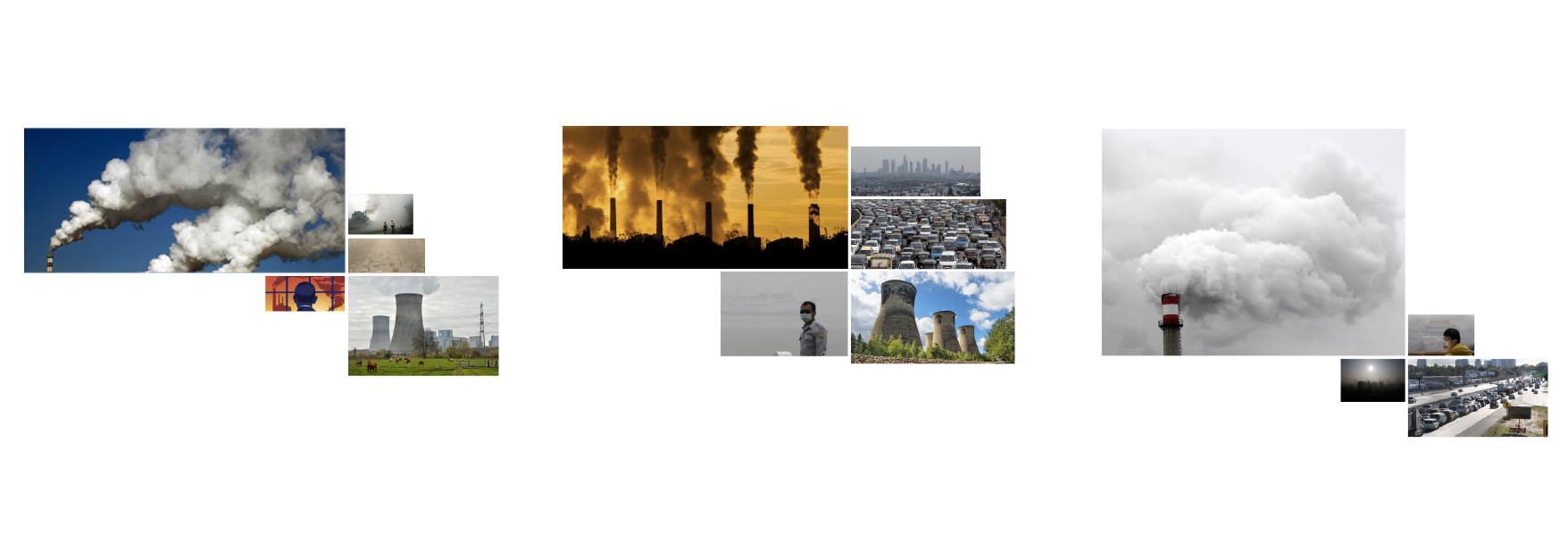
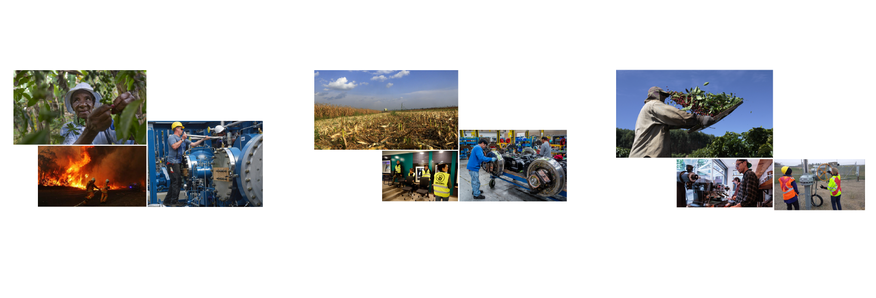
Each year, climate change is visually represented by different categories of images: in 2014, the most recurring categories were images of pollution, animals and visualizations, in 2015 there were mostly pollution, disasters and depiction of the Earth, and in 2016 the most recurring images were from the categories of industries, pollution and disasters. In the below visualization, it's possible to see how the borderline cases change through the years: Industry is the category that sees the most significat growth, while Animals decreases the most.

To better help the reader, sub-categories were visualized to give a sense of the images used, where the size of each image represents the number of photos that depict the same subject.
The images were also analyzed by their color, to see if each category helped shape a different kind of collective imagery of climate change. With this analysis, that was executed with Kromotology and Clarifai, it was noticed that while the quantity of the categories changes through time, the same cannot be said for their quality: the images share very similar color pattern and do not define a distinct chromatic imagery.