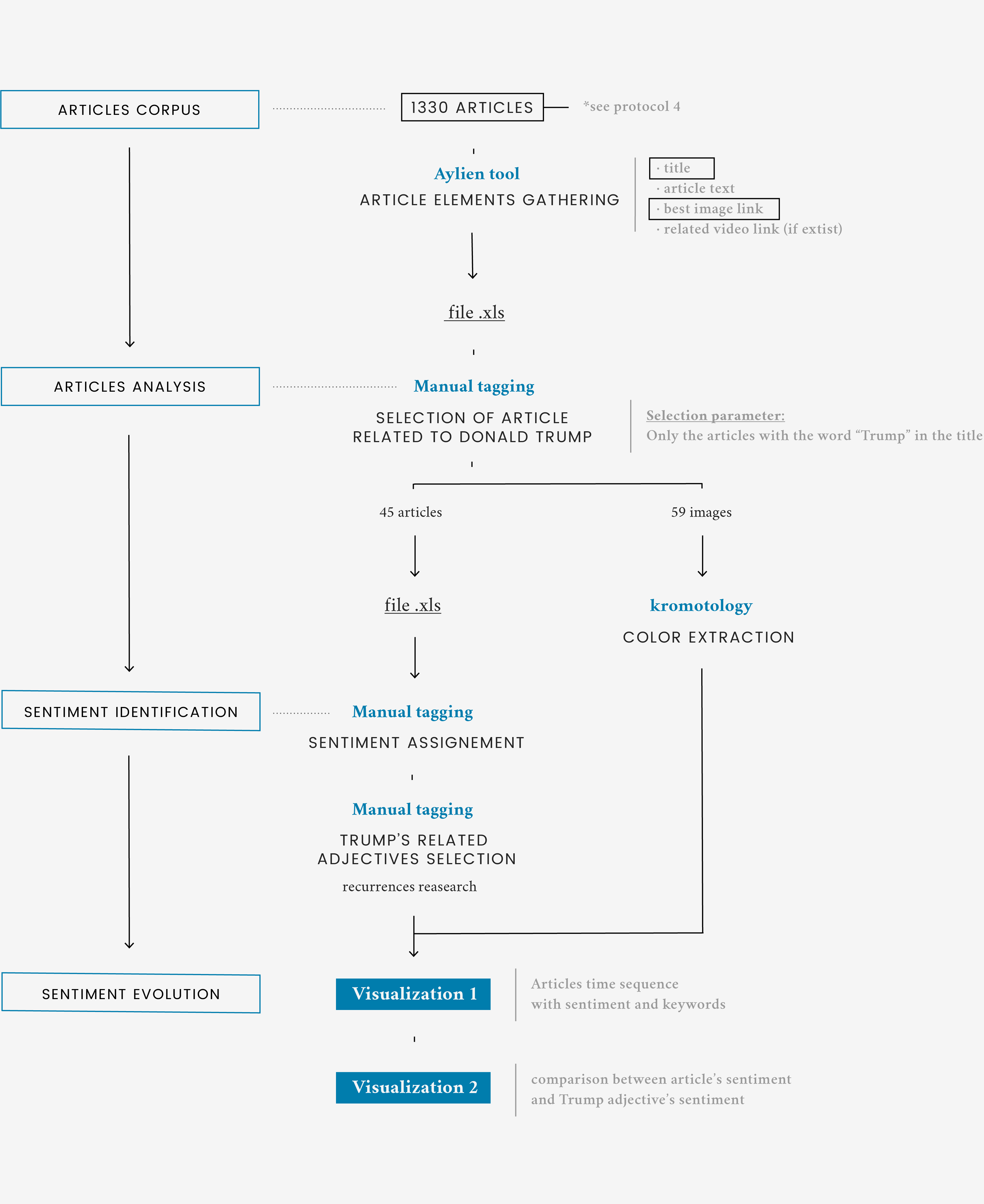
Description

Among the people shown in the previous analysis, Donald Trump is one of the emerging figures. The visualization shows how Trump is presented in relation to climate change by information providers. Each square represents an article while the vertical position indicates the general sentiment of the article. Under some squares there’s a label with the adjective used by the providers to describe Trump within the single article. The colors of the label are related to the meaning of the adjective: positive, negative or neutral.

Finally, the word inside the squares shows the subject portrayed in the pictures inside the single article and clicking on it you can see the color palette of the picture.

It is clear from the visualization that the providers are more negative than positive when talking about Trump and climate change. Most of the articles have a negative or neutral tone while the adjectives used to describe him are mostly negative. This evidence is clearer from the second visualization, which better illustrates the relationship between the article sentiment and each adjective meaning.

Protocol

Starting from the information gathered from the entire corpus of news collected to answer the question 4, only articles related to Donald Trump were selected with the aim to investigate in a more accurate way how Trump was depicted by the information providers in relation to the issue of climate change. The selection was made manually, searching within the articles the word "Trump".

The resulting corpus of articles was analyzed in its texts, images and information provider. The images were analyzed with Kromotology, in order to see if there were any color and pattern, and they were presented through the filter of the categorization (Protocol 5). As for the text, to each article has been manually assigned a sentiment and extracted a key adjective describing Trump according to that article. These operations were performed manually, since the digital tools did not permit an accurate analysis, especially about the sentiment.

Data

Data source: Google News, Kromotology, Aylien

Kromotology's output was a series of .svg files, accompanied by a .tsv files with quantities of colors in percentage to the square's area.
As for the articles's sentiment, each word was chromatically tagged and kept tied to the article itself.