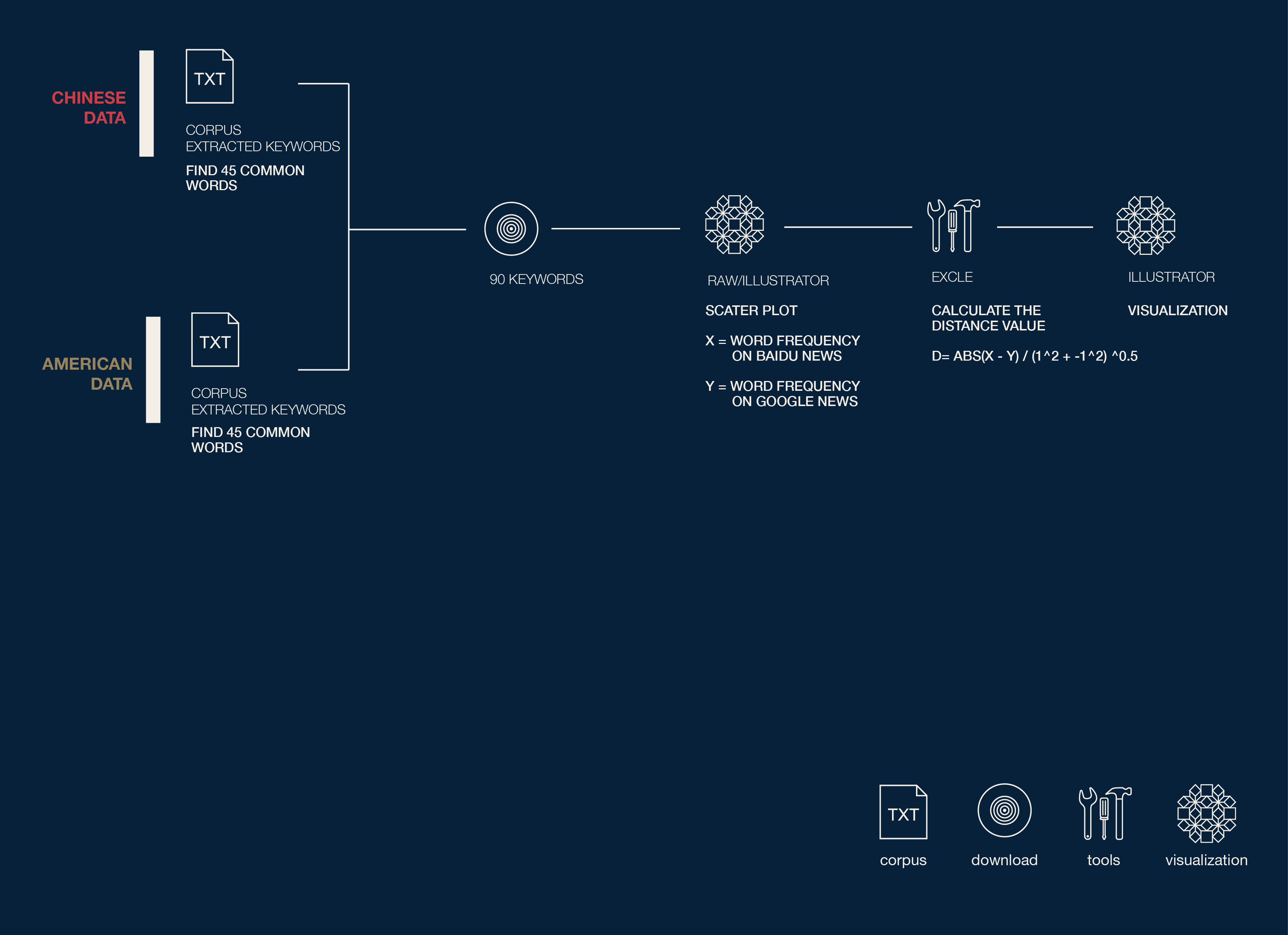

Description
After we extracted the keywords and got the word frequency. we want to analyze the common terms in this two corpus. and try to find out the different orientation on report by comparing their quantities.
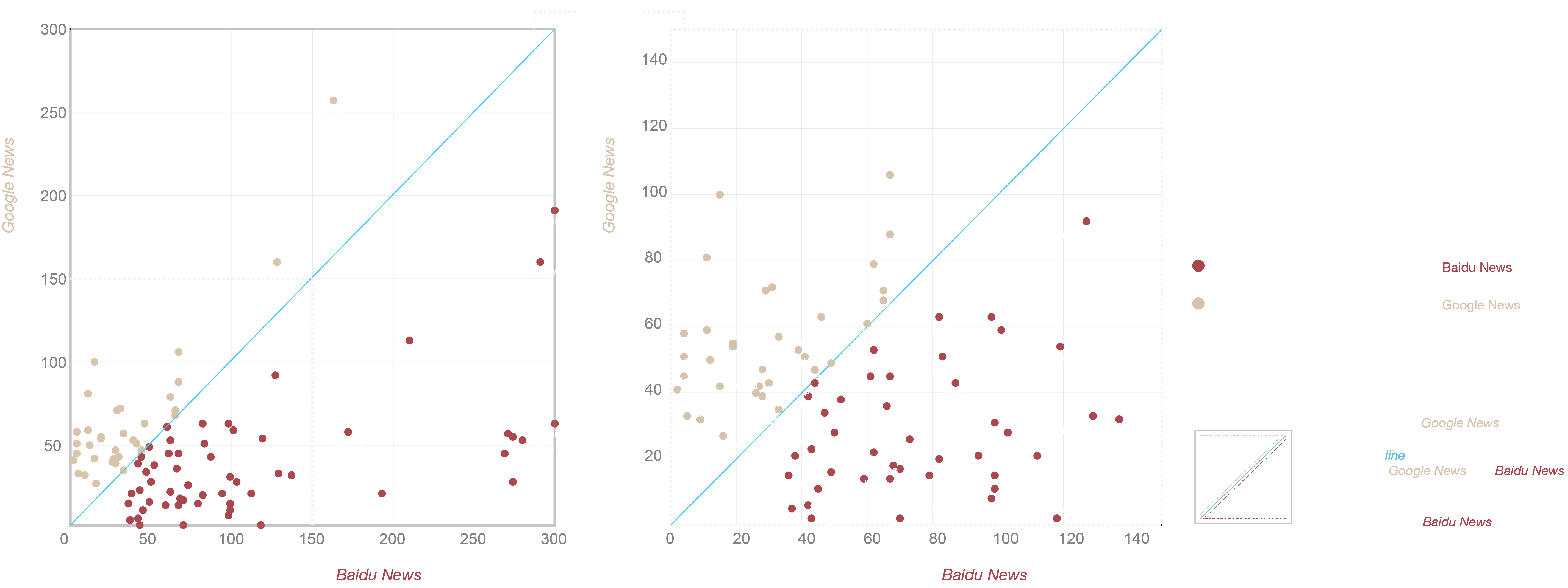
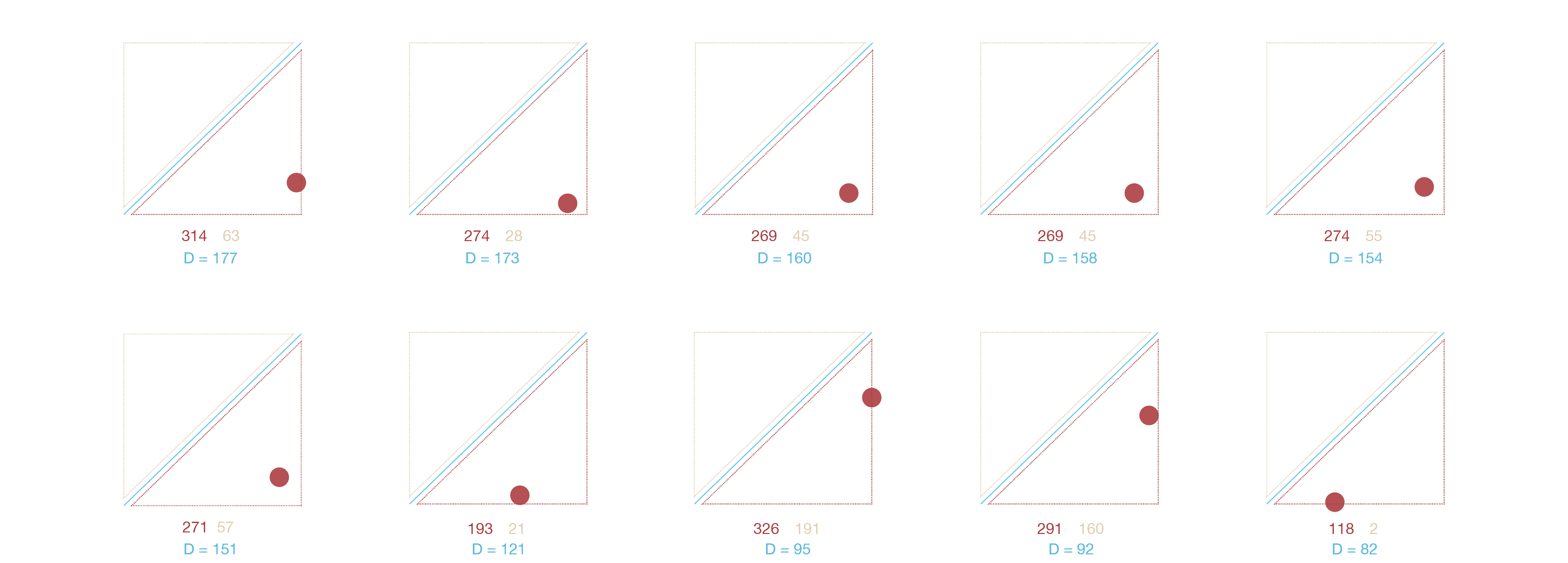
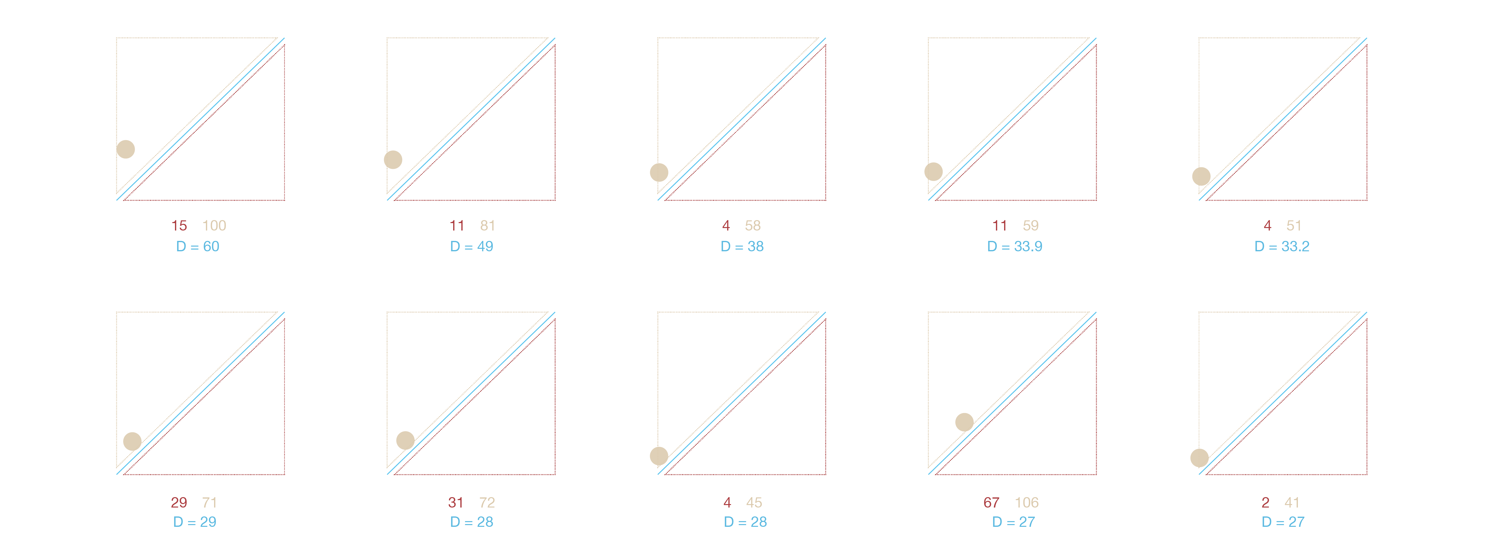
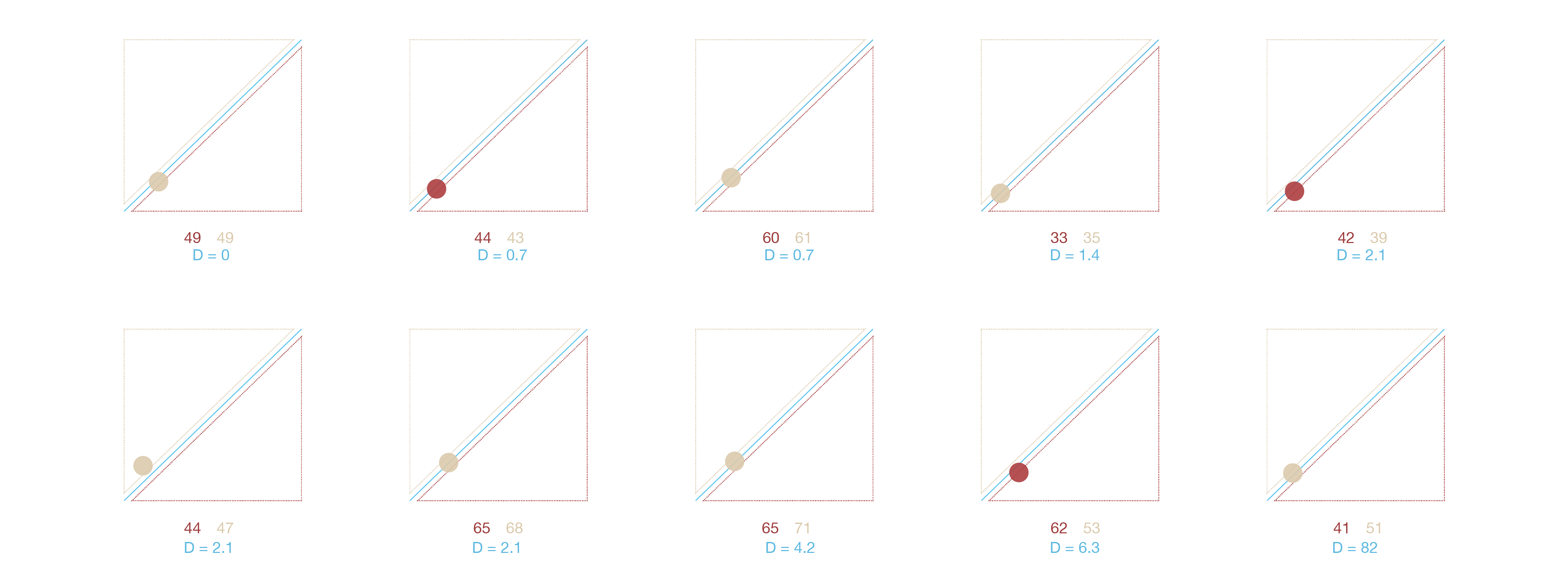
The visualization above shows the different levels of concern of one word on the different countries. The value of X axis represents the word frequency on Baidu News, the value of Y axis represents the word frequency on Google news. The blue line is X = Y, the words on the line have the same frequency in the two corpus. This can be interpreted as it has the same level of concern on both side. The words in the up-left area have higher degree of attention on Google News, the words in the down-right area have higher degree of attention on Baidu News . In next part of the visualization, the blue value is the distance from the point to blue line, the greater the distance, the greater the difference.
In the visualization we can see that Chinese media and American media have different report tendency on climate change issues, and on the same issues they also have different levels of concern.